

![]() San Diego Chargers Logo PNG
San Diego Chargers Logo PNG
The San Diego Chargers is a professional football team of the Western Division (the American Football Conference, NFL). The club is based in San Diego, California.
Meaning and history
![]()
Since its inception in 1960, the club has had several logos. The first one was a shield logo with a blue horse head, white lightning bolt, “LA” in blue (the team was founded in Los Angeles), and “Los Angeles Chargers” in gold yellow on a blue circle enclosing the shield. In 1961 the club moved from Los Angeles to San Diego and it had to modify the logo.
![]()
![]()
1961 — 1973
![]()
The blue circle was removed, as was the “LA”, and a new shade of blue – the “powder blue” – replaced the original deep blue color in the shield.
1974 — 1987
![]()
The 1974/75 season brought about a completely new logotype sporting a helmet side view. The only element borrowed from the previous emblem was the lightning bolt, its shape was altered, though. The color palette was modified once again, both the yellow and blue colors growing darker.
1988 — 2001
![]()
The version introduced in 1988 featured an even darker blue color (navy blue). The helmet was rotated to a 3/4 view. The shape of the face mask and the lightning bolt was modified. In addition to this, the lightning bolt was now white, with a gold and blue outline.
2002 — 2006
![]()
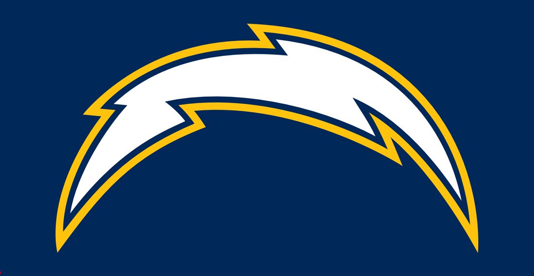
In 2002, the team got rid of the helmet logo, and only the arched lightning bolt was left looking more like the one used in the 1974 logo than that from the 1988 variation.
2007 — 2016
As the result of the 2007 redesign, the white filling was replaced by the gold one, while the outline combined two shades of blue (both are the Chargers’ official colors currently).
Symbol
The Chargers logo symbolizes the team’s infinite electrifying power and energy that nourishes players’ skills, determination, and will to win.
Emblem
Having moved to Los Angeles, the Charges went through three logos in two days, yet eventually stuck to the logotype and the wordmark that looked almost the same as the San Diego ones, except for the inevitable modification of the text.
Why did the change their logo three times in two days?
![]()
As A. G. Spanos, the team’s president of business operations, explained later, the first two logotypes revealed after the Chargers’ relocation, were just meant to supplement, not replace, the official Los Angeles Chargers logo.
Shape
![]()
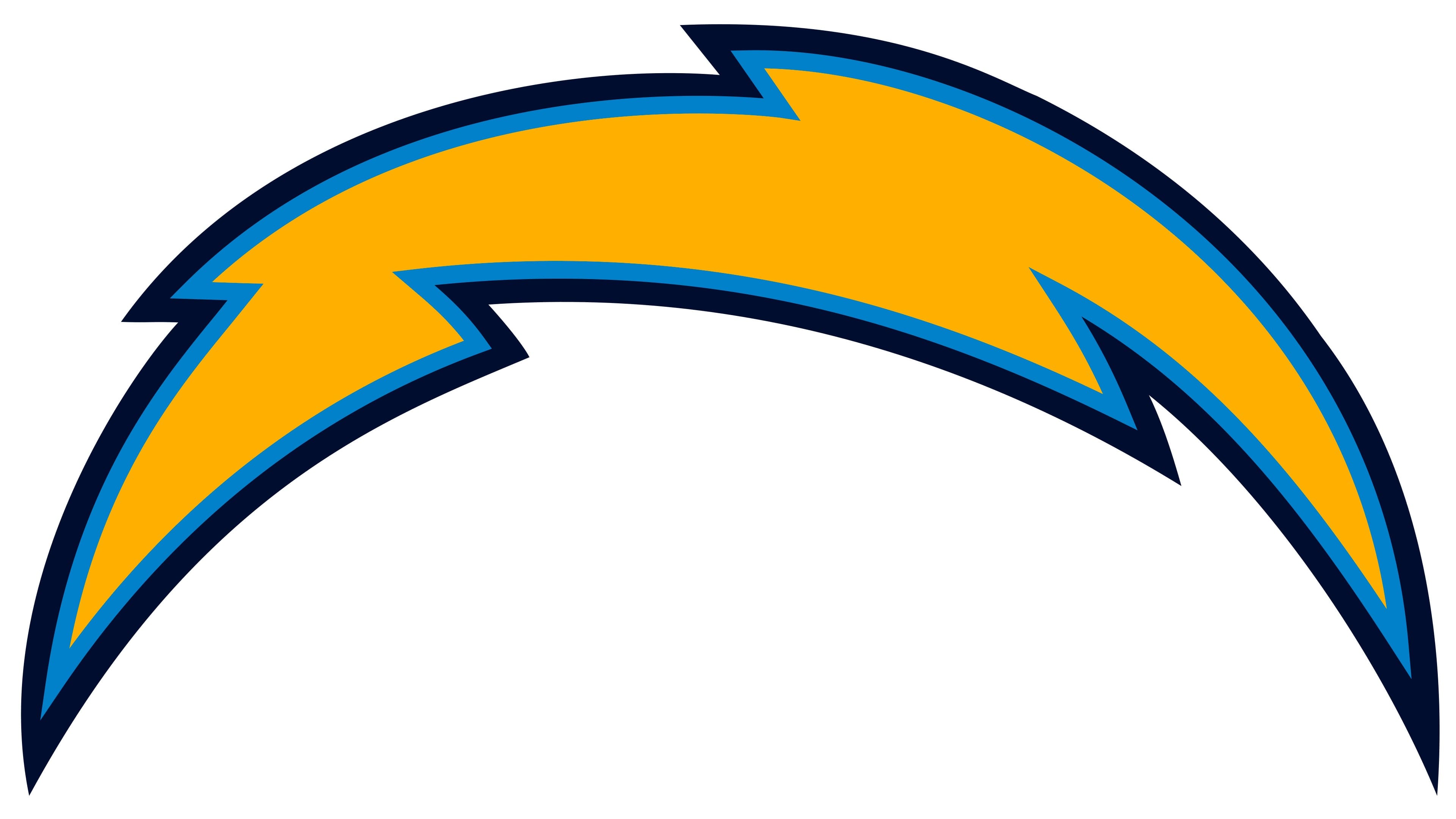
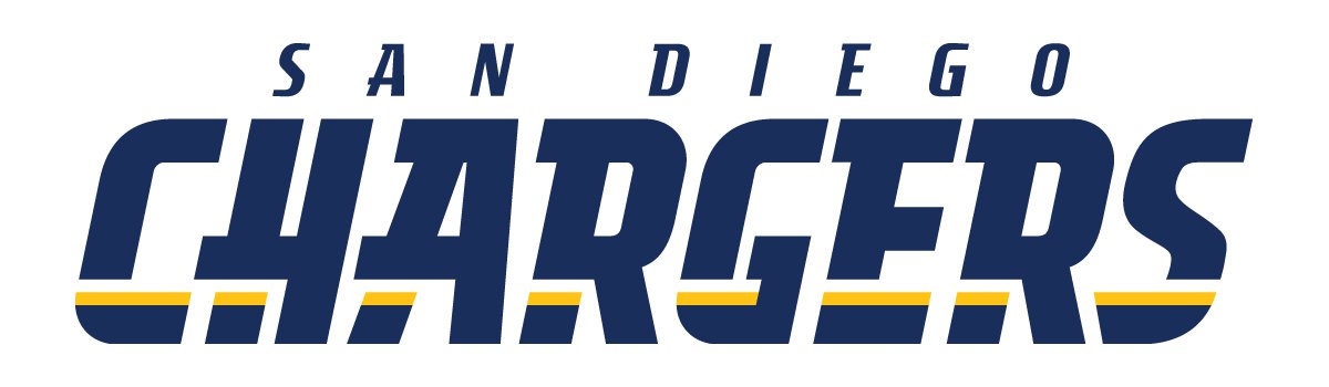
The current Chargers logo features the lightning bolt, which resembles that of the 2002 logo, except the ark is gold, and it has a “powder”- and navy blue contours. It tops the club’s name and its home city that are written in deep blue.
Colors
![]()
The official palette incorporates four colors, including two shades of blue (navy blue and so-called powder blue), as well as gold and white. All these are used on both the LA Chargers logo and the wordmark.
Font
The team preferred to have every letter of its wordmark designed from scratch rather than use an existing font. The glyphs in the LA wordmark seem to belong to the same type as those used in the San Diego Chargers version. Some of the characters are different, though, as the word “San Diego” was replaced by “Los Angeles.”
On the whole, it is a double line wordmark with yellow elements along its bottom.
San Diego Chargers Colors
POWDER BLUE
PANTONE: PMS 285 C
HEX COLOR: #0080C6;
RGB: (0, 128, 198)
CMYK: (90, 40, 0, 0)
SUNSHINE GOLD
PANTONE: PMS 1235 C
HEX CODE: #FFC20E;
RGB: (255, 194, 14)
CMYK: (0, 25, 100, 0)
WHITE
HEX COLOR: #FFFFFF;
RGB: (255, 255, 255)
CMYK: (0, 0, 0, 0)
Why are the LA Chargers called Chargers?
The name of the NFL club from California came up as a result of a contest, held by the franchise’s owner Barron Hilton at the beginning of the 1960s. The winning “Chargers” version was proposed by Gerald Courtney. The legend says, that “Chargers” was one of the first options, seen by Hilton, and that after opening it, he didn’t even look at the rest ones.
Why did the Chargers change their logo?
The logo of the LA Chargers was redesigned several times throughout the club’s history, with the last two versions introduced in the 2000s, and differing from all the previous badges. The modern and laconic logo of the Chargers was created as a tribute to the club’s move to the new arena, the SoFi Stadium.
What is the Chargers logo supposed to be?
The sharp and stylish logo of the Los Angeles Chargers football club depicts a stylized arched zipper in yellow and blue, which represents the name of the club, and reflects the energy and dynamic, showing the team as a powerful and resolute one.
Did LA Chargers change their logo?
The Los Angeles Chargers football club has had its logo redesigned several times throughout the years, with the latest refinement held in 2007. It was more about the color palette, but the intense yellow made the element look completely different — more modern, fresh, and young.


