

![]() Buffalo Bills Logo PNG
Buffalo Bills Logo PNG
One of the most known professional American football teams, Buffalo Bills have gone through four logotypes over more than half a century of their history.
Brand Overview
The Buffalo Bills are a professional American soccer team based in Buffalo, New York. The team originally played in the AFL, and today it is a member of the American Football Conference East Division of the National Football League. The team plays its home games at Highmark Stadium in Orchard Park, New York, and is the only football club, which plays its home games in the NY States.
In 1915 Barney Leppers founded the Buffalo All-Stars club, which wasrenamed Niagaras in 1918, and the Prospects in 1919. The Prospects became the base for the founding of the later Buffalo All-Americans, who joined the league that later became the NFL in 1920. In 1924 the club was renamed the Bisons. Under this name the team played until 1927, coming back for just one season in 1929.
After the war, when the All-American Football Conference was formed, and since there were already Buffalo Bison’s teams in baseball and hockey, the new name should have been chosen for the football club. In 1947 the club changed its name to the Buffalo Bills.
Buffalo is the only team in the league to win the conference championship four times in a row and play in the Super Bowl. All four finals ended in losses.
From its founding until his death in 2014, the club was owned by businessman Ralph Wilson. Since October 2014, the team has been owned by Terrence Pegula and his wife Kim.
Meaning and history
![]()
Looking at the team’s earliest logo, which was adopted in 1961, one can hardly find any similarities with the current emblem. The first Buffalo Bills logo depicted a herd of buffaloes and 2 players in front of them. Above the picture, the name of the team was given in a solid sans serif typeface. All these were placed inside a dark blue shape resembling a football.
Who owns the Buffalo Bills?
One of the most famous football clubs of the United States of America, Buffalo Bills, is owned by Terry and Kim Pegula. Terry Pegula is a very reputable American Billionaire, who owned several sports clubs.
This version was only used for a year, and as soon as in 1962 it was heavily modified. Having preserved the original football shape and the core visual metaphor, the designers changed all the rest. Now, there were only one buffalo and only one player. The buffalo and the background were given in shades of brown, while the football player was wearing the blue uniform and white helmet. There was the number 31 on his sleeve, while his helmet featured a red buffalo.
1960 – 1961
![]()
The Buffalo Bills logo from 1960 only stayed with the club for a few months. It was a pretty naive yet bright badge, drawn in a shape of a rugby ball placed horizontally. The ball featured a bright blue background and an image of two buffaloes and two players on its bottom part. The animals were executed in a brown and orange color palette, while the footballers were wearing white and blue uniforms and one of them was holding an orange rugby ball. The bold white “Buffalo Bills” wordmark in the uppercase was arched about the image, on blue.
1962 – 1969
![]()
The redesign of 1962 kept the shape of the badge unchanged, and almost didn’t touch the color palette, though the composition was replaced with a new one. The whole rugby was executed in a brown and white color palette with the enlarged Buffalo as the main motive. On the right part of the ball, there was an image of a player in a bright blue jersey, with a brown rugby ball. This version had no lettering on or around it.
1970 – 1973
![]() In 1970, a completely new logo was adopted. It was simpler and clearer than its predecessor. The only hero of the story was a red bison with a white eye. Probably the most minimalistic of all the team’s symbols, this one was used for three years.
In 1970, a completely new logo was adopted. It was simpler and clearer than its predecessor. The only hero of the story was a red bison with a white eye. Probably the most minimalistic of all the team’s symbols, this one was used for three years.
1974 – Today
![]() The Buffalo Bills logo adopted in 1974 has a more energetic and dynamic look. The key theme – the buffalo – is preserved in this version of the logotype, yet now it is a charging buffalo with the solid red line coming from its head.
The Buffalo Bills logo adopted in 1974 has a more energetic and dynamic look. The key theme – the buffalo – is preserved in this version of the logotype, yet now it is a charging buffalo with the solid red line coming from its head.
Font

The Bills wordmark features a solid serif typeface. The uppercase font is a custom one.
Helmet
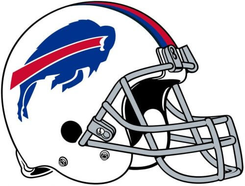
Since 2002, when Tom Donoghue took over as general manager of the Buffalo Bills, helmet and uniform designs have changed. Today Buffalo Bills helmets are mostly red with one blue, two gray, two blue, and two white stripes and a white mask. On the sides of the helmets is an iconic logo designed in 1974, with a blue bull silhouette and a red diagonal line extending from the animal’s white horn. However, the team helmets are also available in white and blue, with the decorative elements remaining unchanged.
Uniform
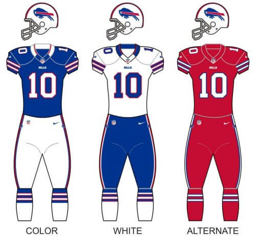
The very stylish and patriotic uniform of the Buffalo Bills football club is based on a color palette, composed of four shades: royal blue, navy blue, white and red. The main uniform features a royal blue jersey with white and red details, and white pants, with red and blue stripes. There is also a white uniform, withblue pants and red and white stripes, and the alternate version of the uniform: all red with white and navy blue accents.
Stadium
Logo
![]()
View
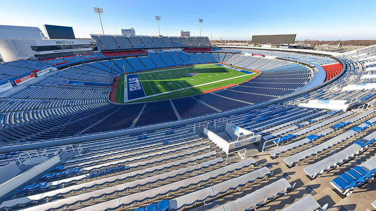
Since 1973 Buffalo Bills play at Highmark Stadium, located in Orchard Park, New York, and is the only NFL team, which has its home games in the Net York State. The stadium, which opened in 1973, was renovated twice, in 1998, and 2013, and today has a capacity of 71,608 seats.
Before moving to Highmark Stadium, the Bills used to play at War Memorial Stadium, for a decade, starting in 1960.
Buffalo Bills Mascot
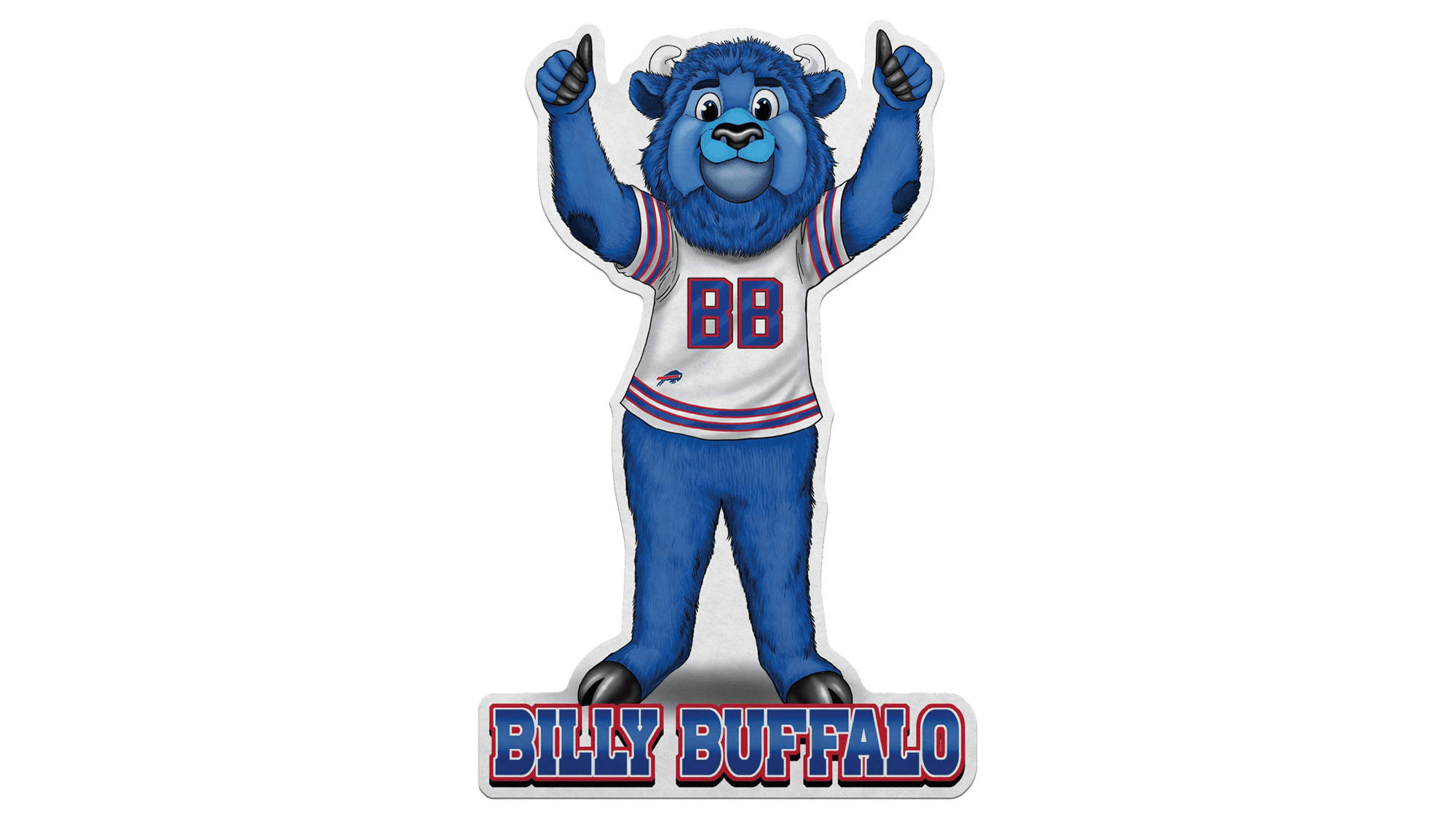
One of the cutest and brightest mascots of the NFL, Billy the Buffalo, was introduced to the public in 2000 and redesigned just once (as of 2024), in 2018. It is a huge light blue buffalo bull, which wears a white jersey with blue stripes in a red outline. Instead of the number, the chest of the jersey is decorated by a bold blue “BB” monogram, also in a red outline.
Anniversary Logos
Apart from primary logos, redesigned throughout the years, Buffalo Bills also have several special insignias, created to celebrate the club’s significant dates. Below we have gathered them all for you.
1984
![]()
The silver anniversary of the club in 1984 was marked by the creation of a medal-like emblem, with the red and blue Buffalo Bills helmet enclosed into a circular light gray frame with blue uppercase lettering around its perimeter, and decorated by the red ribbon, arched under the helm, with the dates “1960” and “1984”.
1994
![]()
For the 35th anniversary, the sharp and strong emblem was introduced: it was an edgy crest formed by two overlapping triangular segments, pointing down and with their top borders arched from the center. The smaller one was set in red and overlapped the solid blue one on its upper part. The main element here was the enlarged white “35” with the blue and red buffalo emblem on it. The uppercase white “Bills” was written on top of the crest, and the dates — at the bottom.
2009
![]()
To celebrate the 50th season of the Buffalo Bills franchise, another anniversary logo was designed in 2009. The badge was based on an enlarged “50” drawn in thick black lines with a delicate golden outline, and placed on a white background. The negative space of the “0” was decorated with a solid red image of a buffalo. Another buffalo, but already in blue with a red stripe, was set on a diagonal banner at the bottom of the composition.
2019
![]()
In 2019 to celebrate the 60th anniversary of the Buffalo Bills franchise, a strong and progressive emblem was created. The white voluminous “60” outlined in red and placed against a solid blue background, has its digits intertwined by a fancy red ribbon with the blue framing and the white “Est. 1960” datemark. The iconic emblem, depicting a blue buffalo with a red stripe, is set at the bottom of the badge.
Buffalo Bills Colors
The three colors featured in the Buffalo Bills logo are actually the team’s official colors that can also be seen in their uniform: royal blue, red, and white. In addition to this, the club’s official palette also includes navy blue, although it is not present in the logotype.
BLUE
PANTONE: PMS 287 C
HEX COLOR: #00338D
RGB: (0, 51, 141)
CMYK: (100, 60, 0, 20)
RED
PANTONE: PMS 186 C
HEX COLOR: #C60C30
RGB: (198, 12, 48)
CMYK: (10, 100, 100, 0)
What is the red stripe on the Buffalo Bills logo?
The stable and confident blue bison from the primary badge of the Buffalo Bills club is decorated by a thick red stripe, which represents motion, speed, and power, creating a strong color accent, and turning the simple badge into something stylish and dynamic.
Why is the Bills logo a Buffalo?
The animal on the Buffalo Bills logo is a bison, a symbol of strength and determination. It is depicted on the badge of the club to depict its name and to reflect its character and fighting spirit.
Does the Bills logo have an eye?
The bison on all four versions of the Buffalo Bills badge featured eyes, but each of them — was different. The realistic badges, used by the club until 1970, had the eyes drawn with all the details, while the Red Bull from the logo, created in 1970, had it stylized as a white dot, and the current badge has the eye merging with the horn, with the red stripe coming out of it to the left.
Did the Buffalo Bills change their logo?
The Buffalo Bills badge has undergone three major redesigns throughout the years, with the first badge introduced in 1960, refined in 1962, and completely changed in 1970. As for the current version, it was created in 1974 and has stayed untouched for decades.


