

![]() New Orleans Saints Logo PNG
New Orleans Saints Logo PNG
The New Orleans Saints logo uses the same symbol as its home city, New Orleans. The city, in its turn, chose it as a tribute to its French founders. The symbol, which is called fleur-de-lis, could be seen on countless European coats of arms and flags over the centuries.
Meaning and history
![]()
The visual identity of the football club from New Orleans is very elegant and light. The symbol, the Saints use for its logo has always been associated with the French monarchy and stands for perfection and royalty. The emblem with an elegant fleur-de-Lys makes the team stand out in the list of its competitors and adds a sense of luxury and tenderness to a strong and masculine sport.
1967 — 1999
![]()
The initial version of the New Orleans Saints logo was executed in a monochrome palette with bold black fleur-de-lys in a double white and black outline. The symbol looked very traditional and elegant, evoking a sense of nobility, lightness, and royalty, just as it was supposed to. This simple yet sophisticated emblem stayed with the football club for more than thirty years, being redesigned for the first time only in 2000.
2000 — 2011
![]()
The badge, introduced by New Orleans Saints in 2000 featured a new tender color palette with the fleur-de-lys symbol in chic beige and a triple monochrome outline, where the inner black contour was thinner than the outer one. There was also a secondary version of the emblem, with the colors reversed — the heraldic symbol in solid black, with a white, beige and black outline, with all three contours featuring the same thicknesses.
2012 — Today
![]()
The golden-beige logo from 2000 got its color palette changed in 2012, with the main shade being lightened up. The current Saints’ fleur-de-lys is executed in a very light and chic gold tone with a black-and-white framing, which adds strength and confidence to a tender sophisticated logo.
Font

Although the club does not necessarily include its name in the logo, it does have a distinctive wordmark. It uses a custom all-cap serif typeface.
Helmet
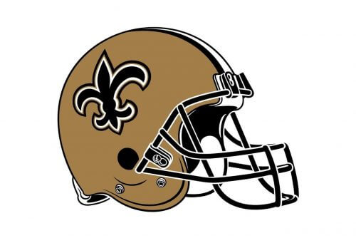
The logo of the New Orleans Saints is the most elegant and heraldic in the NFL. The red fleur-de-lys in a double black and white outline is placed on the sidesnn by of the sand-golden helmet, supported by the stripes, coming through the central part. This combination of the sophisticated emblem and thick geometric lines creates an interesting look and makes the uniform of the Saints different from their competitors.
Uniform
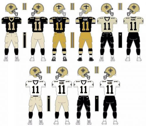
New Orleans Saints have a very modest and simple uniform, but it looks very elegant and chic in its simplicity. The three options of the uniform design are based on solid colors from the official palette of the club, white and black, with the addition of details and outlines in the third official color of the Saints, “old gold”. The primary design of the uniform is totally black, and white the secondary and the alternate versions are set in white, with differences only in small details.
Home ground
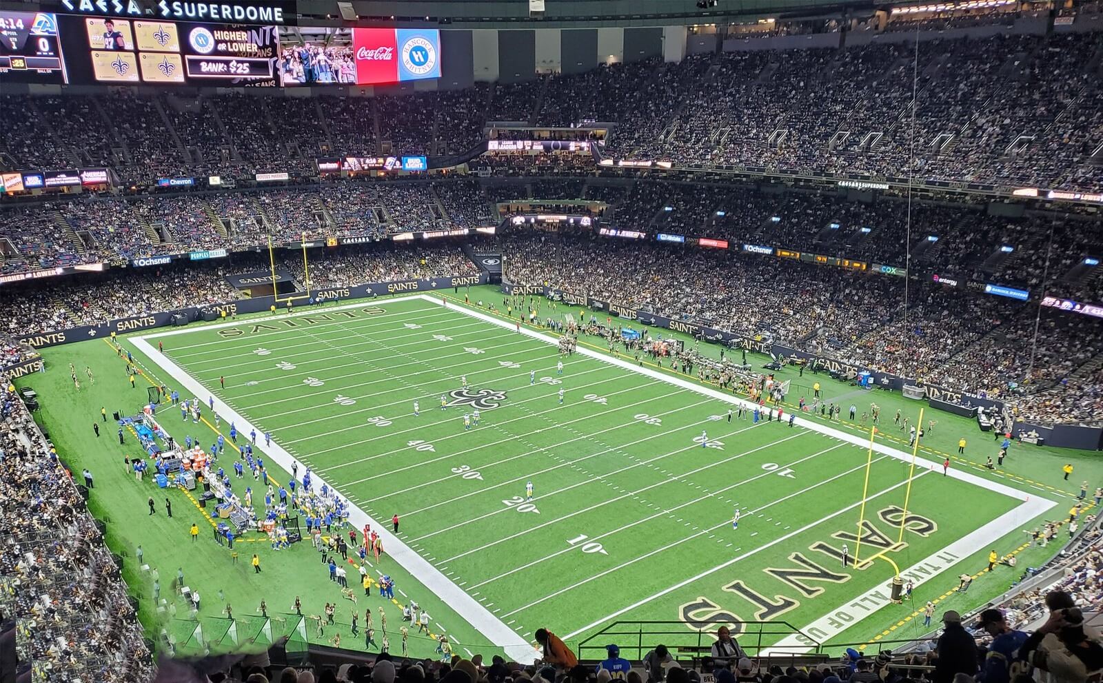
New Orleans Saints is one of the most stable NFL teams in terms of home arenas. If not for two Hurricanes, which made the team move to temporary stadiums, the Saints have only played on Tulane Stadium, which lasted for the first seven years of the club’s history, and Superdome, where the Saints moved in 1975.
Caesars Superdome stadium was reopened after the Hurricane in 2006, and today has a capacity of 73,208, expandable to 76,468.
New Orleans Saints Colors
OLD GOLD
HEX COLOR: #D3BC8D;
RGB: (211, 188, 141)
CMYK: (18, 23, 49, 0)
PANTONE: PMS 8383 C
BLACK
PANTONE: PMS BLACK 6 C
HEX COLOR: #101820;
RGB: (16, 24, 31)
CMYK: (100, 40, 0, 100)
Color
![]()
The New Orleans Saints logo exists in two color versions. In addition to the black-and-white color scheme, it may use a combination of black, white, and gold.
Where does the New Orleans Saints logo come from?
The delicate and tender logo of the New Orleans Saints football club depicts a heraldic fleur-de-lys symbol, which is most often associated with France. And the French roots explain everything — this emblem is an official symbol of New Orleans, and a tribute to its French founders.
Why do the New Orleans Saints have a fleur-de-lis?
The Saints is a professional football club from New Orleans, an American city, founded in 1718 by French settlers. The original name of the city was La Nouvelle Orléans, and its first flag depicted fleur-de-lis, a heraldic symbol widely used in France. The flag with the symbol was raised above the city at the very beginning of its history, and today it is still present on the crest of New Orleans.
What is the logo of the New Orleans Saints?
The logo of the New Orleans Saints is a floral heraldic symbol, fleur-de-lis, executed in a tender and warm shade of beige, close to sand-gold, with a double white and black outline, which allows placing the badge on various backgrounds.
Is the New Orleans Saints logo a plant?
The logo of the New Orleans Saints franchise is a heraldic symbol fleur-de-lis, which is based on the image of a lily flower. The fleur-de-lys symbol features three elongated petals with sharpened ends.


