

![]() Baltimore Ravens Logo PNG
Baltimore Ravens Logo PNG
As for me, It’s so difficult to imagine football fan who doesn’t know what is the Baltimore Ravens. The Baltimore Ravens is a professional American football team based in Baltimore, Maryland. Of course, this team has many famous features. But the main thing which characterizes it is its logo.
Brand Overview
One of the youngest teams in the NFL, the Baltimore Ravens was founded in 1996 after years of trying to reclaim the NFL franchise, because Baltimore’s main asset, the Colts, was stolen by Indianapolis in 1984. Today, the Baltimore Ravens play in the North Division of the NFL’s American Football Conference and have already won two Super Bowl titles to their credit: in 2000 and 2012.
After the Colts soccer club was secretly shipped to Indianapolis in 1984, Baltimore city officials began trying to bring the NFL franchise back to the city. So, for another NFL selection in 1993, Baltimore was all set and had even already come up with both a name and a logo for the new team, the Baltimore Bombers. But the NFL turns its back on Baltimore and turns its eyes to the cities of Charlotte and Jacksonville.
This was a major blow to Baltimore, and the city decides to turn to the Canadian Football League (CFL), where they succeed. Initially, the club gets the familiar name Baltimore Colts, but Indianapolis Colts owner Robert Irsay sued, after which the team’s name was changed to Baltimore Stallions. The club survived for two years and even won the Grey Cup title in 1995, but despite the success, the team still dreamed of the NFL. And in 1995, the city finally got its way.
The team’s mascots and the club itself were named after the famous American writer Edgar Allan Poe, who wrote the story “The Raven,” which became popular around the world. The team’s name was chosen in a poll by the Baltimore Sun newspaper. The shortlist of names consisted of three choices: “Ravens,””Marauders,” and “Americas.”
Meaning and history
![]()
Being a pretty young football club, Baltimore Ravens had only had one major logo redesigns throughout its history, and both of its emblem versions are executed in one style and color palette, which says a lot about the club’s values and philosophy.
1996 — 1998
![]()
The original logo for Baltimore Ravens depicted a traditional crest with some not very traditional details and a very bright and lively color palette. The yellow shield with a bold stylized letter “B” in purple with a white outline, had a double black and purple frame and two sharp and elegant wings coming out of its sides and curving up. The “Ravens” wordmark was placed along the upper bar of the crest, a black stripe. As for the pointed bottom part of the logo, it had a gradient gold heraldic cross drawn in it.
There were also two additional emblems used by the Baltimore Ravens during this period. One was a classy crest, separated into four segments: the yellow with the “B” in the top left corner, the checkered yellow and black in the top right, yellow background with the stylized “R”, repeating the feathery contour of the “B” and its color palette, and a bottom left segments with a red and white cross image.
The third logo for the Ravens featured a sharp winged banner with a stylized inscription with blurred contours in white and yellow and the sharp and masculine head of the bird placed on the bottom part of the badge and adding a sense of strength and danger to the whole visual identity.
1999 — Today
![]()
The redesign of 1999 kept the original purple and yellow color palette, lighting the purple up and complementing the image with white and black accents. The current emblem depicts a raven’s profile facing right, with the bold yellow letter “B” on his head and an elongated white beak. The bird has a double black and yellow outline and looks dynamic and progressive due to its long sharp lines and shapes.
Symbol
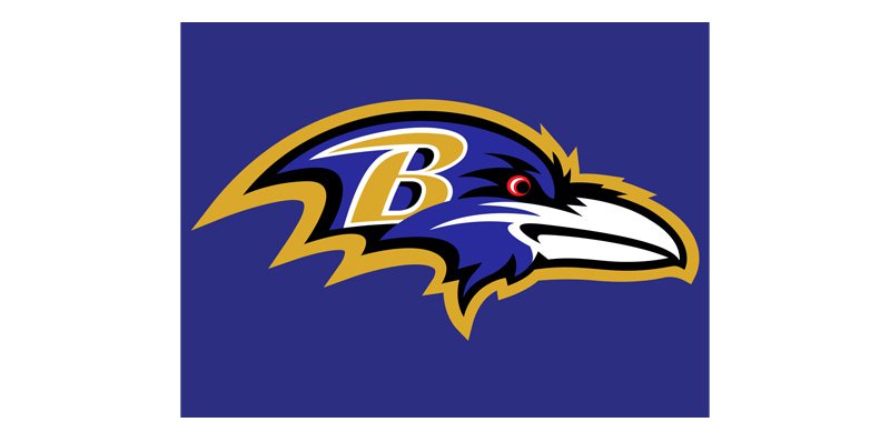 What does this logo look like? Today’s shows a raven’s head in profile with the letter superimposed.
The club’s current logo depicts the head of an aggressively looking raven and features the letter “B” on the left.
Helmet
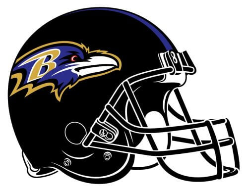
There are two options for the helmet design of Baltimore Ravens. The brighter one features a glossy purple background with an iconic logo, depicting a head of a raven in purple, gold, and white, set on the sides, a land a thin golden stripe coming through the centering the helmet, supporting the golden mask. The second option is more brutal and strong, with the matte black surface, black mask, and the same purple and gold raven on the sides.
Uniform
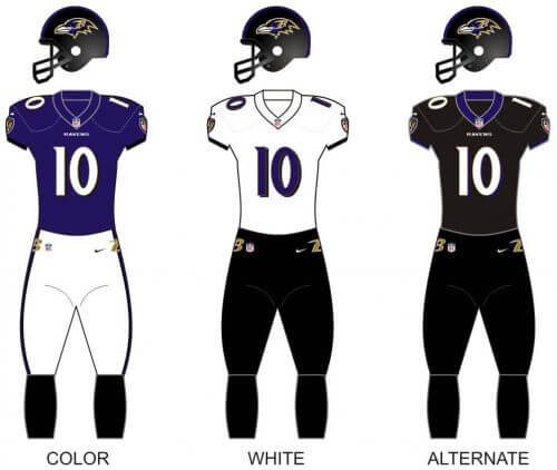
The uniform variety of the Baltimore Ravens club consists of three possible designs: purple jersey with white pants as the primary option; the white jersey with purple details and black pants with small golden elements as the secondary one; the the total black uniform with small purple stripes on the collar, and a white player’s number in a purple outline, — as an alternate one.
Stadium
Logo
![]()
View
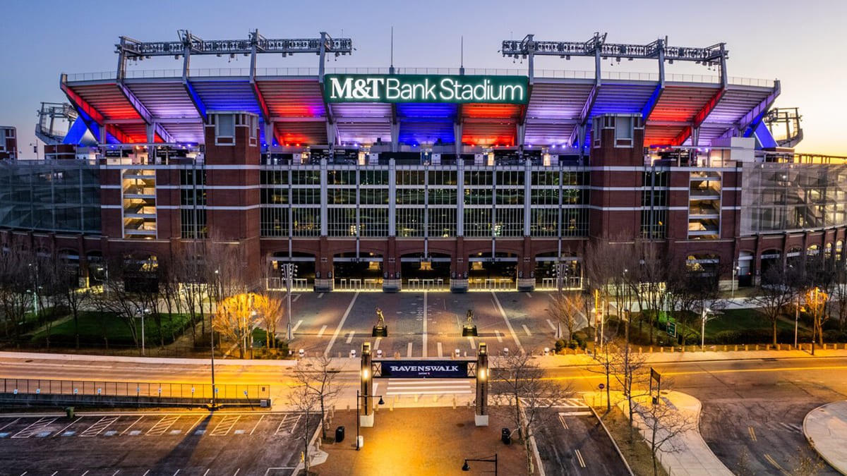
Since Baltimore Ravens is a pretty your club, and it has never moved from Baltimore, the club didn’t jump much from Stadium to Stadium, and only played on Memorial Stadium for their first season, moving to M&T Bank Stadium in 1998. Today the stadium, which is considered to be one of the best in terms of comfort and accessibility, has a capacity of 70,745 seats.
Baltimore Ravens Mascot
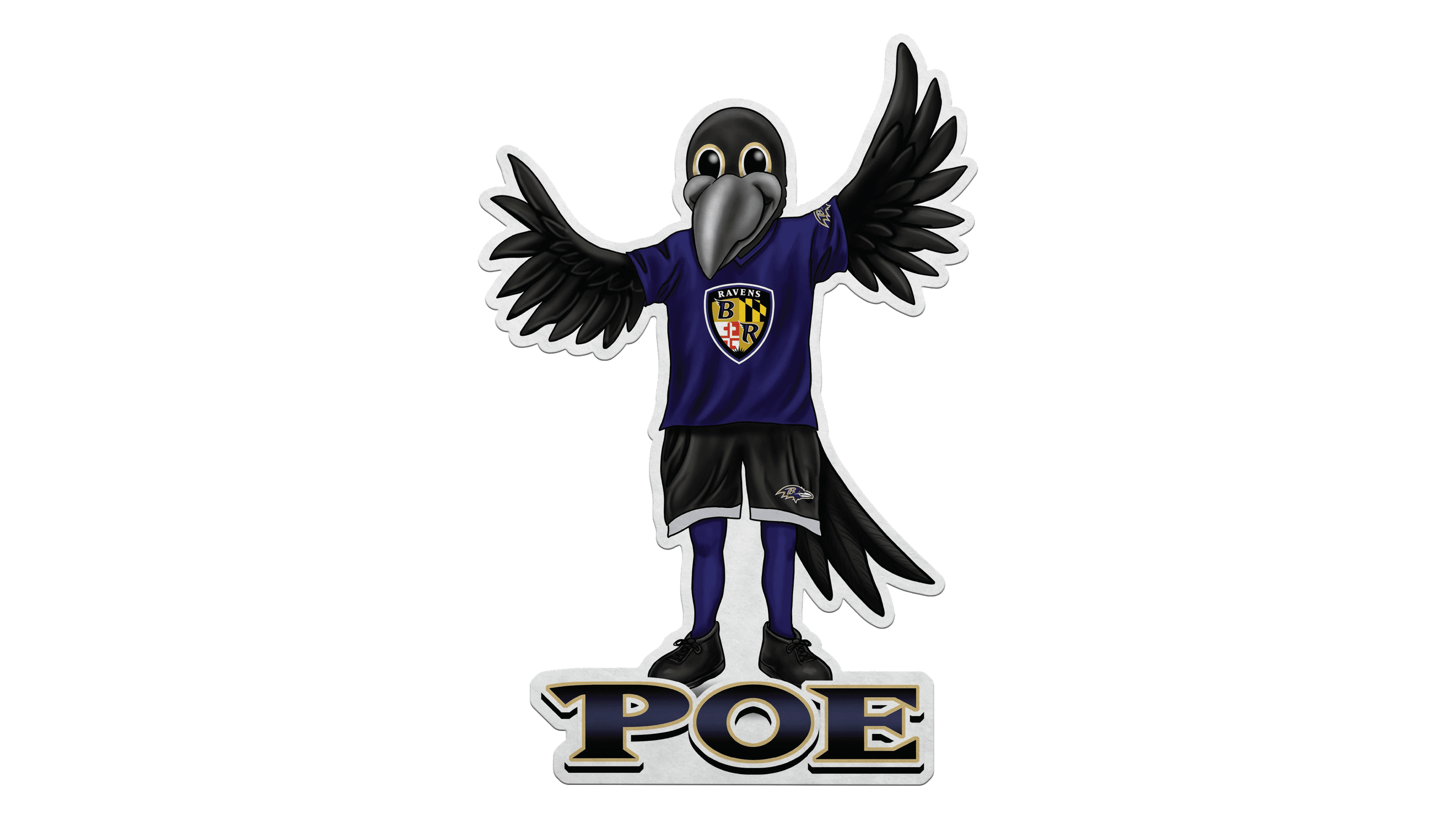
The famous mascot of the Baltimore Ravens football team, Poe the Raven, was introduced in 1988, and since that time has never left the identity of the club, as well as their games. It is a huge black raven with a friendly smile and wide ornate wings. The bird wears the uniform of the Ravens, a solid purple jersey with the official crest of the club on the chest, and black shorts with white trim around the pants.
Anniversary Logos
Baltimore Ravens is quite a young team, compared to other NFL members, however, it has already celebrated several anniversaries, and for each of them, a special logo was designed.
2005
![]()
For the 10th season of the Baltimore Ravens club, the logo was executed in the official color palette of the team — purple and gold, with the addition of white and black. The central element of the fancy crest was a large geometric “X”, overlapping a golden ribbon with the dates written on it. The ribbon with the X was drawn over a solid purple crest with the emblem of the Ravens placed on top of it.
2015
![]()
In 2015 it was the 20th anniversary of the Baltimore Ravens football team, and another anniversary emblem was created to celebrate it. This time it was a classic shield in a purple and gray palette with the stylized “XX” written above the solid golden ribbon where the dates were written along with the “20 Seasons” inscription. The raven’s head was drawn on top of the crest.
Baltimore Ravens Colors
PURPLE
PANTONE: PMS 273 C
HEX COLOR: #241773;
RGB: (26, 25, 95)
CMYK: (100, 100, 0, 5)
BLACK
PANTONE: PMS BLACK 6 C
HEX COLOR: #000000
RGB: (0, 0, 0)
CMYK: (70, 50, 50, 100)
METALLIC GOLD
PANTONE: PMS 8660 C
HEX COLOR: #9E7C0C
RGB: (158, 124, 12)
CMYK: (0, 20, 80, 20)
RED
PANTONE: PMS 186 C
HEX COLOR: #C60C30
RGB: (198, 12, 14)
CMYK: (10, 100, 100, 0)


