According to Google, there are about 20 thousand brands of beer in the world today. Impressive, isn’t it? The companies are mainly spread between 200 countries on different continents, and of course, not all of them are lucky to get popular internationally. Today we will have a closer look at the most famous beer breweries and their logotype, checking which elements they prefer to use for their visual identity, and what they want to tell the customers with their designs.
Most of the brands use traditional and elegant color palettes, composed of gold and red shades, with some smooth additions. Others choose cool blue schemes, which evoke a sense of freshness, promising to help deal with the summer heat. Although, there are some companies, which try to distinguish themselves from the competitors, creating something not very typical for the industry, and showing their unique essence.
So let’s compare and see, which way works better — a traditional or a modern one. The brands in our list are arranged in alphabetical order.
Amstel
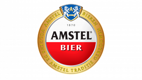
Amstel is one of the leading European brands of beer, which was established at the beginning of the 1870s, and taken over by one of the world’s leading companies in the segment, Heineken, a century later. Today the beer under this label is sold worldwide, making its logo one of the most recognizable brewery badges across the globe. The Amstel badge is composed of a roundel, horizontally divided into white and red parts, and enclosed into a thick circular golden frame. The upper part of the frame is decorated with a blue and white coat of arms, while the name of the company is written in the center of the composition, with black “Amstel” over a white part, and white “Bier” — over a red one.
Anheuser-Busch
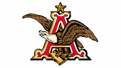
One of the oldest American breweries, Anheuser-Busch, was established in the middle of the 19th century and has its visual identity executed in classic style, with traditional symbols in a warm orange, brown, yellow and red color palette. The logo features a bold and ornate capital letter “A” as the main element. The letter is drawn in solid red and boasts a thick white and gold outline, as well as the voluminous two-colored star with five points, placed at the top. The brown and white Eagle is flying through the letter to the left, holding a golden book in its claws. The badge of the brand is balanced in terms of shapes and colors and looks timeless and elegant.
Bavaria
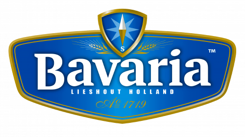
The famous German brewery Bavaria has its visual identity executed in a light and cool blue color palette with thin gold additions and white lettering written over it. Blue and white are colors of the Bavarian region, so this badge also has a patriotic and heritage meaning in it. Apart from the historical core of the Bavaria visual identity idea, the gradient and sleek badge evoke a sense of freshness, which makes it look like a perfect drink for hot weather. This feeling is supported by a sharp light-blue eight-pointed star, drawn over a classy crest at the top of a horizontally stretched banner.
Beck’s
This German brewery, established in the middle of the 1870s, is known for light and crispy beers, which are distributed all over the globe. The visual identity of Beck’s is composed of bold elegant lettering in white, with all characters decorated by thin black lines and a medium-weight outline. The uppercase inscription is complemented by an elegant and strong emblem, depicting a smooth vertically stretched coat of arms in solid red, with a double white and black outline and a contoured image of n old-style key, also in black and white, placed diagonally over the red background. When placed on a bottle, the logotype is set on a solid black horizontally-oriented rectangle, which creates a strong contrast and makes the beer stand out on the shelves.
Bud Light
Bud Light is the brand of light beer, owned by the Anheuser-Busch company, and previously known as Budweiser Light. This American label is well-known all over the globe, and its cool and modern logo looks completely different from most of the badges on our today’s list. The Bud Light badge is composed of heavy uppercase lettering, written in two levels and executed in an extra-bold modern sans-serif typeface, in a calm yet intense shade of blue. The inscription is placed on a solid white background and enclosed into a thin rectangular frame, with the corners slightly softened. The frame is drawn in a shade o blue, which is slightly lighter than the one, used for the lettering.
Budweiser
Budweiser is, probably, the most famous beer brand of the American Anheuser-Busch company. Today it is the best-selling label of beer in the United States but is also super-famous internationally. The visual identity of the brand, established in 1876, is executed in an elegant yet confident style, with the white sophisticated cursive logotype written across a solid red banner. The banner in the Budweiser logo is executed in a shape of a bow-tie, with it slightly slanted to the right, having its sides diagonal, and supporting the italicized font of the inscription. The logo is pretty simple in its composition but evokes a sense of professionalism, passion, and excellence.
Carling
Carling is a Canadian brand of beer, which definitely stands out in our today’s list, as has a super powerful and progressive visual identity, which could suit a contemporary fashion brand or even a car marque. The logo of the brewery is composed of an enlarged uppercase, with the bold black sans-serif letters slightly narrowed. The inscription has bars of the “A” and the “G” set diagonally and separated from the bodies of the letters by thin white diagonal lines. These elements are supported by a graphical emblem, placed above the logotype, starting at the top of the “A”. It is a solid black banner, set diagonally, with the same angle as the bars of the “A” and the “G”, and has its bottom right corner folded and drawn in red.
Carlsberg
This Danish beer is the most important label in the portfolio of the Carlsberg Group, a company that owns hundreds of brands in the segment, including famous Tuborg, Kronenbourg, and Somersby. The logo of the brand is also a part of the logo of the umbrella company, as is composed of a bold dark-green inscription in the title case, with a small graphical element in a shape of a trefoil, placed above the letter “R”. The style of the lettering features extra-thick elongated lines, with the “C” being straightly cut at its top. The whole logotype is underlined with a smooth curved line, which is connected to a short rounded tail of the letter “G”. All of the lines in the badge are set in a solid green color, which looks expensive and elegant.
Coors Light
Coors Light is another American label on our list. This beer has several breweries across the tourney, but the main one is in Colorado, with its snowy mountains. Coors Light is a beer with a “Cold Certified” label, which is not only designed in a winter style but also turns the mountains on the label from white to blue when the beer’s temperature is lowered to 4 C degrees. The logo is composed of two- lettering in different styles, placed under a small solid blue geometric emblem, depicting a triangular mountain with two sharp peaks. The top level of the inscription features a bold red cursive “Coors” with elongated and curved lines of the “C”, and a gray uppercase “Light” in a cool sans-serif with some bars cut diagonally.
Corona Extra
Corona Extra, a Mexican pale lager, is considered to be one of the world’s best-selling beers. This label is associated with the summer heat and beach parties and is usually served with a wedge of lemon in a bottle. The visual identity of Corona Extra is not as light, as the beer itself. It is composed of heavy two-leveled lettering in an extra-bold Gothic-style, set in a deep blue color, and accompanied by a massive yellow crown, set above it, and drawn with lots of bold elements. The crown is horizontally stretched, covering the inscription from the middle of the first “O” in “Corona”, until the vertical bar of the lowercase “N”.
Efes
Efes, or Efes Pilsen, is a Turkish brand of beer, owned by the Andalou Efes company. The company was established at the end of the 1960s, and less than a decade has already become a leader in the local market. The visual identity of the beer is completely different from the bold minimalistic badge of the mother company. The gradient blue banner with some gloss in it features a smooth shape with curved sides, a double white and gold outline with two thin red lines at the top part, a golden ornament with spikes and medals at the bottom, and two-leveled white lettering in a sharp and bold serif font.
Estrella
The Spanish Estrella brewery is one of the most famous in Europe. Established in the middle of the 1870s, today the company distributes its Pilsner Lager beer all over the globe. The name of the brand, “Estrella”, is translated from Spanish as “The Star”, so the visual identity of the brewery has always been based on the image of a five-pointed star. The Estrella logo is composed of a horizontally oriented solid red banner, with its top and bottom lines slightly arched, creating a soft motion, and a solid red star, with two of its five peaks curved and colored in dark gold. The bold white lettering in a smooth elegant cursive is written along the banner, looking fresh and strong.
Guinness
The visual identity of Guinness, a brand of Irish Dry Stout beer, which is considered to be one of the most famous and successful alcohol labels worldwide, is executed in a very sophisticated style, with a black, gold, and white color palette, and an elegant heraldic symbol as the main element. The golden harp on the Guinness badge has been a patriotic symbol of Ireland since the middle of the 13th century, and today represents the heritage and roots of the brand. The harp is usually set above the uppercase serif logotype, with the first letters enlarged. The Guinness logo can be set on a solid black background (in this case the inscription is executed in white), or on a white one (with the black lettering).
Heineken
Another super-popular beer brand on our today’s list is Heineken. This beer from the Netherlands is known and loved all over the globe, and due to its visual identity, which hadn’t been changed for decades, Heineken is sometimes called “The beer in a green bottle with a red star”. The Heineken logo is composed of a bold green inscription in lowercase, executed in an extra-bold serif typeface with some curved lines in some of the characters. The inscription is set on the right from a solid red five-pointed star. When set on a Heineken bottle, the star is enlarged and placed above the banner with the inscription, over a plain white background.
Hoegaarden
One of the world’s oldest brands of beers, Hoegaarden, had its first brewery, producing a wheat beer, opened in Belgium in the middle of the 1440s. Today the brand successfully operates in dozens of countries across the globe and has its bold and elegant logo instantly recognizable worldwide. The badge of the brewery features a white title case inscription in a smooth cursive font, written with a thick blue outline, and accompanied by a delicate emblem, composed of two overlapping crests in thin gold contours. The crests have similar heraldic symbols drawn on them, and look very airy and elegant, balancing the heavy logotype.
Kronenbourg 1664
Kronenbourg 1664 is the brewery from Alsace, which has the date of its establishment as one of the main elements of the brand. The beer is often called just “1664”, and today is mostly known in Europe and the United Kingdom. The logo of Kronenbourg 1664 is composed of a solid white horizontally oriented oval in a thin silver outline, placed on a background with two solid red ribbons, crossed forming an X-shape. The body of the oval medallion has the “1664” in dark blue enlarged and placed in the center, while the “Kronenbourg” in a sophisticated cursive is written in a small size above it.
Krusovice
The Czech brand of beer, owned by Heineken, was established at the end of the 16th century and is also known as the Royal Brewery of Krusovice. This “Royal” theme is strongly supported by the visual identity of the label, which has its logo executed in a dark-red and gold color palette, with classic shapes and an ornate crown placed above the central part of the banner. The smooth wavy banner is dark red is outlined in white and gold, with the bold white lettering slightly shadowed. The main logotype is underlined by a delicate gold “Karlovsky Pivovar” tagline and has the crown on top accompanied by a black “1581” datemark, celebrating the year of the brewery’s foundation.
Leffe
Leffe is the name of a Belgian beer brand, which is owned by the Anheuser-Busch Group. The brand calls itself an “Abbey Beers manufacturer”, and this medieval mood is perfectly reflected in the bright yet laconic visual identity of Leffe. The logo of the brewery features a solid yellow banner, which shape resembles an abbey bell, with black Gothic-style lettering written across it. The inscription is set in a title case and has its two letters “F” drawn in different sizes, with the first one slightly larger than the second. The logo looks well-balanced and very elegant, showing the company as a professional one and evoking a sense of excellence and expertise.
Lowenbrau
Lowenbrau is one of the oldest beer brands in the world, with its first brewery opened in Germany at the beginning of the 1380s. The name of the label is translated from German as the “Lion’s Brew”, hence the lions take the central part in the visual identity of Lowenbrau. The logo of the beer is composed of an uppercase logotype in solid blue, with a light gold outline, and the first letter enlarged. The lettering is set under a square badge with rounded angles, where the golden heraldic lion rampant is drawn over the solid blue background and enclosed into a thick golden frame. The only bright element on the crest is the thin curved tongue of the lion, drawn in red.
Miller Beer
Miller is an internationally distributed brand of American beer, which was established in the middle of the 19th century. There are several types of beers, produced under this brand, but their light lager is the most popular one. The visual identity of the company is set in a dark-red and white color palette, with the white underlined title case inscription in a sharp cursive font set diagonally over a solid rectangular banner with rounded angles and the sides arched to the center. The logo looks very modern and stylish, with the smooth contours of the banner balanced by the sharp contours of the characters and the swoosh underline.
Spaten
Spaten is a German brewery, which was established in Munich at the end of the 14th century. Today the label is owned by the Anheuser-Busch Group and has its beers distributed all over the globe. The visual identity of Spaten is pretty traditional and light, with the solid red crest, decorated by golden floral ornament at the bottom, placed in the center of the plain white shield with the rounded bottom part. The crest is outlined in gold and has a serif uppercase “Spaten” in dark-green placed on its top part, there are also additional small letterings all over the crest — the datemark on the sides from the red element, and an arched red tagline under it.
Staropramen
Staropramen is one of the most popular Czech breweries, which was established in the second half of the 19th century. The visual identity of this European beer brand is composed of a dark-green script logotype, set diagonally over a plain white background, with the elongated tail of the “N” curved to the left, and finishing under the lowercase “T”, being cut diagonally. The inscription boasts a thin elegant outline in gold and white and is complemented by a stylized “S”, enclosed into a golden circular frame, formed by two leafy branches. The emblem is underlined by a dark burgundy ribbon with a gold outline, and a burgundy “1869” datemark on its sides. The color palette of the logo looks very elegant and chic.
Stella Artois
Stella Artois is a Belgian brand of beer, which was established in the middle of the 1920s, and is very popular all over the globe. The visual identity of the brand is executed in a bright red-and-white color palette, with the bold white lettering in the uppercase of an elegant serif typeface written over a solid red banner with arched sides, decorated by white vignettes with thin red accents. The top part of the logo has a red and white horn placed horizontally and covered by an arched red “Anno 1366” datemark with a solid eight-pointed star dividing it. The star has its vertical rays elongated and sharp. The intense and elegant logo looks great on beer glasses, with the golden beverage making up a perfect background for it.
Tuborg
Tuborg is a famous beer brand from Denmark, which was established in 1873, and has been a part of the Carlsberg group since 1970. For most of its existence, the company has been using a dark and classy logo, with the two-leveled lettering in a dark shade of green, outlined in gold, and accompanied by an emblem with a depiction of an ornate crown, drawn in gold, red and white. But after the recent redesign, the company has completely changed the style of its badge, which became very fresh and modern. The new Tuborg badge features a lime-green uppercase logotype in a smooth serif font, set against a white background and complemented by a contoured rounded figure with some thin arched lines accenting its sides.
Velkopopovicky Kozel
Velkopopovicky Kozel is a Czech brand of beer, which is widely known in Europe. The first brewery of the company was opened in 1874. Since 2016 the brand has been owned by the Japanese Asahi Group. The visual identity of Velkopopovicky Kozel is based on an image with the brand’s mascot, a goat, as the Czech “Kozel” is translated into English as the “Male Goat”. The logo of the brand is composed of a vertically oriented oval in gradient gold shades, with the horizontal banner, where the bold white logotype is written, and a brown goat with beer drawn above it. The logo looks very intense and slightly naive, with the goat drawn in a very detailed way.
Warka
The last name in out today’s list is Warka, a Polish brand of beers, which was established at the end of the 1470s. The pale lager of Warka is pretty popular in Europe, but not globally. The visual identity of the brand looks very strong and professional, with the bold white logotype featuring a thin internal outline in gold, and a medium-thick black shadow. The lettering is set over a gradient red horizontally stretched banner with triangular top and bottom lines, accompanied by two gradient gold lines, which repeat the contours of the banner. This classic red, gold and white tricolor evokes a sense of elegance and timelessness and makes the logo of Warka look confident and cool on branded bottles and glasses with beer.
Holsten
 The visual identity of the Holsten beer looks very old-school, yet elegant. The badge of the brewery is composed of heavy serif lettering in the uppercase, executed in plain solid brand, and accompanied by a black, red, and white emblem above it. The Holsten emblem depicts a black knight on a horse, drawn in profile, moving to the right, with an enlarged red shield on the side. The shield has a double white and black outline and a massive white capital “H”, with the bottom lines of the vertical bars cut diagonally, forming a triangular silhouette.
Paulaner
 The logo of another famous European brand, Paulaner, is composed of a solid uppercase logotype with a traditional circular emblem above it. Both elements are executed in a smooth and sophisticated blue and gold color palette, with some muted red additions. The lettering is written in a bold and solid serif typeface and has its first character enlarged. The inscription is colored in blue and outlined in gold. This color combination is supported by a rounded emblem, with the golden monk’s profile drawn over a red background and enclosed into a thick blue frame with a white inscription written around its perimeter.
Asahi
 One of the most popular Japanese beer brands, Asahi, has its logo set in a unique typeface, which adds a progressive and confident characteristic to the company. The badge of the brewery is written in the title case of a custom cursive font, with all letters executed in smooth thick lines in electric blue. The thickness of the line within each character varies, which adds some Asian color to the logotype, showing the roots of the brand. Yet its bright blue color is about the innovative and professional approach of Asahi, and it’s striving to differ from its competitors.
Busch
Unlike the Light version, the classic Busch beer logo features a more intense and warm color palette — the ruby red is added to the combination of blue, white, and silver. The red lines make up a more brutal and confident image, turning the whole badge into somewhat quite patriotic for the USA. The main element of the badge is still all about the snow peaks of the mountains, but in this execution, it looks more warming, and unit you can guess the tangy golden flavor of the beer inside the bottle.
Keystone
The Keystone beer features a super bright and delightful logo, executed in a gradient blue with a silverish-white color palette, which creates a very refreshing and chilling atmosphere. The classic designer move for the light beers’ emblems is to use the image of the mountains, with its ice and snow, but this is the case with Keystone Light, the logo is accompanied by small yellow elements, which make up a very progressive and youthful mood. As for the beer itself, it has a bit of a sweetness in the aftertaste.
Michelob Ultra
The Michelob beer boasts a very elegant and light logo, which has the lettering as its main element. The inscription is set in two levels and two different fonts, with both lines written in white on a bright blue background. The “Michelob” part is smaller yet features a super classy cursive typeface with elongated tails of the letters, which cross the bold enlarged capitals of the serif “Ultra”. As for the graphical elements, there is only one — a solid red pennant, placed on the right from the inscription, and at the top of the beer’s can.
Tecate
Unlike the sweet and crisp taste of the Tecate beer, its logo is somewhat very powerful and brutal. It is based on the plain black image of an eagle, drawn in a brutal geometric style, which resembles both the Aztec culture and the German Nazi symbolism. In the center of the eagle, there is a stylized letter “T” with an interesting angular horizontal bar, which evokes the geometry of the image. The same “T” can be seen in the uppercase sans-serif logotype, which depending on the placement can be both red or black.
White Claw
White Claw is not really a beer, but a hard seltzer, but it is on our list for a reason — for the last several years this alcoholic beverage has sat on the top of the most popular beers in the USA. The brand boasts a very modern and unusual industry logo — a white and black image of ocean waves, looking like claws, inscribed into a wide circular frame with the name of the product written around it. The inscription is executed in a modest geometric sans-serif font, which only accelerates the contemporary style of the badge with its minimalism.
Molson
This sweet corn-flavored beer, produced in Canada, boasts a really impressive logo, which is hard to confuse with anything else. Set in a white, blue, and red color palette, the badge of the brand looks extremely stylish due to the vivid image of a maple leaf, placed on top of the composition, and is its main emphasis. The leaf in dark red has gray and black gradients, which add masculinity and charm to the image. As for the lettering part, it is also very interesting, as the narrowed bold sans-serif capitals alternate their colors — blue and red.
Foster’s
Foster’s is one of the beer brands with quite a simple visual identity. The design of its logo is based on the stability of the shapes and the brightness of the color palette. The logo is composed of two elements — the heavy serif lettering in the uppercase and Foster’s crest, made up of a bold red letter “F” on a blue background enclosed into a rounded golden frame, which resembles the second letter in the name of the brand, the “O”. When set on the packaging, the logo changes its main color to solid blue.
Pabst Blue Ribbon
The logo of the Pabst Blue Ribbon beer is nothing more than the depiction of the brand’s name, but it is executed with precision and attention to all the details. It is a classical circular seal in a silver outline, with a thick red stripe coming diagonally on the background. The seal itself has two wide blue ribbon tails coming out of it at the bottom. The two-leveled lettering is written over the blue roundel in white characters, with the upper line in a custom cursive, and the bottom — in a confident and stable serif typeface.
Dos Equis
Dos Equis is a beer with a lot of heritage and history in its logo. The “XX” monogram with a drawing between the characters might seem simple, but this drawing is actually a portrait of Moctezuma, one of the greatest governors in the history of the Aztec Empire. The rhomboid crest with his image is set in two shades of gold, making the portrait voluminous and alive. As for the letters, they are also set in two shades, but red, not gold. The name of the brand is written above the emblem in a modern and modern elegant sans-serif typeface, using the lighter of the two shades of red in the “XX”.
St. Pauli Girl
It is all about the German roots of the brand in the logo of the St. Pauli Girl beer. And it’s as high in quality as the beer inside the bottle. The logo is composed of a pretty detailed image of a German waitress holding beers in her hands and friendly smiling at a customer. She is wearing a blue and white traditional dress, which is supported by the blue and white color palette of the oval emblem she is unscripted into. The whole banner is horizontally crossed by a wavy black banner with a white inscription with the name of the beer on it.
Modelo
The logo of the Modelo beer is quite simple and usual, but the colors of the lettering and the typefaces used in it make it look exquisite. The color palette of the label is based on a calm yet deep shade of blue with a delicate yellow shadowing. As for the typefaces — the main, “Modelo”, part is executed in a bold and stable serif font, while the “Especial” is set in a classy cursive. There is also a red “Cerveza” wordmark arched on top of the logo and written in a sharp stylish serif font.
Rolling Rock
As for the Rolling Rock logo, it’s quite simple but wins in terms of colors. The blue, white, and green palette make the bold lettering on a plain background quite eye-catching. Also, the shape of the white banner and the volume, given to it by the thin lines, create a very interesting composition. As for the lettering, it is set in a bold font with thin serifs on the ends of the bars, making up a pretty elegant image for the brand.
Yuengling
Despite the name with the Asian notes in it, Yengling is one of the oldest breweries in the United States, and this can clearly be seen in its logo, which was created with a very traditional approach. As on many other beer logos, the main graphical element here is an eagle with its huge wings spread. The bird, drawn on a light background, is surrounded by wordmarks in different styles — from a neat cursive name of the brand on top, to a stable yet sophisticated serif of the “Traditional Lager”.
Redd’s Apple Ale
Redd’s is not a traditional beer, but more an Apple cider, and you can see it in the logo. The white uppercase logotype on the background with a red apple on it looks sweet and fresh, brilliantly representing the taste of the beverage. The golden “Apple Ale” inscription on the bottom of the composition is set in small capitals and adds a playful and elegant note to the badge, promising a buyer a very interesting flavor experience with this beer.
Blue Moon
The Blue Moon logo is just fantastic. This ale has so many different notes in its flavor, that it is not an easy task to create a badge, which would perfectly depict this unique taste. But the brand’s designers have managed to make it. The logo, set in a smooth blue color palette, has the circular moon image as its main element. The blue roundel is diagonally crossed by a gray banner with exquisite dark blue lettering on it. The cleaned dark shade is used for the rectangular background of the label, which is outlined in soft gray
Samuel Adams
Samuel Adams is the beer brand that features one of the most picturesque logos. It is an image of a man wearing a traditional suit with a dark red gilet, standing on a night Boston street, with the blue wall of a house in the background. The enlarged name of the brand is written right across the man’s figure, in a gradient white and blue palette, with the uppercase characters in a classy serif font. The badge is accompanied by a wavy red ribbon with a gold outline and a bright yellow “Boston Lager” inscription.
New Belgium’s Fat Tire
A very interesting flavor of this beer is perfectly accompanied by a cool and modern logo. The main hero of the composition here is a retro-style red bicycle, which is drawn on a white background. The banner itself is horizontally divided into two parts — with the top one narrower, and set in a solid blue shade. The name of the beer is written across this blue part, accompanied by a graphical rounded emblem with the red bicycle drawn on it. The lettering also uses two styles — a simple white font for the “New Belgium” and a shadowed golden for the enlarged “Fat Tire”.
Great Lakes Dortmunder Gold Lager
This quite young brand has managed to get to the top-selling rankings in just no time. And you can clearly see the quality-centered approach of the Great Lakes Brewery in its logo design. The main part of the composition is taken by the huge golden medal, which is accompanied by a dark-blue roundel in a smaller size with the name of the brewery written on it in white characters. The “Dortmunder Gold Lager” inscription is set at the very bottom of the label, on a solid blue wide horizontal stripe.


