Bavaria is the second largest brand of beer in Netherlands (after Heineken). Established in 1719, it’s now a part of Swinkels Family Brewers, a family business, selling such brands as Bavaria, La Trappe and Rodenbach.
Meaning and history
Bavaria is a unique beer brand for several reasons. First, it is a Dutch label with a German name. Secondly, the brand belongs to the Dutch independent family brewery Swinkels Family Brewers, which was founded in 1719, making Bavaria one of the oldest privately owned beer breweries in the world. And thirdly, it is the second best-selling beer brand in the Netherlands.
The history of the brand name is quite funny. The Swinkels brothers went to Germany to study production and named the beer Bavaria after the most famous brewing region, famous for its traditions and culture. The Swinkels wanted to emphasize their advantage over their Dutch competitors, and it worked.
What is Bavaria?
Bavaria is the name of a European beer brand, which was established in the Netherlands at the beginning of the 18th century. One of the largest and most popular brands of beer in the country is owned by Swinkels Family Brewers.
Before 2009

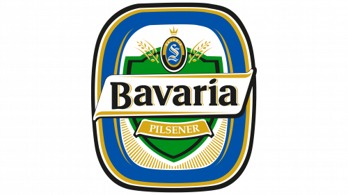
The beer’s original logo was a badge of sorts – a rectangle with rounded corners and a lot of visual elements inside. The coloring was mostly blue with some golden additions along the edges. The center of the emblem was occupied by a green shield (for hops) with a white-golden ribbon along its middle. That’s where the main wordmark was written in black with yellow shading.
Furthermore, there was also a similar, smaller yellow ribbon saying ‘pilsener’ (a type of bear) beneath. And an oval badge with the letter ‘S’ above.
2009 – Today
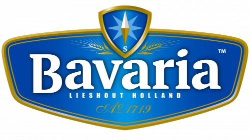
The Bavaria logo is very bright and confident. The main brand color is blue, but the color palette of Bavaria also includes white for the wordmark and gold for the logo framing and the icon.
Probably the choice of the color aimed against Bavaria’s main competitor – Heineken, and it’s green.
Along with the wordmark, there is another element of the logo – a compass, pointing South, in a rounded-edge triangle. The compass is apparently a nod to the three Swinkels brothers that founded the brewery. The emblem is bold and consistent and it seems as if a whole custom typeface has been created around it.
Font and Color
The bold and elegant logotype from the Bavaria badge looks very traditional and even nostalgic, because of the softened contours of its stable serif characters. The closest fonts to the one, used in the Bavaria insignia, are, probably, Aelita Bold, Amariya Heavy, or PT Serif Pro Bold, but with the contours slightly modified and rounded.
As for the color palette of the Bavaria visual identity, it is set in blue and white, with golden gradients for the framing and small decorative details. This color scheme evokes a sense of elegance and security, a professional and fundamental approach, and the value of the brand’s heritage and traditions.


