Heineken is one of the best-known brewing companies in the world, which was established in 1864 in the Netherlands. Today the company has its production facilities in over 70 countries worldwide and produces 250 various beverages under its sub-brands. The main product of the company, Heineken beer is still on the top of the world’s list among the most selling beer labels.
Meaning and History
The instantly recognizable green logo of the world’s famous beer takes its roots in the 19th century, being first designed in the 1860s. Unfortunately, the original version of the company’s visual identity hasn’t been saved by today, but it is known, that it became a prototype for the logo from 1884, just had fewer elements on it.
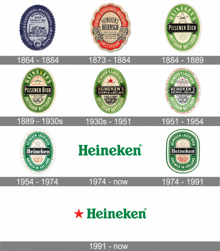
1864 – 1884
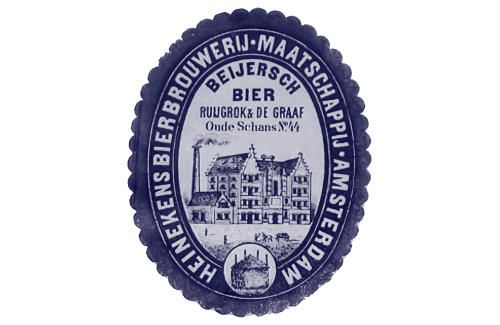
The initial logo was a blue oval posing as a badge. On its outer rim, they’ve wrote what amounts to ‘Heineken Beer-brewing Company, Amsterdam’ in bold white. In the grey space in the middle, there was the drawing of the brewery itself, plus some words that explains what product they make exactly.
1873 – 1884
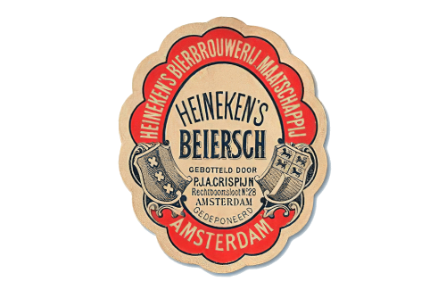
This secondary emblem used a lot of the same elements, but had a red oval ring with everything else colored beige. The building illustration was gone, but they added a big ‘Heineken’s’ word in the middle, next to other writings there. Apart from that, there were also shields (likely coats of arms) on the sides.
1884 – 1889
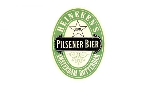
The oldest known logo of the beer label was designed in 1884 and featured an oval shape with a thick green frame in a white outline. The middle part of the emblem consisted of a black horizontal ribbon with a wordmark on it, a black contour of a five-pointed star, and a fine green ornament under the ribbon.
The first name of the product was “Pilsner Beer”, and this inscription in white was placed on the black background in the center of the emblem. The green oval frame featured a “Heineken’s Amsterdam-Rotterdam” lettering, celebrating the birthplace of the beer.
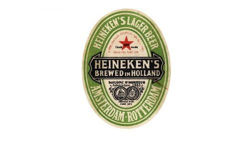
1889 – The 1930s
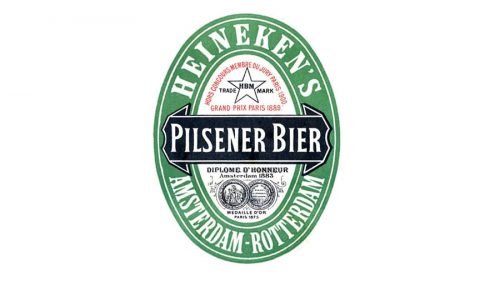
The redesign of 1889 brought red color to the logo and made the green more intense. There were also some monochrome details added to the central part of the emblem, which was two coins and additional lettering, showing the rewards of the label.
The upper part with the star now contained a red inscription around its perimeter. So the iconic green and red color palette of the label started from here.
The 1930s – The 1951
Two versions of the logo were created during this time period. One of them was designed exclusively for the Dutch market, while the other one was an international logo.
The one for the inner market featured a vertical rectangle with a red outline and a big red star in the middle. There were two seals placed in both upper corners and an “Amsterdam Rotterdam” lettering under the star. As for the wordmark, it was executed in two different styles — white script lettering in a dark green outline for “Pilsener”, placed in the center of the star, and a stricter and straighter “Heineken’s Bier” in dark green, located above and under the main inscription.
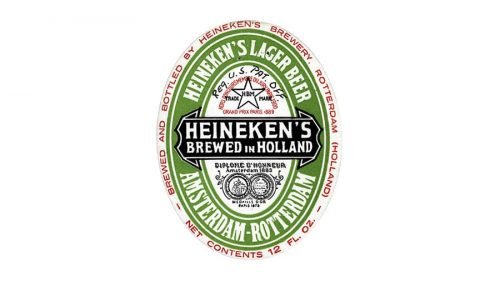
The international logo featured the same style and symbols as the version of 1889, but some changes were made. First of all, the star was finally pained red. Another major change was in the black ribbon with the wordmark. It was now enlarged and composed a “Heineken’s Brewed in Holland” inscription.
1951 – 1954
The red star was changed back to the white, not to be associated with communism after the Second World War. The green color became brighter and the bottom part with the rewards — more intense and ornate. No other major changes were made.
1954 – 1974
The redesign of 1954 was pretty delicate. The black lines and contours were replaced by the red ones, but the most important thing about the new logo was its nameplate. Finally, the label started using only “Heineken” inscription in white, places on a black horizontal ribbon-bar. The wordmark was in the title case, and the typeface was bold and pretty elegant, with some gothic style features.
1974 – Today
In 1974, they introduced the brand’s main wordmark. It was the company’s name written in green. The font consists of soft, serif letters with mild boldness.
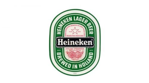
1974 – 1991
One of the two Heineken logos we all know today was designed in 1974. It is a refined version of the previous brand’s insignia, with more distinct lines and shapes. The green color gained its signature shade, and the additional logotype, which is still being in use by the brand, was also colored green.
The black ribbon was slightly extended and the lettering — enlarged, while the red lines and inscriptions now got less space and started looking more elegant and fine, accenting on the main hero, the name.
1991 – Today
The second official logo for the famous beer label was designed in 1991. It boasts a sleek and instantly recognizable inscription in green with a solid red star, placed whether on the left or above the lettering. Sometimes only the star is used by the brand, in other cases — white wordmark in a black ribbon, with the red star above and a green leaves ornament under it.
The signature green red and black color palette and the traditional typeface are two elements, which make the Heineken logo instantly recognizable. It is a timeless and powerful visual identity design, showing the label as the one, which values its roots and heritage.
Symbol
Probably the most recognizable features of the Heineken logo are its oval shape and a characteristic shade of green color. Two more important visual elements are the five-point star and the black horizontal bar. The bar has curled up edges.
Emblem: recent changes
Designers of the Heineken house are open to change and react to current visual trends. In most cases, the changes that have been introduced over the recent years are minor ones and consumers typically do not notice them.
Colors
The current version of the Heineken symbol uses three colors. Green is reminiscent of the color of the bottle. It is a pretty recognizable shade, which is sometimes even referred to as the Heineken green. To create a visually appealing contrast, designers added red and black.
Font
There are several customized typefaces used within the Heineken emblem. In the second half of the previous century the capital letters were replaced by more rounded and small ones, and a ‘smiling e’ appeared.


