Tecate is the name the first brand of canned beer in Mexico, and the brand is known for funding sporting events. The brand was established in the first half of the 20th century and acquired by Cuauhtémoc Moctezuma in 1955. Since 2010 Tecate is owned by Heineken, one of the world’s largest beer brewing and distribution companies.
Meaning and history
Tecate was originally a Mexican brand, one of the most loved and famous in its country. Until 2010 it was owned by a local company, but after the brand’s acquisition by one of the global giants, Heineken, it went international, and for this matter, the production facilities of Tecate were moved to Europe.
This was the reason the company got recently sued. The beer passes itself off as Mexican with its brand name, stylized font, an image of an eagle revered by the Aztecs, and the words Cerveza (which means “beer” in Spanish) and Original. In addition, the brand website says Hecha En Tecate Baja California Mexico (“Brewed in Tecate, Baja California, Mexico”).
However, the real origin of the beer is indicated only in the fine print on the back of the box: it says that the beer was brewed in the Netherlands by HBBV Amsterdam and imported into the US by Cervezas Mexicanas. Heineken acquired the Dos Equis, Tecate, and Sol brands in 2010 by acquiring the brewing division of the Mexican company FEMSA – breweries in Tecate, Monterrey, and other cities.
Whatever the Heineken reasons are, Tecate is still the world’s most loved American beer, with its presence all over the globe, and its logo super stylish and confident.
What is Tecate?
Tecate is the most popular beer brand from Mexico. Many Americans have tried Mexican beer, but Tecate is one of the best. Mexico is the world’s largest exporter of beer and a huge portion of it goes to the United States. Many people know brands like Corona and Dos Equis. But Tecate was voted a favorite during a blind tasting by VinePair experts.
In terms of visual identity, Tecate has always been loyal to its stable and brutal badge, composed of a black emblem and red lettering, executed in a custom style, with an Aztec feeling.
1980 – 2004
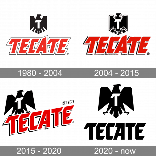
The original Tecate logo, designed in 1980, featured a stylized black eagle emblem drawn above the red uppercase lettering in a double white and red outline, and decorated by a white capital “T” with a recognizable horizontal bar, elongated and bent on its left part.
2004 – 2015
In 2004 the Tecate logo was redesigned with the eagle enlarged, and outlined in white and black, getting its contours cleaned up. As for the lettering, it got a brighter and more vivid shade of red, with the characters emboldened and slightly refined. The white and red outline of the letters was switched to third and black, which made the look of the badge more balanced and confident.
2015 – 2020
The redesign of 2015 has modernized both elements of the Tecate badge, making the contours of the eagle and the characters more sleek and rounded, although the lines gained sharp details in the outline, which made the whole badge look more progressive and cool. The logotype was now set diagonally, with the black eagle placed right on it.
2020 – Today
In 2020 the badge of the Mexican beer brand was redesigned again. This version of the badge is fully based on the logo, designed in 2004, but with the contours of all elements modified, and the red color of the inscription switched to black. Getting more minimalistic, the Tecate badge turned strong and brutal, showing a progressive approach of the company, which at the same time values its roots and heritage.
Font and color
The recognizable uppercase lettering from the primary badge of the Tecate brand is set in a custom sans serif typeface with diagonal cuts of the bars, and a unique tail of the “T”. The closest fonts to the one, used in this insignia, are, probably, Shopping Basket JNL, or The Story So Far, but with some significant modifications.
As for the color palette of the Tecate visual identity, the latest redesign has minimized it to black and white, but before the badge featured a powerful red-black-white tricolor, which brilliantly reflected the confidence and strength of the brand. As for the current laconic scheme, it looks very modern and shows the brand as a growing and developing one.


