Velkopopovicky Kozel is the name of the famous beer brand from the Czech Republic, which was established in the 1870s. The company, which is known across the world for its lager, has been a part of Asahi Group since 2016.
Meaning and history
Throughout the company’s pretty long history, its visual identity has always been connected to a Goat. The name of the brand, Velkopopovicky Kozel is composed of two parts: the first one is a tribute to the city it was founded in — Velke Popovice, and the second one, Kozel, is translated from Czech as “Goat”. So the animal mascot’s image always has its place on the famous lager’s logo.
The very first logo for the brewery was designed by a French artist, who was traveling around. It was a detailed image of the goat he saw near the brewery. This is how it all began.
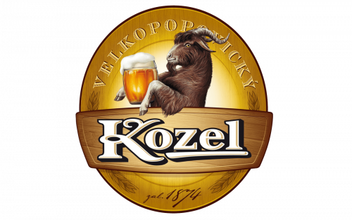
The iconic goat, standing in profile, turned to the left and holding a beer, has been executed in various different color schemes. On the earlier versions, the goat was drawn very detailed in brown and black and placed on a green background. Then the contours got modified and the background switched to yellow. For quite a long time Kozel was using the rounded emblem in a thick gold outline with the wordmark placed around its perimeter.
Later the circular frame was removed and the goat was slightly redrawn. The logo became simpler yet more confident. The goat was placed on a gradient brown background and the wordmark, consisting of only “Kozel” lettering, was written under the image in white bold sans-serif.
Today the Velkopopovicky Kozel logo is composed of two independent parts — the logotype, written in intense green with a thin black shadow and an emblem with the iconic mascot image and a shortened nameplate.
The logotype is executed in a custom serif font with the first letters of both words curved. The two parts of the logotype also have a bold underline in the same green shade.
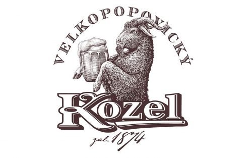
As for the emblem, it still resembles the earliest versions, but is now drawn only in thin brown lines, and is placed on a white background. The “Kozel” wordmark, located under the goat, is written in dark brown and uses the same style of the typeface as the green logotype.


