

![]() Anheuser-Busch Logo PNG
Anheuser-Busch Logo PNG
Anheuser-Busch is the name of one of the world’s most famous breweries, established in 1852 in the United States. The company has its subsidiaries across the globe and distributes its beverages on all the six continents.
Meaning and history
![]()
The Anheuser-Busch visual identity is ornate and instantly recognizable. Its bright heraldic emblem is a reflection of the company’s power and authority.
What is Anheuser-Busch?
Anheuser-Busch is the name of an American company, which was established in 1852, and is specialized in the production and distribution of beverages. The company, which is owned by the AB InBev drop since 2008, has 12 breweries across the USA and exports its beers all over the globe.
2017 – 2022
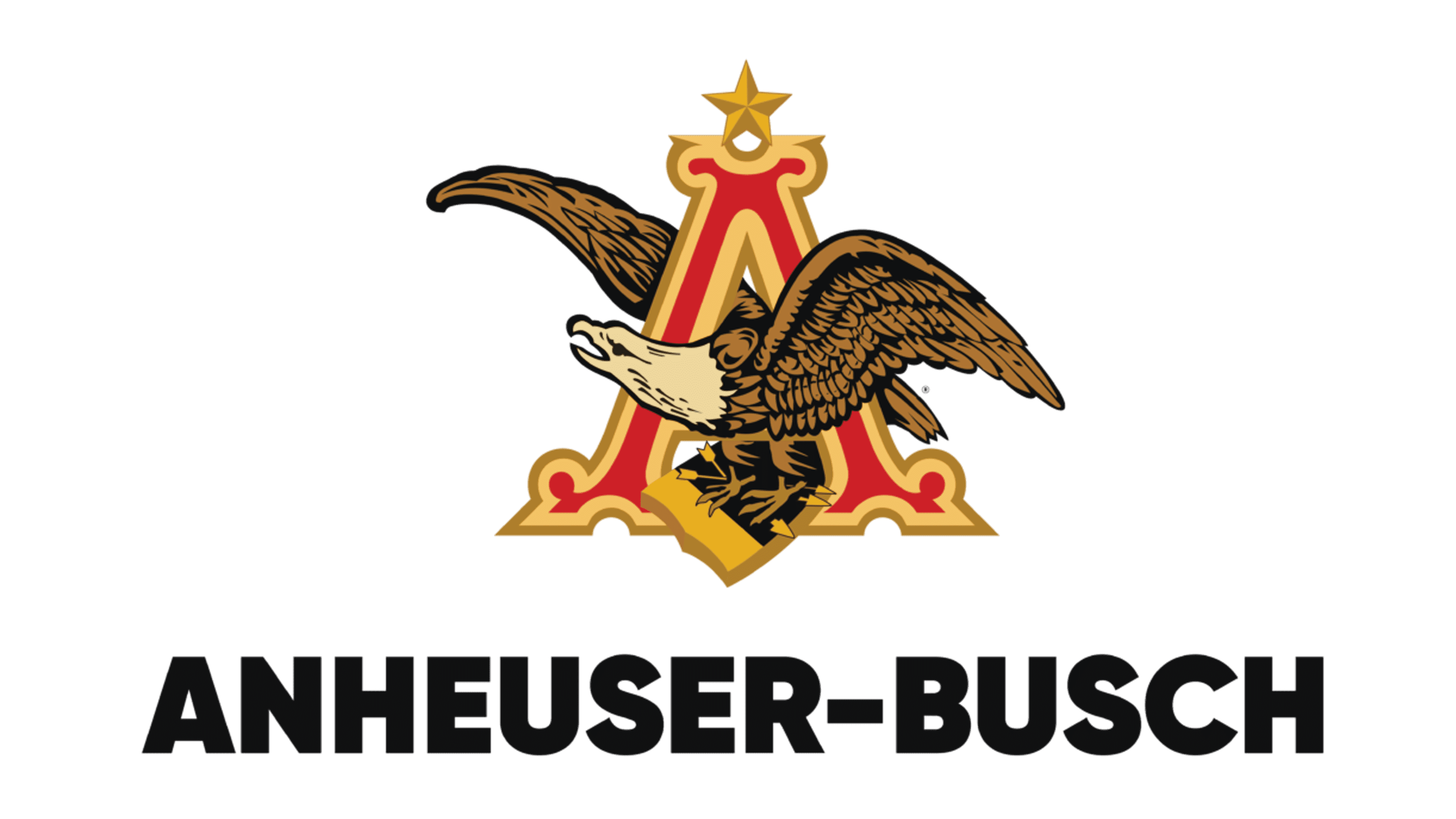
The Anheuser-Busch logo is composed of the letter “A” in red and gold and an eagle, flying through it. The “A” has curves on its serif and looks really royal and luxurious. The bright red symbolizes passion and strength, while the gold outline of the letter adds a high-end sense.
The gold five-pointed star on the top of the letter is a reflection of excellence and professionalism. It is also known to be a symbol of hope and truth, which shows the company as reliable and progressive.
The eagle, facing left, has three arrows in its talons. The eagle is a reflection of courage and power, while the arrows pointing right represent the company’s innovative and progressive approach, as well as its willingness to move forward and its confidence in today.
The prevailing color of the Anheuser-Busch logo is gold, which symbolizes love, wisdom, and passion. This is how the brand treats its customers and how it leads its business.
2022 – Today
![]()
The redesign of the Anheuser-Busch logo in 2022 has kept the iconic ornate emblem with the capital “A” and an eagle but brought some modern and fresh vision into it. The whole image is now set in gold and white, with the bird changing its direction from left to right. As for the lettering, it has also been rewritten. Now the Anheuser-Busch inscription is set in an elegant yet pretty modest cursive typeface, in black lines of a medium thickness.
Font and color
The elegant cursive lettering from the primary Anheuser-Busch badge is set in a custom sophisticated typeface, which looks very traditional and confident and reflects the company’s value of heritage and roots. The closest fonts to the one, used in this insignia, are, probably, Maughan Script Regular and Take All Regular, but with some contours modified, and some lines — elongated and curved.
As for the color palette of the Anheuser-Busch visual identity, it is set in a chic and bright combination of yellow and black, with a plain white background, which adds lightness to the composition and creates a strong contrast between the elements. Yellow here stands for energy and growth, while black adds professionalism, expertise, and confidence.


