Budweiser is the brand of an American lager beer, which is today manufactured by AB InBev. The lager was first introduced in 1876 and became incredibly popular across the United States. Today the famous beer is being distributed across the globe, being one of the leading world’s brands in its segment.
Meaning and history
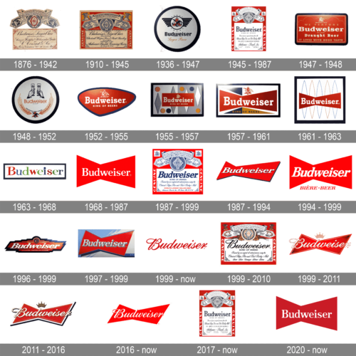
Known as The King of Beers, Budweiser has a remarkable and instantly recognizable logo, which has gone through many redesigns during the history of the brand. Its bright color palette and minimalist sharp shape make it look decent and modern on any background.
The first three versions of the famous beer’s logo were very ornate, basing on the seals and coat of arms, with a lot of additional lettering. But in 1952 the company started to make it more minimalist and bold, in order to satisfy the tastes of the young audience and the overall progress.
1876 – 1910
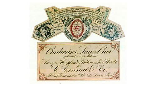
The very first Budweiser logo was composed of a rectangular badge with cursive lettering, where the “Budweiser Lager Beer” was placed on the top line and featured the largest size. The ornate red coat of arms was located above the rectangle and had two wide ribbons coming out of it. It was an elegant and traditional for its time tag.
1910 – 1945
In 1910 the color palette was changed to red, blue and white, where the bold cursive lettering on a white background was placed inside a scarlet red rectangle with the coat of arms and ribbons in its upper part.
1936 – 1947
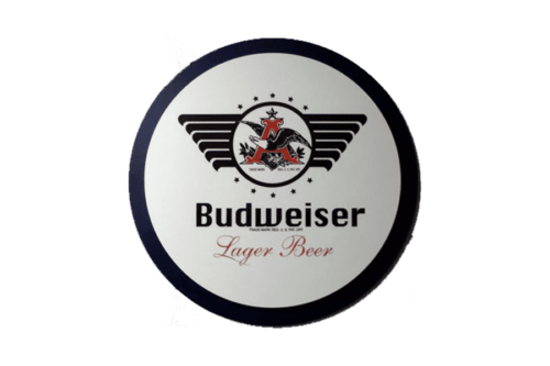
This logo, circular in form, showcases the classic Budweiser branding with a modern twist. At its center, the proud Budweiser name is presented in a sophisticated, bold script. Above it, a stylized depiction of wings, reminiscent of a bird in flight, lends an air of freedom and expanse, symbolic of Budweiser’s vast reach and long-standing heritage. The logo’s color palette is dominantly white, contrasted with sleek dark outlines. A vintage touch is added with the coat of arms which features a regal “A” and a proud eagle, both representing Budweiser’s proud American legacy.
1945 – 1987
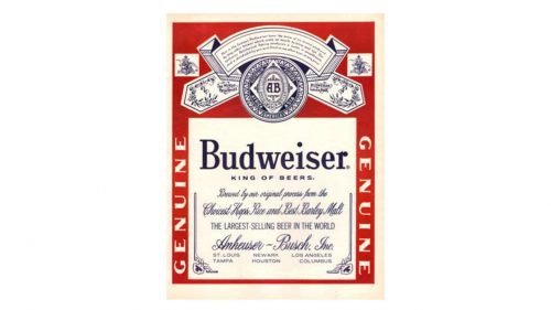
The label got more refined contours in 1945, and the rectangle was now vertically oriented. The inscription was now in a modest serif font, with additional lettering in a thin and fine cursive with curves and vignettes.
1947 – 1948
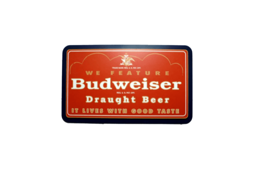
This rectangular logo beckons with its warm, fiery hues of red and orange. The words “We Feature” prominently sit atop the logo, suggesting exclusivity. The primary focus is the bold “Budweiser” name, placed centrally, exuding confidence and assertiveness. The words “Draught Beer” beneath it emphasize the fresh, on-tap quality of the beer. A crowned “A” sits subtly at the top, alluding to Budweiser’s royal standing in the world of beers. The entire design encapsulates the brand’s promise of quality, authenticity, and superior taste with the catchy phrase “It Lives With Good Taste.”
1948 – 1952
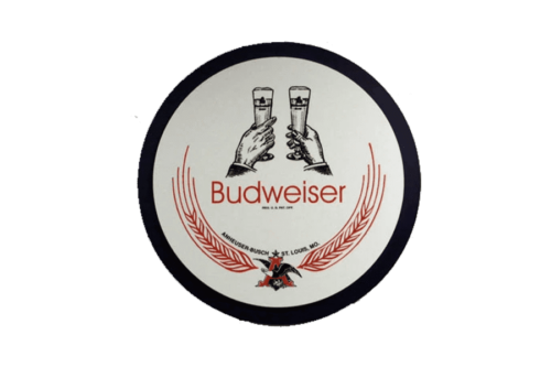
This evocative design, primarily round, captures a special moment shared universally: a toast. Two hands, intricately sketched in a vintage art style, clink two glasses of Budweiser beer, symbolizing celebration, camaraderie, and shared memories. The red laurel wreath encircling the central design is reminiscent of victories and achievements, positioning Budweiser as the champion choice for celebratory moments. The Budweiser name is elegantly displayed at the center, accompanied by the traditional “Anheuser-Busch St. Louis, MO” designation, grounding the logo in its rich heritage and origin.
1952 – 1955
The redesign of 1952 brought modern minimalism to the beer’s visual identity. The white bold wordmark was placed in a red abstract geometric figure with a thick black outline. The Anheuser-Busch seal in thin white lines was placed above the wordmark, while the “King of Beers” tagline in all capitals was under the main inscription.
1955 – 1957
This logo showcases the brand name “Budweiser” written in bold red letters with the subtitle “King of Beers” below it. The entire design is encapsulated within a silver rectangular frame and features an abstract background with geometric shapes in different shades of blue and dots in various colors like yellow, green, and dark blue.
1957 – 1961
The iconic red bow-tie first appeared in 1957. It was placed inside a white rectangle with yellow and green triangles. The wordmark was still in white but enlarged in comparison to the previous version, and the Anheuser-Busch symbol was now executed in red and placed on a white part of the logo.
1961 – 1963
The version of 1961 featured a red bow tie with the white wordmark, placed on a white background with five thin egg-like contours in blue and gold. It was a light and playful logo, which stayed with the company for only two years.
1963 – 1968
For the next five years, starting in 1963, the company uses a single inscription, without any graphics. The husking letters are written in a bold serif typeface and feature three different colors: red, purple and green. The logo looks unique and friendly, evoking a sense of creativity and a welcoming feeling.
1968 – 1987
The bow-tie was brought back in 1968 and stayed for another twenty years. It was a neat and minimalist logo, with a simple white wordmark on a red background. Nothing else, no frames, outlines or additional letterings.
1987 – 1999
A predominantly red logo with the brand name “Budweiser” written in bold blue letters in the center. Above and below the brand name are intricate designs depicting a crown, hop leaves, and a shield emblem. The perimeter of the logo is bordered with a blue ribbon design, with phrases describing the beer such as “This is the famous Budweiser beer” and mentions of the beer’s brewing process. In the bottom, the tagline “WORLD’S LARGEST SELLING BEER” is written, with the manufacturing company’s name “Anheuser-Busch, Inc., St. Louis, Mo., U.S.A.” below.
1987 – 1994
In 1987 the bow-tie was refined, gaining a black thin shadow. Its left part is now significantly smaller than the right one. As for the inscription, it also has a thin black shadow now, and the serif letters are italicized, reflecting progress and elegance.
1994 – 1999
The flat design came back in 1994. No shadows, no outline, just a red bow-time, and white wordmark. The only extra of this version was “Biere. Beer” tagline written in red capitals under the emblem.
1996 – 1999
A completely new emblem was designed in 1996 but stayed with the company for only three years. It was a red rectangle with a black outline. The logo resembled an aviation badge.
The white inscription was executed in an extra-bold italicized serif typeface with the rounded end of the letter “R”. It was a short experiment, and in 1999 the company comes back to an iconic bow-tie.
1997 – 1999
This striking logo captures the essence of modern design with its minimalist yet effective composition. The emblem showcases a harmonious blend of geometric shapes and symmetry, suggesting balance and stability. The color palette is tastefully chosen, exuding a sense of professionalism and trustworthiness. The logo’s simplicity ensures its scalability, making it suitable for various platforms, from business cards to billboards. Furthermore, the design’s clear and uncluttered nature communicates a message of clarity, purpose, and direction. It is a mark that would undoubtedly stand out in a market saturated with complex designs, setting the associated brand apart as a beacon of simplicity and elegance.
1999 – Today
Emblazoned in a passionate hue of red, the logo effortlessly spells “Budweiser” in an unmistakably elegant and flowing script. Each letter seamlessly melds into the next, creating a sense of unity and continuity. The striking cursive font harks back to a bygone era, evoking feelings of tradition and heritage. The logo’s fluidity suggests craftsmanship and attention to detail, indicative of the brand’s dedication to quality. The small registered trademark symbol subtly placed at the top right reinforces the brand’s established presence and authenticity in the market. This design, with its clean and minimalist aesthetic, is a testament to the brand’s confidence and prominence in its domain.
1999 – 2010
Steeped in tradition and lore, this intricate logo tells a story of Budweiser’s illustrious past. Dominated by a vivid red backdrop, the logo presents intricate details, from the emblematic eagle to the ornate motifs, symbolizing strength, freedom, and American pride. At the heart lies the iconic “A & Eagle” insignia, framed within an ornamental oval, highlighting Budweiser’s legacy. The proud declaration, “King of Beers,” stands beneath the brand name, emphasizing its unparalleled status in the beer world. Elements like hops, grains, and the Anheuser-Busch seal are interwoven with rich textual details, providing glimpses into the brand’s brewing philosophy and heritage. This emblem is not just a logo; it’s a mosaic of Budweiser’s storied history and commitment to excellence.
1999 – 2011
The distinctive Budweiser logo exemplifies modern branding with its vivacious red bowtie design. At its center, the brand name “Budweiser” is elegantly scripted in white, outlined with gold. This presentation offers a depth to the letters, creating an almost 3D effect. Positioned just above the brand name is a regal golden crown, symbolizing the brand’s reputation as the “King of Beers.” The playful shimmer and shadow effects amplify the logo’s contemporary feel, and the classic registered trademark symbol is present at the bottom right corner.
2011 – 2016
During the 17year period, the brand redesigns its logo a few times, but all the versions have a lot of things in common. They are all composed of a red bow-tie with a white cursive inscription and a gold crown above it. In the first version, the outline was red, which was changed to white in 2011.
2016 – Today
The current Budweiser logo is a simplified version of the previous one. The flat two-color design has no additional details, only the red background, and the white lettering. It looks sleek, professional and very modern, despite the use of an old-style script typeface.
2017 – Today
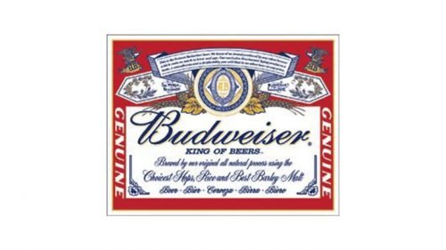
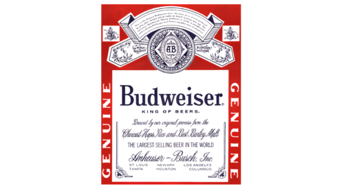
The more traditional Budweiser label takes one back to the brand’s rich history. Centered is the bold “Budweiser” name, underscored by the proud title “KING OF BEERS.” Surrounding text elaborates on the brewing process and the company’s credentials. Dominating the top of the label is a detailed emblem with “AB,” representing Anheuser-Busch, encompassed by ornate designs and detailing that highlights the brand’s heritage. Illustrations of hops, the critical ingredient in beer-making, border the emblem, completing the authentic look of this classic label.
2020 – Today
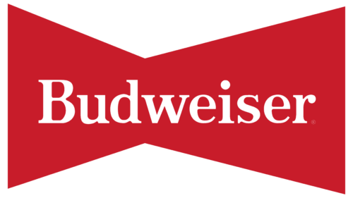
The logo prominently showcased is instantly recognizable as that of Budweiser, one of the world’s most renowned beer brands. The design is both simple and striking, making use of a bold red background that immediately grabs the viewer’s attention. This vibrant shade of red suggests a sense of passion, energy, and strength, which aligns with the brand’s longstanding reputation as a robust and full-bodied beer.
At the forefront of the design is the brand’s name, “Budweiser,” elegantly rendered in a crisp, clean, white font. The typography exudes a classic and timeless charm, juxtaposed against the modern and edgy bow-tie shape of the backdrop. This clever play between the traditional and the contemporary can be seen as a reflection of Budweiser’s legacy — a brand rooted in tradition yet ever-evolving with the times. The inclusion of the ® symbol, or the registered trademark sign, to the right of the name emphasizes the brand’s established status and its protective stance over its iconic identity.
Overall, this Budweiser logo exemplifies the power of minimalistic design. It doesn’t rely on intricate details or an abundance of colors. Instead, it conveys its message and brand identity through a strategic use of space, color, and typography. In doing so, it captures the essence of the brand: confident, timeless, and unmistakably iconic.
Budweiser king of beers logo
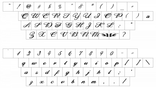
Font
What does the Budweiser symbol mean?
The symbol of the Budweiser beer brand, which can be found in every can and bottle of the product is the seal of the Anheuser-Busch company, owning the famous brand. The seal depicts the ancient brewing traditions, showing barley and wheat spikes. As the graphical symbol is accompanied by the “King of Beers” inscription, which also refers to the historical heritage of the brand.
What shape is the Budweiser logo?
The iconic red and white Budweiser logo is executed in a unique recognizable geometric shape — a bow with slanted sides. The clean contours and sharp angles of the Budweiser bow represent the sharpness, progressiveness, and stability of the brand, which has been on top of the world beer ranking for decades.
Is the Budweiser logo a bowtie?
Yes, the famous Budweiser badge is executed in a modified bow-tie shape, with the sides slightly slanted, representing motion and development. The Budweiser bow is an internationally recognized insignia, which by today has already become synonymous witha beer of high quality. The original version of the iconic bow tie was introduced by the company at the end of the 1950s.
Why did Budweiser change its logo?
The latest redesign, held by Budweiser in 2016 was all about minimizing the concept of the beer’s badge. The new logo became brighter and cleaner, more laconic and distinctive, evoking a sense of professionalism and determination. This was made to show the brand’s growth, and its ability to change. Also, the new badge looks better on digital materials and web icons.
When did Budweiser change its logo?
Budweiser is a brand with a long history, and it’s only logical, that the logo of this brand was changed several times throughout the years, reflecting the motion and growth of the company. The very first redesign of the Budweiser logo (created in the middle of the 1870s) was held in 1910, introducing a banner, which stayed untouched for more than thirty years. From the middle of the 1940s to the middle of the 1960s the badge has been changed five times, with the modern and bright bow tie introduced in 1968. Since then, the badge of Budweiser has undergone several more changes, with the last redesign held in 2016.


