Michelob Ultra is the brand of a pale lager beer, produced by one of the largest brew ring companies in the world, Anheuser-Busch, since 2002. The main feature of this brand is that it claims itself as a beer for those, who choose dietary products.
Meaning and history
Michelob Ultra is quite an unusual brand of beer on the global market. With its recipe, created by Adolphus Busch in 1896, the beer is light and suitable for people who care about their weight and health.
Michelob Ultra is an Anheuser-Busch brand that is suitable for consumption even by athletes and contains 4.2% alc., 95 calories, and 2.5 grams of carbs. Michelob Ultra dominates the market in the category of light, and low-calorie beers aimed at people with an active lifestyle. In recent years the concept of “healthy beer” has become more and more interesting to consumers, and Michelob Ultra’s sales volume increased by 500 million dollars in 2020.
What is Michelob Ultra?
Michelob Ultra is the name of a beer brand, established in 2002, and owned by the famous Anheuser-Busch company. The recipe for this lager was developed back at the end of the 19th century by Adolphus Busch, but as a separate brand, it was only introduced in the 2000s.
In terms of visual identity, Michelob Ultra is a very sophisticated and chic brand. The badge, designed for the light pale lager beer at the beginning of the 2000s brilliantly represents the company value of this brand’s legacy and shows it not as something modern, but as a beer with history and deep roots. The elegant badge was only redesigned once throughout the years, with all the main elements and accents kept untouched.
2002 – 2020
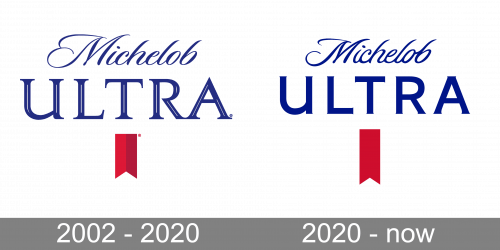
The Michelob Ultra Logo was designed in 2002 and stayed with the brand for 18 years with no changes. The original version featured a blue two-leveled inscription with the parts of the wordmark set in different typefaces. The top “Michelob” was written in a fancy custom cursive, while the bottom uppercase “Ultra” was enlarged and executed in an outlined serif font with long straight bars and sharp serifs on their ends. The inscription was accompanied by a red pennant in two shades, which was placed under the blue logotype, and added some brightness to the badge.
2020 – Today
The redesign of 2020 has kept the composition of the logo untouched but played with all the elements — refining and modernizing the contours of the characters, intensifying the color in the badge’s palette, and redrawing the pennant in a flat and minimalistic way. The inscription on the top line of the logo got shorter and bolder lines, while the bottom line changed its typeface to a modern sans-serif. As for the emblem, the red pennant got longer, which also made it look a bit narrower than the one from the previous version of the logo.
Font and color
The bright blue lettering on the primary Michelob Ultra badge is set in two different fonts — an elegant cursive for the upper line, and a stable bold sans-serif for the bottom one. The closest fonts to the ones, used in this insignia, are, probably, Fargo Bold Italic and Ramble Brave Script Italic for the “Michelob”, and TT Commons Pro Expanded DemiBold, or Organetto Regular for the “Ultra”.
As for the color palette of the Michelob Ultra visual identity, it is based on an intense and super sleek combination of red and blue, the two shades, which stand for quality, professionalism, and power. When placed on a white or silver background, these colors get even brighter and make the brand stand out in the list orbits competitors.


