Amstel is one of the famous beer brands from Netherlands, was founded in 1870 in Amsterdam, and was taken over by Heineken in 1968. The original Amstel brewing plant closed down in 1972, with production moving to the main Heineken plant at Zoeterwoude.
Meaning and history
Amstel is one of Europe’s most popular beer brands, founded in Holland and named after the country’s main river. The brand, established in 1870, today has its bottled and draft beer sold in almost every country of the world.
It was founded by two entrepreneurs Jonkheer C.A. De Pester and J.H. van Marwijk Kooy. They did not have to think long about the name, the new company was named after the river on which the first plant was built. In those years the competition in the local beer market was already quite high because at that time there were already more than 500 breweries in the country, but Amstel managed to win popularity in Holland rather quickly and in a few years the company entered the international market.
What is Amstel?
Amstel is the name of the European beer brand, which was established at the beginning of the 1870s in the Netherlands. The brand has always been well-known in Western Europe, but the international recognition Amstel got after its acquisition by the Heineken Group in the 1960s.
1870 – 2020

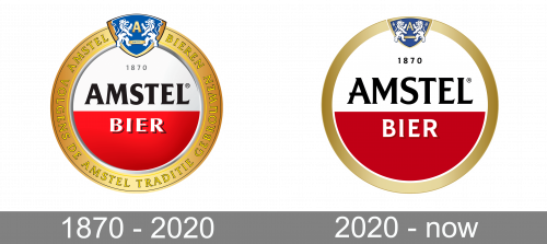
The first logo, which they used for the longest time, was the same red-n-white circle as the following version, but with a few caveats.
There was more relief and texture. The colored parts had some lighting effects on them; the letters in ‘bier’ had some shading, as well; the golden frame around had more nuance. Its top held the Amstel coat of arms (a blue shield with a big letter ‘A’ and some lions), while the perimeter was inscribed with ‘Amstel beers’ in the top and ‘brewed fully with Amstel tradition’.
Minor details include a slightly different color of gold and a somewhat different font.
2020 – Today
From it’s foundation, in 1870, Amstel’s brand mark has relied on simple elements to be recognized all over the world: a red half circle enclosed by a golden circle. The simple strict forms express the idea of container and support, while the circular shape suggests continuity, the main Amstel’s brand message of timeless quality.
After the last brands redesign the Amstel logo featured more red color and started looking crispy and powerful, preserving the iconic foundation.
The Amstel brand identity is based on two core elements – geometry and color. The minimalistic logo’s color scheme includes two main color – red and white. The wordmark is executed in black and the logo round-framing is gold.
The Amstel logo embraces modernity while preserving the rich heritage of the brand that has been built since 1870, the year of the brand’s creation.
Font and Color
The elegant uppercase inscription from the official badge of Amstel beer is set in a custom serif typeface with slightly flared bars of the stable bold characters. The closest fonts to the one, used in the Amstel insignia, are, probably, Majesty Bold and Naveid Arabic Semi Bold, but with some contours significantly modified.
As for the color palette of the Amstel visual identity, it is based on a combination of white and red, with a gradient gold for the framing and black for the lettering. This is a very elegant scheme, which evokes a sense of excellence and quality, showing the brand’s strongest sides and reflecting its professional approach.


