

![]() Guinness Logo PNG
Guinness Logo PNG
Guinness is the Irish beer brand, first brewed in 1759 in Dublin, Ireland. It is one of the most well-known beers in the world. Family owned through the better part of the twentieth century, Guinness has been part of the Diageo Group since 1997 and is now brewed in 49 countries worldwide and sold in over 150.
Meaning and history
![]()
The visual identity of the iconic beer has been based on one elegant symbol since the very beginning of the brand’s history. The Golden Harp is not just a picture or simple emblem, but a symbol, synonymous with the brand and representing its philosophy and legacy.
1862 – 1955
![]()
The very first logo for Guinness was created in 1862 and featured a monochrome badge with a double oval outline where the ornate wordmark in two different styles was placed. The harp was put in the upper part of the emblem, surrounded by cursive lettering. It was a logo, usual for its times, with a lot of text and details, though it looked strong and professional.
1955 – 1968
![]()
In 1955 the Guinness logo was simplified to just a harp, drawn very detailed in monochrome, and placed on a plain white background without any lettering and framing.
1968 – 1997
![]()
In 1968 the Harp gets modern contours and a renewed color palette, now its thick and smooth lines are executed in dark l and placed on a gradient blue background, resembling sky and evoking a sense of lightness and freedom.
1997 – 2005
![]()
The wordmark was added to the logo in 1997. The custom serif stencil font became as inevitable for the brand as its golden harp and was only slightly refined throughout the years. In this version of the logo, all letters feature the same size; and look massive and masculine, located under an elegant feminine emblem.
2005 – Today
![]()
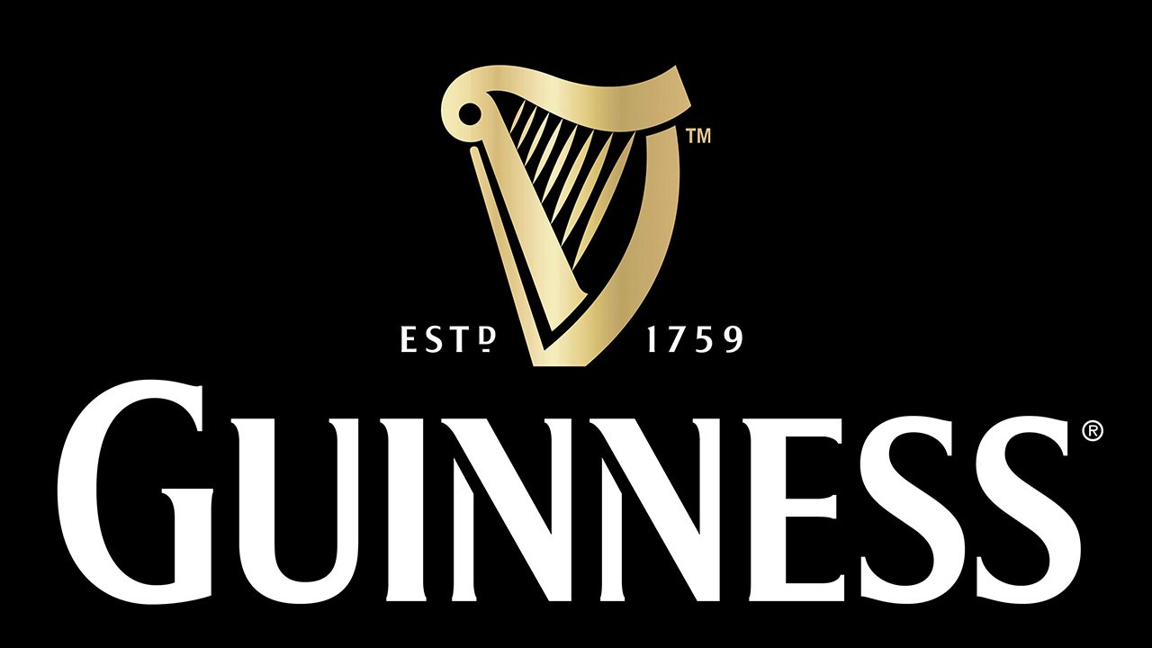
The color palette was elevated in 2005. The golden harp was placed on a black background, above the white inscription, which contours were modified and cleaned. Though the wordmark was all set in capitals, the first letter was enlarged in comparison to others, which adds timelessness and sophistication to it. On the left and right from the emblem the date mark “est 1759” in thin white symbols was placed.
2016 – Today
![]()
The redesign of 2016 brought a three-dimensional emblem to the Guinness visual identity, making the surface gradient and its texture — metallic. The harp got enlarged and the white inscription gained a new typeface with elongated and sharpened serifs, which looked a bit old-style yet extremely elegant.
The Emblem
The harp, the national symbol of Ireland, was adopted by Benjamin Lee Guinness for his family’s beer in 1862. He based the logo on a specific harp—Brian
Boru’s Harp, which is the oldest surviving Gaelic harp.
The harp is also the official national emblem of the Republic of Ireland and can be found on the Republic’s coinage.
However, there is a difference between the Irish government harp and the Guinness harp. The Guinness Harp always appears with its straight edge (the soundboard) to the left, and the government harp is always shown with its straight edge to the right.
There have been a number of changes to the design of the harp device over the years including a reduction in the number of strings shown. The current harp was introduced in 2005 by Design Bridge.
![]()
Design Bridge collaborated with artisan letterpress print studio, New North Press, to help dramatize the harp’s form and create the striking physical impression of the final design.


