

A good logo is simple and clear. It should hint at the company’s sector and include colors that are important to the business without overcomplicating things. But the best logos also have hidden messages and meanings, ones that you may have overlooked even though you’ve seen them hundreds of times.
You will see these hidden messages in logos across every industry, whether it’s an online casino like the ones listed on casinos.com or an electronics company and household name.
Here is a list of our favorite logos with hidden meanings.
Amazon’s A to Z
![]()
Let’s start with an easy one, and one you may know.
Take a look at the Amazon logo. It’s a simple, lowercase brand name that uses a font known as Amazon Ember, one that’s based on ITC Officina Sans. But if you look at the orange arrow, you’ll see that it starts at the “a” and ends at the “z”. It looks like a little smile, but more importantly, it hints at one of the company’s messages, which is that they stock everything “from A to Z”.
The Bear on Your Toblerone
![]()
Toblerone has a reputation as the chocolate you only ever buy at the airport, usually in a jumbo size you’ll never eat. You’re no doubt familiar with it and have likely noticed the mountain above the name (it used to be the Matterhorn, but was recently replaced due to some legal issues). You may not have noticed the image of the bear inside the mountain though.
Still can’t see it? Look at the clear white silhouette to the left of the mountain.
The Razor Slash in Gillette
![]()
The Gillette logo is a classic, with a font that oozes style. But there’s also a hidden slash in there, one that looks like it could have been made with the company’s signature razor blades. Check the end of the “G” and the beginning of the “I”. It matches perfectly and looks like a razor has slashed through the two letters.
Negative Space with FedEx, F1, and WST
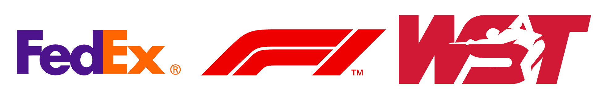
Some of our favorite logos are the ones that make use of negative space to get a certain message across.
The Formula 1 logo is one of the simplest examples of this, but it’s also one that many miss. The home of expensive cars uses a logo with an “F” and what appears to be a generic red image. But if you look between these two images, you’ll see a “1” in the negative space.
As for FedEx, look at the negative space between the “E” and the “X” and you’ll see an arrow, hinting at the company’s direct and fast deliveries.
Now for the best one, the World Snooker Tour (WST) is one you might not be familiar with, but it creates a unique negative space image between the “S” and “T”, depicting a snooker player in the midst of a shot.
The 31 in Baskin Robbins
![]()
The Baskin Robbins logo is simple and colorful. It’s also hiding a “31”, which represents the initial selection of 31 flavors, with the idea being that they had a flavor for every day of the month. Just look at the pink section of the logo. The Baskin Robbins logo has changed a couple of times over the years, but the “31” has always been there.
The People, Chips, and Dip in Tostitos
![]()
The Tostitos logo is hiding two people, a large chip, and a bowl of salsa. Just look at the middle of the logo—those “Ts” are enjoying some of the product with a big bowl of dip.
The Rider in the Tour de France Logo
![]()
The logo for The Tour de France just looks like a quirky text logo at first glance, maybe with a bright sun image to indicate a sunny day. But there’s a cyclist hiding in this logo.
The “Tour” depicts a cyclist riding a bike. The “R” is the actual cyclist, the “U” is the seat, the “O” is the back wheel and the yellow ball is the front wheel. As fans of the race will know, yellow is also the color of the famous jerseys given to the winners, so there’s a double meaning.
The Three Kisses in Hershey’s Kisses
![]()
There are two obvious “kisses” in the Hershey’s Kisses logo, but there’s also a third. Check between the “K” and the “I”, and you’ll see a chocolate Hershey’s Kiss on its side.
Summary: Hidden Meanings in Logos
These are just a handful of the logos that contain hidden messages and meanings. Every logo tells its own story, whether it’s the aforementioned Toblerone and its bear/mountain combination that was recently changed or the Apple logo and its bite, which was added to ensure it didn’t look like a cherry when scaled down. It’s a fascinating topic, so the next time you see a famous logo, take a closer look and see if you can see any hidden messages.


