The current version of the Bud Light logo is a perfect illustration of how a retro design may look really fresh and modern.
Meaning and history
One of the most famous products of the iconic Budweiser brand, Bud Light, was first introduced at the beginning of the 1980s and was named simply Budweiser Light. The current name appeared two years later, and this is when the new era of the logo design began.
1982 — 1983
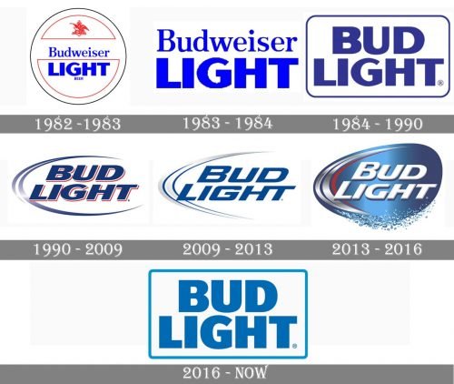
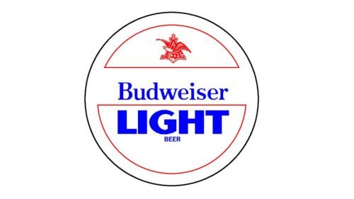
The very first logo, introduced in 1982, and featured a rounded badge with a famous red eagle on its top part, and electric-blue lettering in the center. The wordmark was set in two levels and two different styles, with the “Budweiser” part in title case and a serif font, and the “Light” in all capitals of a bold and modern sans-serif.
1983 — 1984
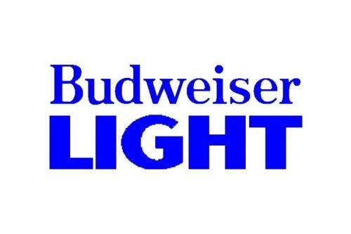
In 1983 the logo was simplified to just two levels of lettering, executed in the same color and style as on the previous version, just without any additional details. The text was enlarged a balanced.
1984 — 1990
With the new name, the new logo appeared in 1984. The “Bud Light” in all capital letters of a thick and sleek sans-serif typeface with clean smooth lines, was executed in calm blue and enclosed in a horizontal rectangular frame with rounded angles. The frame was very thin and delicate and was colored in the same blue, as the inscription.
1990 — 2009
The new style and shape were adopted for the logo in 1990. The bold sans-serif lettering got italicized and gained a double white and red outline. As for the main blue color, it became lighter and fresher. The whole logotype was enclosed into an open oval frame in gradient light blue and red. The logo looked dynamic and progressive.
2009 — 2013
In 2009 the emblem was redrawn in a 2D way, keeping the structure, but changing the typeface and the shade of blue. Now it was a darker color, which was brilliantly balanced by a modern and strong font with wide lines and softened angles.
2013 — 2016
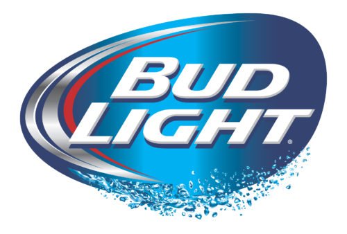
Another three-dimensional badge was introduced in 2013. It was a white italicized inscription with a dark shadow, placed on a glossy gradient blue oval background with silver and red arched lines on the left. The badge looked like it was made of aluminum, and resembled ice, freshness, and cold. The bottom part of the emblem was stylized like a blue water line.
2016 — Today
After using a colorful 3D emblem for three years, the company decides to come back to its roots and adopts the logo from 1984, modernizing and refining it. The color was taken from the 1990s, as its French and calm blue shade is a perfect representation of the lightness and freshness of the brand’s products. As for the typeface, the custom sans-serif looks solid and neat, having thick lines with straight distinct ensues. The thin blue frame has its angles only slightly rounded, which makes the whole badge look friendly yet powerful and confident.
Emblem
The original emblem, which was introduced in 1982, featured the words “Budweiser Light Beer” with an intricate emblem above. All these were placed inside a circle shape. In 1984, the company adopted a simple logotype featuring a custom bolded sans serif font
Symbol
The latest update took place in late 2015. The Bud Light logo looked almost identical to the 1984 one, except for the shift in the color palette. The logo sported the name of the beverage placed inside a rectangular shape with rounded corners. It was the first time in fifteen years when the “AB” insignia could be seen on the can.
Font
All the wordmarks featured custom sans serif typefaces created specifically for the multinational corporation Anheuser-Busch InBev. As the result of the 2016 update, the italicized typeface was replaced by the iconic font developed for the 1990s logotype.
Color
Although the 2016 version features only blue and white, for most of the beverage’s history, its logo also included red elements. Red could be seen in the emblem in 1990-2009 and then in 2013-2016.


