Foster’s is a brand of lager, founded by William and Ralph Foster in Melbourne, Australia in 1888. It is owned by the international brewing group AB InBev, and is brewed under license in a number of countries, including its biggest market, the UK, where the European rights to the brand are owned by Heineken International.
Meaning and history
The Foster’s logo is a great example of using contrast colors. The brand’s color palette includes iconic blue, gold and bright red.
The recognizable red Foster’s F sits within a gold roundel. The serif F symbol has slanted crosses and a white outline.
After the last redesign, the word “Melbourne” features within the roundel and elsewhere on packaging.
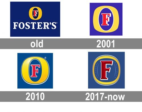
1889 – 2001
The very first Fosters logo was created in 1889 and stayed untouched for more than a century. It was a bold white serif inscription in the uppercase, placed on a bright blue background under a colorful emblem, which became a basis for all the future redesigns. The emblem was composed of a sleek thick “O” in intense yellow color with the red capital “F” in a white outline, placed inside. The font of the red “F” resembles the one from the white wordmark, though featured cleaner lines and sharper edges.
2001 – 2010
 The redesign of 2001 removed the white wordmark from Foster’s logo, making the emblem the only element of the badge. The colors of all the components were brightened up, and now the light yellow “O” with a scarlet-red “F” inside, were placed on an electric-blue background. The white outline of the “F” was balanced by a white outline on the internal part of the “O”.
2010 – 2017
 In 2010 the darker shades replaced the bright ones, making the logo look more sleek and serious. The “O” gained an interesting texture and some gradient shades, which made it look vivid and voluminous. The contours of the “F” were refined and softened, while some white accents were added to its red body. The blue of the background became muted and calm, showing the brand as a luxury and professional ones and evoking a sense of reliability and expertise.
2017 – Today
The brand aims to stand out better on shelf and Foster’s made effective use of it’s large Foster’s F emphasized on the bottle’s main label as well as on the neck to allow easy recognition and distinction from a far.
The Foster’s logo is contemporary and sunny, with informal and inclusive personality. It has an iconic presentation and can innovate using just its brand signifier – a strong identity roundel.


