Stella Artois is one of the world’s most famous beer brand. It was founded in 1366 in Leuven, Belgium. In 1708 local brewer Sebastian Artois bought the Den Hoorn brewery, where the beer was being produced. Today Stella Artois is owned by Anheuser-Busch InBev, the same Belgian-Brazilian conglomerate that produces Budweiser, Becks, Busch, and dozens of other domestic, craft, and imported beer brands. It acquired Stella Artois as part of the Anheuser-Busch acquisition of InBev in 2008.
Meaning and history
Stella Artois is a European brand with a very long and rich history. In 1708 Sébastien Artois became head brewer at the Den Hoorn brewery in the Belgian city of Leuven. This brewery was founded in 1366. Artois bought the brewery in 1717 and renamed it Brouwerij Artois.
The modern heat of the brand began in the 1920s, when Stella Artois’ most popular product, the low-fermented light beer, was first brewed in Leuven, Belgium, in 1926 and achieved its first commercial success and industrial production volumes in the 1930s.
What is Stella Artois?
Stella Artois is one of the world’s oldest and best-selling brands of beer, which was established in the 14th century in Belgium. Throughout the years, the company has had many ups and downs, but by today has grown into an iconic label of beer, distributed all over the globe.
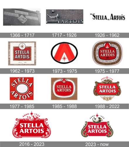
1366 – 1717
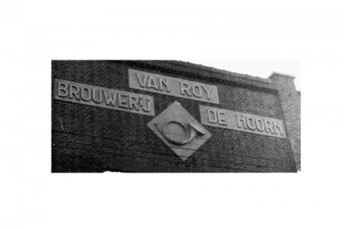
The Stella Artois logo is considered to be one of the oldest in the world. The logo was first used when the brand appeared – in 1366 – when the Den Hoorn brewery was established. Den Hoorn means “the horn,” and this symbol is represented on the beer’s current labels.
1717 – 1926
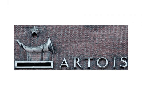
The 18-19th centuries emblem they had depicted a horn, a star above it and the brand’s name – ‘Artois’ – written to their right in big serif letters.
1926 – 1962
The following emblem was their name written in black. It was now ‘Stella Artois’, where the first word was put in quotation marks as a moniker. The font was a normal sans-serif style.
1962 -1973
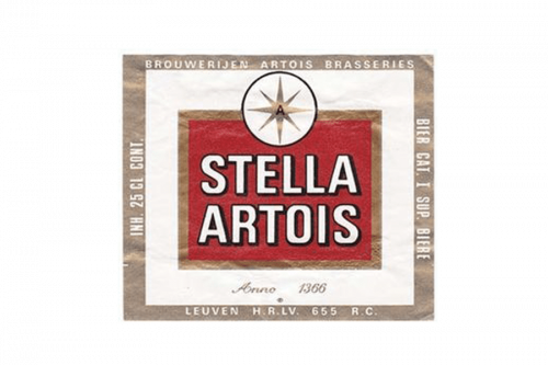
The next logo was a red square with this same wordmark written inside it in two lines. This time, though, the letters were capital, white and without the quotation. The square was outlined in brown and crowned with a big star image. Usually, the label would have a white frame around the square and, after that, a smaller brown frame.
1973 – 1975
The 1973 emblem was a black ring a portion of the red letter ‘A’ thrust into it in a cropped form. In the free space, they also accommodated a small red star.
1975 – 1977
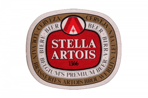
The 1975 logo was a lot like the 1962 emblem, except everything was rounded, the letters became a serif style and they also added something. The star was replaced with the new 1973 emblem, and there were more layers of white and brown around the logo proper, with various descriptions of the beer they make.
1977 – 1985
The 1977 emblem looks like a red square with a white circle in its middle. Along its edges, the company’s name was written in two curved, serif words.
1985 – 1988
This emblem has the same central piece as the 1975 logo, but with just one white frame around it. This entire structure is also put in the middle of a brown rectangle. There are also no additional words on the frames now.
1988 – 2022
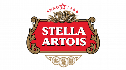
In 1988, they adopted a new design. In many ways, it’s the same ornate emblem as the more modern 2016 logo, but with bronze coloring on the edges and decorations.
2016 – 2023
The word Stella, meaning “star” in Latin, was not added to the name until the company released its first seasonal beer, the Christmas Star, in 1926. The Stella Artois brand was originally released as a special holiday beer for Leuven locals. It caught on, and became available year-round and now pays homage to this original occasion, accompanied by a star on every bottle.
The label also shows medals for excellence awarded to Brouwerij Artois at a number of trade exhibitions in Belgium in the 19th and 20th centuries.
Additionally, the fancy frame around the brand’s name is representative of the style of Flemish architecture around the city.
2023 – now
The redesign of 2023 has brought back the red, gold, and white color palette to the Stella Artois visual identity, keeping the recognizable style of the logo. Although, all the graphical elements on the badge were refined and cleaned up, gaining thin white lines to their contours. As for the bold white lettering, it remained the same as on the previous logos.
The Emblem
Despite numerous shifts in management over hundreds of years, the original horn logo has not changed. The same horn that once beckoned travelers in Belgium is still prominently featured in the current Stella Artois brand
The brands logo highlights Stella Artois’ namesake, the star, and nods to the brand’s 600 years of Belgian brewing heritage.
An image of an eight-point Stella Artois star features eight rays which add texture to the design.
Color and font
The Stella Artois color scheme is elegant and classic. It is composed of white, gold, black and red. White being the dominant color, while the others can be used for accent. The four Stella Artois colors symbolize sophistication and beauty.
The bold custom Stella Artois typeface is based on the Friz Quadrata sans serif.


