The second best-selling beer in the US has the logo that evolved from a vintage look of the 1970s to the angular minimalism of the recent version.
Meaning and history
The current visual identity of the famous American beer is still based on the original logotype, introduced in 1978, and this says a lot about the company and its value of traditions and loyalty. The iconic inscription has had several redesigns, yet kept its color and character and keeps making the brand’s beer bottles stand out on the shelves.
1978 – 1980
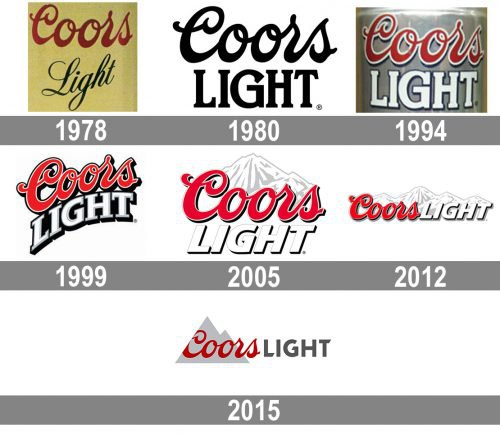
The original Coors Light logo, designed in 1978 was composed of a two-leveled wordmark, where “Coors” in the red script was placed above the “Light” in black cursive and placed on a light beige background. The upper level featured unique curved lines, which we still can see today, as for the “Light” part, this was the first and the last time when it was written in such a tender and sophisticated way.
1980 – 1994
The redesign of 1980 switched the color palette to monochrome and completely changed the “Light” inscription at the bottom level. It was written in all capitals of a string and solid serif typeface with a wide letter “G”, which was balancing the unique script Of the “Coors”.
1994 – 1999
The color palette was changed again in 1994. The script lettering became red and gained a thick white outline when the bottom part was colored white and contoured in black. The background was usually in silver-gray, repeating the aluminum beer can.
1999 – 2005
The logo was refined and modified in 1999. The horizontal orientation of the wordmark became slightly diagonal, with the “Light” level a bit arched. The color palette remained untouched, but the lines of the letters and their contours became thicker and cleaner.
2005 – 2012
The graphical part was added to the logotype in 2005. It was a white and gray image of snow mountains, placed above the “Coors” inscription. The typeface of the bottom line was changed to an italicized sans-serif with a double gray and black outline. Letter “G” now featured a sharp tail, which added strength and masculinity to the brand’s character.
2012 – 2015
In 2012 the logo is being set in one horizontal line. Two parts of the lettering have no space between each other and are “covered” by a long mountain line from the top. The outline of the red lettering changed its color from white to red in order to create a brighter contrast with the graphical part of the brand’s visual identity.
2015 – Today
 approach was adopted by the company in 2015. The detailed mountains were replaced by an abstract triangular icon in gray, which was placed behind the “Coors” part of the wordmark, which got thinner and more elegant lines and got its left part of the “C” cut diagonally, repeating the shape of the gray mountain. The “Light” inscription was written in gray and used custom and sleek sans-serif typeface with a sharp elongated tail of the “G”.
Current Logo
In 2015 the company turned to the design agency Turner Duckworth to refresh their visual identity including the mountain logo. They wanted a more simplistic and cleaner look.
On the whole, everything the consumers have got accustomed to in the Coors Light logo is still there ‒ the distinctive red Coors script and the mountains. Yet, these elements changed greatly.
The letters lost their trimming and drop shadows. There were two reasons to get rid of them. Firstly, they were not popular any longer. Secondly, simplistic logos look better on smartphone screens.
The word “LIGHT” is not tilted in the new emblem. The font didn’t change much. It is also sans serif, yet, it became more dignified.
That year the company also launched the “Born in the Rockies” symbol. It shows the mountain icon placed against the background of a round stamp. The lettering “Born in the Rockies” is above and the “EST. 1978” is below. The intention was to emphasize the brand’s heritage in Colorado.
Color
The Coors Light logo palette is red (#C2112F), dark gray (#757373), light gray (#CBC8C7) and white.
What mountains are on the Coors Light logo?
The mountains, depicted on the logo of the Coors Light beer brand are the the famous Rocky Mountains, located in Colorado, USA. To be more specific, it is the Wilson Peak of the San Juan Mountains, which is located in San Miguel County.


