Leffe is a premium beer brand, owned by InBev Belgium, the European operating arm of the global Anheuser-Busch InBev brewery giant. It was founded in 1152 in Notre-Dame de Leffe, abbey of Premonstratenian canons. In 1240 the brewery was built and the production started.
Meaning and history
The first mention of Leffe beer dates back to 1240. But it is believed that it began to be made much earlier – from 1152 when a monastery was founded in the southern Belgian province of Namur.This monastic past of the brand even gave a special name to the beers produced under the Leffe brand. The company’s lineup is mainly made up of so-called abbey beers.
For centuries Abbey beer was brewed in the monastery, but from 1796 the abbey reduced the sale of alcohol to a minimum and from 1809 stopped brewing it altogether. The monks left their refuge and did not return to the monastery until the beginning of the 20th century. But the first beer after such a long break was brewed here only in 1952.
Later the right to produce beer under the Leffe brand was bought by Interbrew. Since 2008 the brand belongs to the alcohol giant Anheuser-Busch InBev.
What is Leffe?
Leffe is the name of one of the world’s oldest beer brands, which had its first brewery built in Belgium in the middle of the 12th century. Today this famous European brand, owned by InBev Belgium, is distributed all over the globe and is considered to be one of the most popular Belgium brands ever.
1952 – 2010s
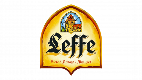
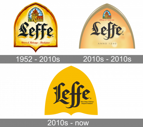
The old Leffe emblem is a yellow orange styled like a wooden casket with beer in it (from above). In its top section, they’ve put a stained-glass illustration of the abbey where the beer was brewed. The middle section occupies the big ‘Leffe’ word in elegant Gothic letters. Below, the same style is used to write ‘abbey beer’ in French and Dutch (in red letters).
2010s
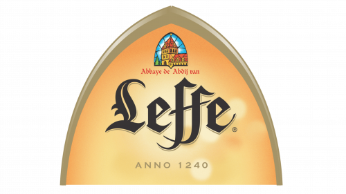
By the 2010s, they reimagined it into a wider, pale triangle with curved lines and a grey frame. The stained glass became smaller, the ‘abbey bear’ part moved to directly beneath it. In its place, a basic, ocher ‘anno 1240’ inscription was put.
2010s – Today
The Leffe logo is a shield-form frame with the image of the abbey on top and the gothic wordmark in the center of it.
The color scheme of the logo is yellow, black and red, with some blue and green details on the stained-glass window style emblem. The abbey image makes a necessary color accent.
The Leffe logo shows brand’s heritage and confidence and balances it with contemporary relevance. It’s very recognizable due to its black gothic-style typeface and the light yellow color of the logo’s background.
Font and Color
The bold and sharp inscription from the primary Leffe badge is set in a custom designer font with heavy Gothic-style letters featuring unique contours, and elongated lines with pointed tails. The closest fonts to the one, used in this insignia, are, probably, Rockner Bold, or Fine Gothic Black, but with some significant modifications of most letters.
As for the color palette of the Leffe visual identity, it is based on the intense and dark combination of yellow and black, which looks pretty dramatic and suits the gothic lettering on the banner, evoking a sense of elegance and confidence, and showing the product of the brand as a high-quality one.


