

The impact of logos on the fate of companies cannot be underestimated, because for most brands the first impression is the key to getting new customers, and the emblem is the thing, that makes up for this first impression. That is why today we can see an incredible number of logo designs, as companies all over the world are competing for recognition and popularity. One of the key elements of any logo is the color palette. The color can say a lot, and the first impression will depend on the colors the logo is made in.
Today we’re going to talk about a logo executed in red tones. Red is an incredibly strong color, dramatic, and full of confidence. This color can mean both love and passion, as well as strength and determination. When combined with white, red looks soft, while paired with black or other dark colors, it can evoke a sense of aggression and danger.
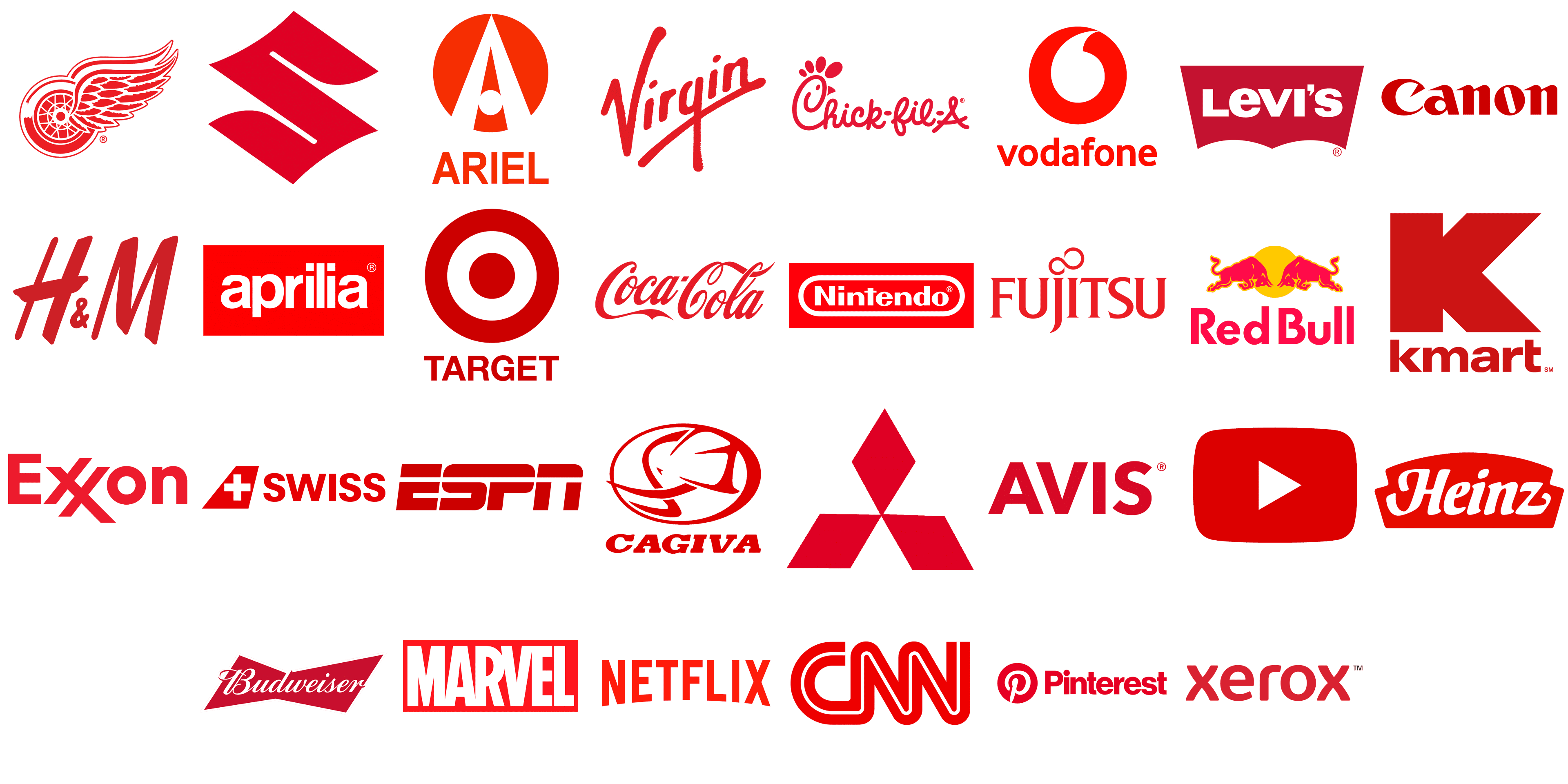
Below we have compiled a list of the most popular logos executed in the red color scheme. Let’s take a look together at how you can use this rich color to better represent your brand. Here are our top 30, placed in alphabetical order.
Aprilia
![]()
Italy is deservedly considered a world center of design and all brands born in this country have a special attitude towards visual identities. Each detail on the logos of Italian companies is balanced and well-thought-out. Aprilia is one of those brands. The logo of the motorcycle manufacturer features a bold white sans-serif wordmark in the lowercase, written across a solid red rectangular banner. Minimum of elements, but clean lines and bright color palette — a perfect combination for a memorable and eye-catching badge.
Ariel
![]()
Another example of wise use of red is the logo of Ariel, a manufacturer of racing cars. The badge of the company is composed of a graphical emblem, accompanied by an uppercase logotype under it. Both elements are set in red color and placed against a white or black background. The emblem of the automaker features a solid red circle with two bold cut-out lines, set diagonally and forming a contour of the letter “A”, with a small circle replacing its horizontal bar. The badge looks powerful and professional.
Avis
![]()
The visual identity of the international car rental service Avis is also set in red. The company has chosen a very laconic design for its badge and simply wrote its name in the uppercase of a modern geometric sans-serif typeface. The stable heavy letters of the wordmark are colored red and usually placed over a white background. In this particular case, the color is the only decorative element of the logo, which is a game-changer, as the simple and minimalistic Avis badge looks powerful and confident.
Budweiser
![]()
The famous beer brand Budweiser uses red color, not for the lettering, but for the geometric banner on the background. A slightly slanted element is drawn in a shape of a bow-tie with sharp angles and straight lines. It features a solid red body, which creates a great contrast with the white cursive lettering, written across it horizontally. Red here is a representation of passion, which also elevates the image of the brand, making it look progressive and professional.
Cagiva
![]()
Cagiva is an Italian company, engaged in the production of motorcycles. The badge of the brand has always featured an image of an elephant on it, and the animal was usually depicted in gray, placed on a background with an Italian flag tricolor. But the latest redesign has changed the look of the Cagiva insignia, drawing it in only red lines against a white background. With the change of color, the style of the elephant image has also been changed, and now the logo looks very modern and progressive.
Canon
![]()
Canon is one of the world’s leading companies engaged in the production of photo cameras and lenses. And the red shade of its bold custom logotype, written in the title case against a white background, is the graphical representation of the strong, reputable, and influential brand. The solid scarlet-red letters in the Canon inscription evoke a sense of power and excellence, and so do the products of the brand, which are sold internationally and are considered to be one of the best on the global market.
Chick-fil-A
![]()
The meaning of the red color in the logo of Chick-fil-A, the chain of fast-food restaurants in the United States, is slightly different from all the brand emblems we discussed above. Here the bright and deep shade stands for warmth and love the company tends to give to their customers with their food. And this feeling is elevated by the smooth rounded letters in its cursive logotype, wide loops, and elongated lines with softened ends. The logo of the chain looks very welcoming and friendly, and this was the main target of the company, which was successfully achieved.
CNN
![]()
CNN is one of the world’s most influential mafia companies, which provides its viewers with the latest news and analytics. There is no surprise, that this media giant chose red as the main color of its visual identity, as it looks powerful and confident. The bold custom capital letters from the iconic CNN badge are colored red but have a medium-thick white line coming through them in the middle, to make the inscription not too heavy and to add some air for better readability. The red here is also a representation of passion. Passion to find out what is happening in the world and to share it with the people.
Coca-Cola
![]()
One of the most iconic and recognizable logos all over the globe is, undoubtedly, the Coca-Cola insignia. For decades the company has been using one badge, designed in a red and white color palette. On the bottles with the famous drink, we see the white lettering written over a solid red banner, while for other needs the company can place the red inscription against a white background. Here red stands for love and passion, as well as for the confidence of the brand and its stability.
Detroit Red Wings
![]()
The visual identity of one of the NHL clubs, Detroit Red Wings is a literate graphical representation of its name. Of course, there are wings, and of course, the wings are red. The badge with the winged wheel is set in a red and white color palette, which reflects the determination and energy of the hockey club, along with its confident and professional approach to training and competing in one of the world’s strongest leagues. With additional white elements, the badge looks light and fresh, being bright and eye-catching when placed on the white uniform of the club.
ESPN
![]()
There is no better color to represent energy and motion, than red. And this explains why ESPN, an American cable channel specializing in sports and extreme, chose this color for its badge. The channel has its logo based on stylized massive lettering in dark red, with the uppercase inscription set in a smooth and heavy sans-serif font with clean contours and the letters slightly slanted to the right. Just like with the CNN badge, the logo of ESPN has a white line coming through it, but in the case of the cable channel, it is a thick horizontal line, placed on the top part of the wordmark.
Exxon
![]()
Exxon is one of the world’s largest oil and gas companies, and its power and influence are reflected in its badge. The logo of the company is based on the title case logotype, set in a bold modern sans-serif typeface, with two letters “X” placed diagonally and sharing one of the bars. The lettering is written in a light yet the intense shade of red, which stands for energy and power. And these two characteristics not only represent the essence of the business Exxon is involved in but also show the main features of the company itself: its professionalism, confidence, and stability.
Fujitsu
![]()
Many Japanese companies design their logos with the use of red color, and it’s not only because of the commonly known meanings of the color but also as a sign of patriotism, as red is the main shade of the National flag of Japan. Jujitsu is one such brand. The manufacturer of communications technology equipment has its logo based on the uppercase lettering, executed in a sharp serif typeface with clean bold lines and small pointed serifs on their ends. The red inscription is placed on a white background and accompanied by a thin red curved line, set above the letters “J” and “I”.
Heinz
![]()
The famous brand of sauces and food products, Heinz, adopted the red color for its logo as a symbol of love and caress, warmth and friendliness. The products of the company are made for people to cook at home, gather together at the dinner table, and spend their best moments with their families and friends. All these meanings are brilliantly combined in the solid deep red, used for the arched banner of the Heinz badge. The bold white lettering in a custom typeface with smooth elongated lines, set over the banner, only elevated the feeling of friendliness and kindness.
H&M
![]()
The Swedish fashion brand, which is specialized in the production of stylish and affordable casual clothing for the whole family, chooses a dark shade of red for its laconic logo. Apart from standing for strength and confidence in this particular case red also represents beauty and style. The logo, composed of the handwritten inscription in bold lines, with a small ampersand between the “H” and the “M”, set at the bottom of the letters, is usually placed on a white or light silver background, creating a strong contrast and memorable image.
Kmart
![]()
Kmart is one of the most popular American chains of department stores, which offers everything from clothing to electric appliances. The company has its logo composed of two parts: the massive letter “K”, which is used both as the emblem and as the brand’s signifier, and the modest lowercase logotype, which can be placed whether under the emblem or on its right. Both elements of the Kmart visual identity are set in a calm and deep shade of red, which evokes a sense of comfort and reliability, yet also points to the expertise and professionalism of the company.
Levi’s
![]()
The iconic manufacturer of denim clothing, Levi’s, has its logo based on the red color since the middle of the 1920s. Throughout the years the red was used in different ways and shades, but the current badge was first introduced in 1969 and was only slightly refined at the beginning of the 2000s. The solid red banner with the bold white lettering in all capitals of a modern sans-serif typeface looks bright, stylish, and strong. The shade of red on Levi’s badge is deep and calm, softer than bright, which makes the brand look stable and professional.
Marvel
![]()
The red, used for the logo of Marvel is, on the contrary, all about brightness and energy. Although here the main here is the logotype. Set in an extra-bold sans-serif typeface, and written in the uppercase, it takes up almost all the space on a horizontal rectangular banner, hence red is only seen around the perimeter of the badge and in small negative spaces in the massive narrowed letters of the inscription. The logo looks very bright and progressive, evoking a sense of joy, and inviting to entertain.
Mitsubishi
![]()
Another Japanese brand on our red-logos list is Mitsubishi. As in the case with Fujitsu, red here is a celebration of the historical roots of the company and its motherland. The sharp geometric badge of the corporation is composed of three rhomboid figures, which touch their corners in the center of the badge, forming a triangular “flower”, which is known as the Mitsubishi Diamond. The simplicity of the shapes and cleanliness of the lines in this badge is elevated by the bright scarlet/red color, which makes the minimalistic logo look modern and sleek.
Netflix
![]()
Another example of how the right color can make minimalistic design shine bright is the logo of Netflix. The world’s most popular online-streaming service uses a classic shade of red color for its uppercase sans-serif logotype. The red inscription with the arched bottom line can usually be seen on a white or black background and looks equally cool in both cases. The characters in the logotype are placed at a significant distance from each other, which makes the composition look relatively light and perfectly balanced.
Nintendo
![]()
There are brands, which you can not associate with any other color but red, and Nintendo is one of them. First of all, it is a Japanese company, and we already know that red for it is something about roots and traditions. Secondly, it is one of the world’s leaders in the video-gaming industry, hence red is here as a representation of power, influence, and excellence. And thirdly, the essence of the company is entertainment, and there is no better color than red to represent joy, fun, and energy. The solid red badge of the Nintendo visual identity is accompanied by bold white lettering, enclosed into a horizontally stretched rounded frame, also in white.
![]()
The logo of the popular online platform Pinterest also uses red as its main color. Both the official version of the badge and the mobile app icon is set in a red and white color scheme, with red prevailing. Standing for passion and beauty, red suits the essence of the photo-sharing portal better than any other shade. The Pinterest badge is composed of a circular emblem with the white letter “P”, stylized as a pin, set over a red background, and a title case logotype in a bold sans-serif font, which has all of its characters drawn in solid red.
Red Bull
![]()
Red in the name of the brand, Red in the logo of the brand, is about Red Bull, the world’s most famous manufacturer of energy drinks. Two Red Bulls are drawn on a background with a solid yellow Sun, and a massive sans-serif logotype in the title case, written in red under the graphical part — this is the logo of the Red Bull brand. The bulls are outlined in yellow, which adds even more drama and strength to the image. As for the inscription part, it is usually set on a white background, or when written on a can with the drink, on a silver and blue one, creating a bright contrast between cold and warm shades.
Suzuki
![]()
One more Japanese brand on our today’s list is Suzuki. The logo of the automaker is composed of a single element — a stylized letter “S”, drawn in a very elegant manner, representing the Asian roots of the company. The emblem is colored in solid red, with bright hues. The Suzuki logo evokes a sense of power and progress, showing the brand as the one that is constantly evolving and looking for new technological solutions. And again, here red is also a symbol of patriotism and the love and respect of the company for its motherland, Japan.
Swiss International Air Lines
![]()
Another example of a patriotism celebration is the badge of Swiss International Air Lines. The air carrier from Switzerland has its logo set in red and white, the colors of its country’s national flag. Apart from the bold uppercase logotype in red sans-serif characters, the badge also comprises a red geometric emblem, drawn in the shape of the plane’s tail, with a white cross on it. All the aircraft of the airlines are painted in red and white, which looks very bright and lively. The red on the Swiss International Air Lines badge also stands for confidence and reliability.
Target
![]()
Target is an American chain of department stores, which has a huge range of products offered to the customers, from clothing and beauty items to furniture and pet products. The company aims to give its clients an opportunity of getting all the needed things in one place, saving their time and money. The logo of the retailer is composed of a red and white emblem, formed by a solid red circle set on a white background and enclosed into a circular red frame, and an uppercase logotype in a medium-weight sans-serif font, which is also written in red.
Virgin
![]()
Virgin is a huge British conglomerate, involved in different sectors of the economy. So it was important for the company to create one main badge, which will be easily adapted to different activities, showing the affiliation of the subdivision to the main brand. The Virgin logo is probably one of the most recognizable insignias in the world today. It is a diagonally written logotype, executed in bold smooth red lines, with a thick underline, creating a cross with the straight vertical tail of the “G”. The logo is usually set in red on a transparent background, but sometimes can be seen in white letters on a solid red banner.
Vodafone
![]()
The European telecommunications company Vodafone uses red color in its logo as a symbol of power and professionalism. One of the largest mobile and internet service providers, Vodafone has a badge composed of a graphical emblem and a lowercase logotype, both are drawn in red. The emblem of the company features a solid red circle with a white element, looking like a comma turned upside down. As for the inscription, it is set in a modern sans-serif font, with clean contours elevated by the chosen bright shade of red.
Xerox
![]()
Another well-known company, that uses red as the main color of its visual identity is Xerox, one of the world’s pioneers in printing and scanning technologies. The company chose a dark and deep shade of red, which is closer to burgundy. This hue evokes a sense of traditional approach, stability, excellence, and responsibility. The badge of Xerox is based on a lowercase inscription with the softened contours of the sans-serif letters and straight cuts of the lines. The massive and heavy characters are set at a significant distance from each other, which balanced the logo and adds air to the dark shade of red, used for the letters.
YouTube
![]()
The last, but not the least today is YouTube, an online streaming service with billions of users from all over the globe and one of the most recognizable logos ever created. And of course, this logo is red. The solid rectangular banner with arched sides and softened angles has a small white triangular in the middle. The triangular stands for the Play button, and the color palette of the badge — is for passion, influence, and excellence. When the logotype is used with the emblem, it is also set in red, having its simple sans-serif characters stable and strong.
Motorola
![]()
Motorola was one of the world’s pioneers in the production of mobile phones, so the solid red color in its visual identity is a representation of passion and progress. The logo of the brand is composed of a scarlet-red roundel with a stylized white capital “M” drawn on it. The letter is formed by two identical sharp and narrow elements, which only enhance the meaning of the red, making it look even more powerful and exquisite. The Motorola logo is a brilliant example of how laconic design can become super cool when set in the right color palette.
Adobe Acrobat
![]()
Just like Motorola, Adobe Acrobat chooses a simple design, yet bright colors. The logo of the software features a stylized white “A”, drawn in medium-thick lines in a shape of a triangle with three loops. The letter is placed under a small angle, going slightly diagonal, upright. The Adobe Acrobat “A” is set against a solid red square with rounded angles, which makes it possible to use the emblem as a mobile and web icon, software signifier, and primary badge. The red and white combination here stands for energy and innovations.
AirAsia
![]()
The visual identity of the largest Malaysian air carrier, AirAsia, is also set in a red and white color palette, but this time the main element of the badge (inscription) is executed in red and placed against a white background. The bold lowercase lettering of the company’s wordmark is set in a custom sans-serif typeface with thick lines and massive shapes. The solid red dots in both letters “I” and an “R” overload the straight vertical bars, forming thin white “smile-lines”, which add friendliness and a welcoming feeling to the powerful bright logo, which evokes a sense of professionalism and excellence.
3M
![]()
The visual identity of the 3M brand is all about strength and confidence: the badge is based on the massive sans-serif inscription with the glued symbols written in thick red lines against a white background. Nothing else, just the clean contours and an intense scarlet-red shade, which literally yells “power”. This logo has it all, from distinction to readable geometry and passion, reflected in the right shade of red.
Adobe
![]()
Adobe is a company, which evolved much dusting the last decades. Its logo was also redesigned not once throughout the history of the brand. However, the recognizable geometry of the insignia and The intense red color has remained untouched. The Adobe red is powerful, strong, energetic, and determined. It evokes positive feelings and encourages a person to take action. In combination with white, red also points to the professional aspects and represents quality and excellence.
Kellogg’s
![]()
Kellogg’s is an American company founded in 1906, a manufacturer of breakfast cereals and convenience foods. The brand has been using different shades of red for its logo from the very beginning of its history. There were brownish, scarlet, and pinkish tones, and in 2011 the company came to a perfect shade of red, smooth and intense, which evokes a sense of warmth and caress and looks elegant on a custom cursive wordmark.
Lego
![]()
The visual identity of the world’s most famous toy manufacturer, Lego, uses red as the background. After all, it is believed that Red and its shades energize a person, give a charge of vigor, and allow you to feel a surge of strength, and using it for the background only enhances this effect. In combination with another energetic color, yellow, and red only wins, and black and white add professionalism and reliability to the list of the company’s qualities.
New Balance
![]()
New Balance is an American sports brand founded in 1906. It is one of the most experienced and largest manufacturers in the sports segment. The brand’s famous “N” logo was designed in 1975 by designer Terry Heckler. Since then, this massive geometric letter has not left the brand’s models. However the official New Balance logo is different: the monogram with the striped “N” and the solid “B”, is accompanied by a modest lowercase lettering, with both elements set in a calm shade of red, as a symbol of speed and motion.
Oracle
![]()
Red is one of the brightest and most dominant colors. Companies that choose red as their corporate color set global goals, strive for leadership, and want to have a strong impact on human consciousness. So Oracle, a leader in the international software market, has chosen red as its corporate color. The company has been using two different options of the logo: the custom red lettering on a transparent background, or the white inscription on a solid red banner. Both of the versions evoke a sense of power and excellence.
Rolling Stones
![]()
One of the world’s most iconic logos in red is definitely The Rolling Stones badge. The logo in the form of lips with a tongue sticking out, as many think, is based on the recognizable face of the band’s frontman Mick Jagger. However, this is not entirely true. Jagger was inspired by a newspaper clipping he saw that depicted the Indian goddess Kali with her sharp tongue sticking out. In Hindu mythology, she symbolizes death and time and is a strong female figure. When the artist who created the iconic logo first met with the singer to discuss the idea for the design, Jagger said he liked the tongue of the Hindu goddess Kali. And that was the deal.
Santander
![]()
The visual identity of one of the largest and most reputable European banks, Santander, uses a stylized geometric representation of fire for its emblem, and a combination of scarlet-red and white for the whole badge. The fire here is a symbol of strength and passion, something uniting humanity and bringing light into people’s lives. And the intense and bright shade of red on the logo elevates these meanings and creates a truly exquisite and memorable composition, representing professionalism and stability.
Stranger Things
![]()
Stranger Things has become one of the most significant entertaining projects of the past years. And to enhance the importance and popularity of the series red was chosen as the main color of its visual identity. A very dramatic and deep shade of red looks great both on light and dark backgrounds, creating a mysterious feeling and promising a super interesting and exciting journey with the heroes of the TV show. The elegance of the sharp serifs and the massive straight bars of the characters complement the look of the badge.
Tesla
![]()
Red is the color of progress, aspiration, and confidence not only in today but also in tomorrow. It is these values that most of all correspond to the innovative approach of the American company Tesla and its creative and memorable logo. The company logo shows the letter “T”, which is also a stylized section of the electric motor invented by the great physicist Nikola Tesla. Moreover, many people see this emblem as a cat’s nose. And the badge is completed with custom sharp lettering in the uppercase; with both elements set in one color.


