

![]() Target Logo PNG
Target Logo PNG
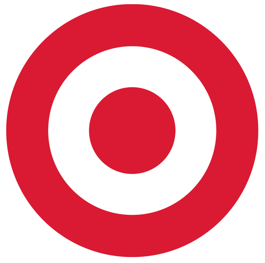
Although the Target logo has been updated more than once throughout its history, the core visual metaphor has always stayed the same. The emblem has always been built around a stylized depiction of a target, with a pronounced bullseye. Moreover, the word “bullseye” itself is the nickname for the Target’s registered trademark.
Meaning and history
![]()
The history of Target started in 1962, when the Dayton Company opened a discount store in Roseville, Minnesota. Prior to it, the company’s team discussed over two hundred versions of the name and the emblem for the new store. As a result of this, the name “Target” was chosen and the first version of the logo was born. It depicted a target with three red circles and white spaces between them. It served as the background against which name of the store was written. The wordmark itself was black and featured a bold italic font.
What is Target?
Target is an American chain of department stores, which was established in 1902. Today it is one of the largest players on the market, with almost two thousand locations offering a variety of products including clothing and accessories, beauty goods, consumer electronics, gadgets, pet supplies, and others.
1962 – 1968
![]()
This is definitely the most detailed version of all the logos Target has had so far. You could see the word “Target” written across a target design (three red rings and three white rings). The legibility was a problem because of the choice of typeface and also because the two elements overlapped.
1968 – 1972
![]()
The legibility issue was resolved, the emblem grew easier to grasp. To begin with, the type grew more transparent and the elements of the Target logo were separated from each other (it was easier to make out the company name when it was placed over the white background). Also, three rings disappeared making the design simpler.
1968 – 1972
![]()
The so-called “Bullseye” symbol was often used without the company name, just as a standalone logo.
1972 – 1973
![]()
The designers played with existing elements while creating a new brand visual identity. First of all, the so-called bullseye was moved to the left of the name. It was slightly taller than the letters. The italicized type was replaced by a regular one. In addition, the black outline around the white letters grew thicker, making the inscription easier to read and see on different backgrounds.
1973 – 2004
![]()
The white letters with black trim were replaced by solid black, which improved the legibility of the Target logo.
2004 – 2018
![]()
The company name grew red and smaller in comparison with the Bullseye. It moved below.
2018 – Today
![]()
Once again, the target icon remained virtually unchanged, while the company name was modified. The capitals were replaced by lowercase letters.
Which Target emblem has been most popular?
In 2014 the company’s PR team conducted a customer survey in the streets of New York so as to find out which of the logos was the most appealing for the citizens. Here are the results:
- 20% preferred the 1962 logo, explaining that they liked its “retro” and “less corporate” look
- 5% opted for the 1975 version
- 2% voted for the 1989 wordmark
All the rest either liked the current emblem best or refused to choose any of the versions.
Font
![]()
The current version of the logo is just an emblem that does not actually need the name of the company or any other text to be recognized. However, the previous version did use a wordmark, which was given in the Helvetica Neue Bold font.
Color
![]()
Red and black have always been the two main colors of the Target logo, while white has been left for the background. The black letters in the wordmark provide excellent legibility, while the red depiction of the target is a perfect eye-catcher. The earliest version sported a lighter shade of red that included rosy and orange hues.
Why did Target change its logo to white?
The management of Target decided to make the iconic logo less red, and the interior design of the chain’s stores was changed accordingly, and the company wants to show its progressiveness and follow the latest trends in the world of consumption and design — minimalism. Also, with white as a prevailing color, the badge became brighter and more eye-catching.
What was Target’s original logo?
The original logo of Target was composed of three concentric red rings on a white background, with a shade of red light and muted. The lettering on the first badge was set in a bold black italicized serif font and was placed right over the red and white graphical element.
Did target change its logo?
Target has changed its logo five times. The original version was different from the one, we all know today. As for the iconic Bill’s eye emblem, it was first introduced in the 1960s and has undergone four redesigns by today.


