Coca Cola is the world’s most renowned beverage maker with the most iconic logo ever. The company was founded in 1886, and began to grow exponentially right away.
What is the symbol of the Coca-Cola company?
The symbol of Coca-Cola is the iconic script logotype, which predecessor was first introduced at the end of the 1880s. The current wetsuit of the symbol saw the light in 1903, gaining an intense shade of red by 1934. Since then the logotype has been refined and strengthened, yet kept its recognizable style and mood.
Meaning and history
The brand’s history began when John Stith Pemberton, the inventor of the beverage, turned to his book accountant – Frank M. Robinson, to help him brand his creation. Frank immediately suggested the simple and mark-hitting ‘Coca-Cola’. The marketing strategy created a boom, and one year later Frank came up with the first logo – the handwritten name of the company. The handwriting has proved to be an eternal element, as it has come through the numerous logo modifications unchanged except for the color.
What is Coca-Cola?
Coca-Cola is the world’s most famous brand of soft drink, which was established in 1886 by John Stith. Today the bottles with red and white Coca-Cola labels can be found literally in every supermarket and grocery store all over the globe. The most intriguing thing about the brand is that only a few people know its original recipe.
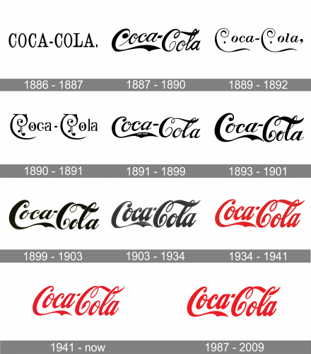
1886 – 1887
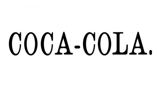
The earliest version was also the simplest one. You would have hardly recognized one of the most iconic logos in these simple letters with serifs.
1887 – 1890
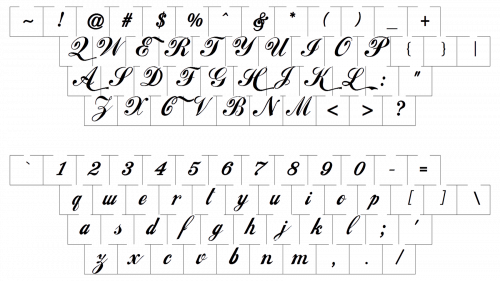
Very soon, the company founder John S. Pemberton realized the need for a more distinctive and refined wordmark. It was here that the ‘Spencerian’ script made its first appearance. Generally, the overall look of the emblem has preserved the same ever since. Yet, there have been quite a few experiments and minor updates.
1889 – 1892

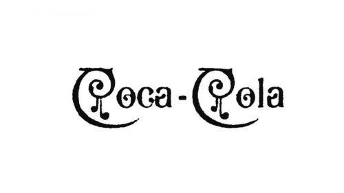
The redesign of 1889 has introduced a more elegant version of the Coca-Cola logotype, with elongated lines of both “C’s, which were curved even more, and two small rhomboid diamonds, drawn in black in the middle of the letter’s negative space. The inscription was followed by a bold enlarged comma sign.
1890 – 1891
The 1980 version, for instance, featured a completely different type with additional decorative swirls. The design was discontinued only a year later.
1891 – 1899
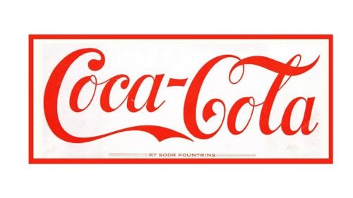
The emblem was redrawn with minor alterations. You would hardly have noticed them unless you had compared the two versions side by side. It was only the red rectangular border and the red color that made it different from the 1887 Coca-Cola logo.
1893 – 1901

The design of 1887 was brought back to the primary logo of Coca-Cola in 1893, but with the lines of all elements being emboldened and cleaned. The new lettering looked very professional and confident, with the sharp details in some of the letters adding strength and edginess to the logo.
1899 – 1903

In 1899 the logo gets refined again, with all the letters getting more balanced, and the lines of the two parts of the drink’s name almost equalized. The new badge is smoother and looks closer to the iconic logo we all can see today.
1903 – 1934
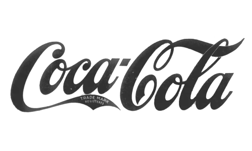
The first version of the Coca-Cola logo, which almost looks like the current one, was created in 1903, based on the previous version, but with narrower and taller contours of the letters, and the bolder lines. Overall, nothing changed in the design concept, but the look of the logo got more refined.
1934 – 1941
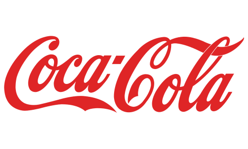
With the redesign of 1934, the Coca-Cola logo got its iconic red color, which still stays with the company. It was the same inscription as on the previous badge, but due to its powerful and bright shade, it started looking more powerful and elegant.
1941 – Today
The design team made the wordmark more italicized and removed the border. Also, the letters look more elongated in comparison with the previous version.
1987 – 2009
The design grew bolder. The glyphs appear to be slightly straightened-up. The overall style has not changed, though.
Who created the Coca-Cola logo?
The author of the original script logo and the name of the drink was Frank Mason Robinson. While Mr. Robinson worked for the Coca-Cola inventor, John Pemberton, as a bookkeeper, he also played a great part in creating and developing the brand. The Coca-Cola logo was based on Spencerian font, which was the most widely used form of formal handwriting back then.
Symbol
Today’s Coca Cola symbol is has a classic two-color design, which is very simple and speaks for itself in all respects.
Swirly emblem
The version of the Coca-Cola logo adopted in 1890 looked very unusual and different from the iconic logotype. The name of the company got a lot of extra swirls adding magic to the overall logo look. As a result of the emblem update, it acquired an appealing “fairy tale” mood. However, the version was used for one year only.
Shape
The swirly Coca Cola logo looks almost the same as it looked in 1887. The survivability testifies to Frank M. Robinson’s unmatched talent.
Colors
The Coca Cola logo presents an appealing combination of red and white, which expresses youth, optimism, purity, and excellence.
Font
The distinctive font is what has actually made the brand. Its swirly design adds a degree of elegance and beauty.
What makes the Coke logo unique?
The main distinctive feature of the Coca-Cola logo is the wordmark, executed in a unique Spencerian typeface. The inscription, set in a handwritten font, looks very fancy and elegant, having no analogs in the visual identity universe.
Why did Coca-Cola use red in its logo?
The company decided to use red as its main color at the very beginning of its history. Today the Coca-Cola badge can not be imagined in any other color. The Coke red is an inevitable part of the brand’s visual identity, which stands for power and excellence. Although, there is a curious history: Coca-Cola used red containers for its beverage so that it could not be confused with other products when delivered to the pharmacies.


