The Exxon brand is used by the US oil and gas corporation ExxonMobil for certain gas stations, motor fuel, and related products. The Exxon logo created by Raymond Loewy has not changed much since 1972.
Meaning and history
Exxon is a brand with a long and intense history. Its roots date back to the end of the 19th century when in 1882, John D. Rockefeller organized the Standard Oil Trust. The same year Standard Oil Co. of New Jersey and Standard Oil Co. of New York were reorganized. As a result of changes, two companies appeared: Jersey Standardand Socony, which were the forerunners of Exxon and Mobil, respectively.
Exxon Chemical Company became a worldwide organization in 1965 and until 1999 was a major producer and marketer of olefins, aromatics, polyethylene, and polypropylene, along with specialty lines like elastomers, plasticizers, solvents, oxo alcohols, and adhesive resins. The company was a leader in the production of unique polymers, with production bases in 24 countries.
The current company was created in 1999 as a result of the merger of Exxon and Mobil, the largest U.S. oil company. It became one of the biggest and most important mergers of the 1990s.
What is Exxon?
Exxon is the name of an American gas and oil company, which was formed from Standard Oil in 1965, and became a part of ExxonMobil in 1999. Today it is the largest private oil company in the world, one of the largest corporations in the world by market capitalization
1926
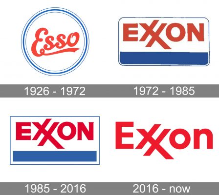
The predecessor of ExxonMobil, the Standard Oil Company of New Jersey, introduced a new blend of fuel under the trade name Esso. The name represented the phonetic rendition of the letters “S” and “O” in “Standard Oil.”
If you’re looking for the roots of the current Exxon logo, you will find them in the emblem developed for the fuel. Here, you could see the word “Esso” in red inside a white circle with blue trim.
While the cursive script is in no way like the heavy glyphs of the current logo, you can still see that the palette is the same as is the structure featuring a prominent red wordmark in the center.
1972
The name Exxon Corporation was officially adopted.
The new brand identity was developed by industrial designer Raymond Loewy. The daily web magazine Designboom wrote that Loewy created the name “Exxon” and he drew seventy-six rough pencil sketches of the wordmark. In all the cases, the double “x” was emphasized.
You can see some of the versions on a page from Loewy’s sketchbook kept in the Library of Congress. In several versions of the logo, the double “x” was deliberately drawn in a way that makes it look similar to the double “s,” thus creating a strong link with the old brand Esso. There are versions, where the double “x” is positioned above or below the line, where it forms a mountain or a glyph similar to the “w.”
The version with the double “x” forming a cross has a red frame and the word “ok” written next to it, which apparently means that this was the one approved by the client. You can also see the date, March 1966, in the lower right corner. It shows that around six years lay between the first drafts and the introduction of the Exxon logo to the public.
While the company has never explained whether the design has a hidden meaning, there have been several interpretations (and even an anecdote).
Some people noticed the similarity between the linked “x” and the Cross of Lorraine, known as a symbol of the Templar Knights. According to this theory, both Loewy and the brand’s owners were Masons.
Other people suggest that the logo represents a car’s gas gauge with the red strokes going through the needle pointing to empty. The message of this image is, therefore, “XX on empty.” According to this interpretation, the blue line stands for the lower portion of the gauge. The value of this interpretation for the company is obvious: it’s great when your logo sends the drivers a subliminal message suggesting they’ve run out of fuel.
On a more romantic note, we can mention the anecdote from the book Brand Identity Now (2009) by Julius Wiedemann (in the part about John Rushworth). Once a woman approached Loewy at a party and asked why he used the double “x” in the name (meaning “two kisses”).
“Why would you want to know it?” the designer asked.
“Well, I just happened to notice this strange thing,” she answered.
“This is exactly why I did it,” said Loewy.
1985
The rounded corners of the blue frame were replaced by square ones. The colors grew slightly brighter.
In 1972-2016, Exxon used a logo without the blue frame and bold line as an alternative one.
2016 (2014)
In 2014, the company started to use a different version of the logo on signage for the canopy and pumps. Here, only the “E” was capitalized, while the “o” and “n” were lowercase letters. The double “x” was moved lower – its ends weren’t above the top of the “E” anymore.
In two years, when ExxonMobile was formed, the updated design became part of the new logo. Starting from this moment, the “uppercase” logo began to be phased out. The logo can be seen both with or without the strip.
Font
The original 1972 Exxon logo featured barely visible serifs. On the current version, the ends are just rectangular. While the type may look pretty much the same, you can notice, for instance, that the proportions of the “E” have changed.
Colors
The roots of the red-and-blue palette go back to the 1926 Esse logo. The hues slightly altered over time, though.


