YouTube is the world’s top video hosting service created by three former PayPal employees: Steve Chen, Chad Hurley, and Jawed Karim. The service has been around since 2005.
Meaning and history
YouTube was created by work colleagues Chad Harley, Steve Chen, and Jawed Karim, who worked together at PayPal In February 2005, after a party, the pals wanted to share a video, and realized that there were no convenient mechanisms for doing so. The photos were quickly posted on the web, but where could the video be uploaded? Nowhere. That’s when they decided to fill the empty niche.
Chen and Karim were excellent computer programmers, and Harley had a gift for design. He designed the iconic YouTube logo, which hasn’t changed much since 2005.
Not many people know, but the original idea of the creators of YouTube was a dating site. The main difference from Facebook was that the user could not only get acquainted but also upload their videos to the profile. It was thanks to this feature that YouTube’s future history was determined.
Dating services began to work on a symbolic date, St. Valentine’s Day in 2005. This is the date when YouTube’s history began: the trademark, as well as the logo and domain, was registered at the same time. But users, instead of posting videos of themselves for dating, began recording video content mostly about what was going on around them and sharing videos. So the “romantic” component of the portal idea faded into the background and then disappeared altogether.
A year later, in 2006, Google became interested in the service, and in November of that year, the company was sold for $ 1.6 billion.
As for the visual identity, there are barely people on our planet, who do not know the YouTube logo, one of the most iconic emblems ever created. The visual identity of the world’s most famous online video portal has been pretty consistent throughout the years and fully based on the original version, created in 2005, until 2017, when the new symbol appeared.
What is YouTube?
YouTube is the largest video hosting service in the world, which was created in 2005, and bought by Google in 2006.Today the platform is used by more than a billion people, that’s almost half of all Internet users worldwide, and 80% of them have an account on this service.
2005 – 2011
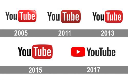
The very first logo for YouTube was introduced in 2005 and boasted a logotype, split into two parts: the simple black “You” with the first letter capitalized, and the “Tube”, written in white and placed on a gradient three-dimensional rectangle with rounded angles. Resembling the shape of the tv, or a computer screen, the red part of the YouTube logo became a brand’s signifier, known all over the globe. This was the only version of the YouTube badge with bright glossy gradients on the red rectangle.
2011 – 2013
The color palette of the logo became darker in 2012, and the glossy texture of the red rectangle was replaced by a matte one. The logo started looking more serious and trendy, showing power, passion, and progress. By getting flat, the badge also gained a more professional look, evoking a sense of confidence and stability.
2013 – 2015
In 2013 the color palette was switched to a lighter one again, though now the red part of the logo was flat and minimalist. In this version the “Tube” part has no outline and shadow, looking plain and simple, it became strong and elegant at the same time.
2015 – 2017
The redesign of 2015 made the red element darker again, and the composition and the typeface of the logotype remained untouched, but with the change of the color the mood also changed — now the emblem looked exquisite and serious.
2017 – Today
A new YouTube logo concept was introduced in 2017, and this is when the emblem we all can see today appeared. The logotype with “Y” and “T” capitalized is still executed in the same sans-serif typeface, but now both parts are written in black and placed on a white background, on the right of a red emblem. The new emblem featured the same shape of a softened horizontal rectangle, but instead of the lettering, there is a white triangle, pointing to the right, and resembling the “Play” button.
Black YouTube logo
Apart from the primary YouTube logo version, executed in red and white, the monochromatic black-and-white version can sometimes be seen as a part of the platform’s visual identity. This palette is used by the service mainly for official documentation, or on some occasions, requires a more serious or even dramatic image. Black is the color of confidence and strength, but at the same time is known to represent mourning and sorrow, so can be used by the company to show its empathy and involvement in some global social events.
Red YouTube logo
The red and white YouTube logo has already become one of the main symbols of the graphical design industry in the past years. Red is all about passion and power, but also reflects the entertaining side of the platform, and the intense line-up of the videos, which can be found here. As for white, it is the color of loyalty and reliability, which shows how the platform values its users, both the creators and the followers.
Shape
Just like all previous versions, the current one consists of the black “You” and white “Tube” on the red “vintage TV screen”. The “curved” shadings were removed, and now the screen part looks completely flat.
Color
The YouTube logo uses three colors: white, black, and red – a combination, which creates an appealing mix. It emphasizes excellence, optimism, passion, purity, elegance, and perseverance. These are the qualities that have helped YouTube reach its current height.
YouTube Icon
The iconic softened rectangle with slightly arched sides and rounded angles, resembling a contour of a tv-screen on old-style television models, can be used as an icon in two color schemes — red and white, or black and white. The solid main element has a clean and sharp white triangle drawn horizontally, pointing to the right, in its center. This Play button reflects the essence and purpose of the video hosting service.
This style of the icon has been in use by the platform since 2017 and has replaced the iconic version with the white bold “Tube” written across the solid red element, which could be seen in various shades of red throughout the years. The switch from the lettering to the minimalistic geometric element, the triangle, represents the growth and development of the service and shows its ability to change and evolve with the needs of its huge audience.
Icons
The red and white icon has already become one of the most recognizable graphical emblems ever created. Though there is nothing new at all in the YouTube icon, all together, the elements of the emblem create a powerful and eye-catching image.
The whole logo was dramatically changed in 2017, and its icon, which previously consisted of white lettering on a red background, became geometric and cool. A red “Play” button appears to the left of the company name, reflecting the site’s specificity of watching and downloading videos. The figure is still in the form of a smoothed rectangle but is smaller than in previous versions of the logo.
A small white triangle on a solid red background — and that is it. A complete reflection of the service’s purpose, focus, and values. The color combination represents influence and power, while the triangle points to the right — movement and development. And, of course, the “play” button for all the video content YouTube has to offer to millions of users from all over the globe.
When was YouTube made?
The original idea of YouTube’s creators was a dating site. Moreover, it had its feature – the user could not only get acquainted but also upload his videos to the profile. Dating service came to life on a symbolic date – Valentine’s Day, February 14, 2005. This is the date when YouTube’s history began: the trademark, as well as the logo and domain, were registered at the same time.
Who invented YouTube?
The creators of YouTube are three young guys from PayPal, the world’s most popular online payment platform. These guys are Chad Hurley (former PayPal’s chief designer), Javed Karim (former PayPal’s anti-fraud system), and Steve Chen, a computer engineer.
When was YouTube founded?
The official foundation date of the world’s most popular video hosting platform is February 14, 2005, when the domain name was registered. This date is still considered the birthday of the video hosting. On April 23, the first test video appeared there: it was uploaded by Javed Karim. The clip lasted just 18 seconds: it was a video, shot at San Diego Zoo. It was called “Me at the zoo”.
What year was YouTube made?
YouTube was founded in February 2005. The history of video on the YouTube platform began with the first video posted. At the time, it was not supposed to be more than 10 minutes long. The first video was posted by Javed recording his trip to the zoo. It was posted on April 23, 2005, and was only 18-20 seconds long.
Cultural and Global Influence
The YouTube logo has transcended its initial identity as a simple video platform emblem to become a universal symbol of cultural connectivity and creative expression. Its recognition spans continents, languages, and cultures, making it one of the most identifiable icons in the digital age. The logo carries with it a promise of accessibility and opportunity – from exploring global cuisines to learning complex scientific concepts or watching music videos from around the world. It also serves as a platform for diverse voices and stories, allowing people to share their experiences and talents, fostering mutual understanding and cultural enrichment.
Moreover, the YouTube logo symbolizes the shift in modern media culture where traditional forms of entertainment and information are giving way to user-generated content and the democratization of creativity. It represents a new generation that prefers interactivity and customization in their media consumption. This influence extends to education, social movements, and political expression, making the logo far more than just a corporate trademark.
Future of Branding
The branding of YouTube, particularly its logo, is on the cusp of significant changes as the world of technology evolves at a rapid pace. Future innovations may include adapting the design to various formats and devices, from smartwatches to large public displays, and even integrating with virtual and augmented reality technologies. Beyond visual changes, the brand might seek to enhance its impact on users by incorporating interactive and personalized elements into its symbolism.
At the same time, YouTube will continue to balance innovation with maintaining the recognizability and trust it has built with its audience. This might involve strengthening connections with users through branded campaigns, social initiatives, and continuing to support diversity and inclusion through its content. The future branding of YouTube will likely reflect a deep interplay between technology and human stories, emphasizing the platform’s role as a place where everyone can find something for themselves, learn something new, or share their view of the world.
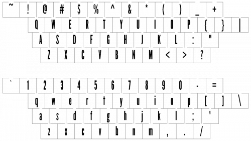
Font
The YouTube logo used to have a distinctive and recognizable Helvetica font, which was widely used in TV shows in the 1950s, in all the old versions of the badge. With the last redesign, the clean modern typeface was switched to a narrowed and elegant one, the font, is pretty close to Indecise Condensed Medium, another famous type, used by many reputable brands and companies.


