Ariel is the name of a British brand, which specializes in the production of automobiles and motorcycles. The company was established by Simon Saunders in 1991, and by today it has already released four models of high-performance cars and motorbikes, including an electric one.
Meaning and history
Though the company we know today was only established in 1991, it has a pretty intense prehistory, as was formed from the created motorcycle brand, established in 1896, which was pretty successful for almost seventy years.
The Ariel Motors company started as a bicycle producer and released its first Kerry motorcycle in 1902. The Ariel Motor name came up in 1932, and this is when the first logo was created.
1902 – 1932
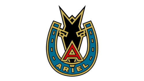
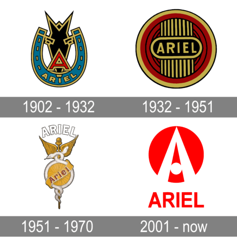
With the release of its first motorcycle, the company introduced quite an intricate emblem. A horseshoe of teal color with golden accents served as the base. It held the full name printed in golden, all uppercase letters without serifs. A large, red initial was placed in the center with a black geometric shape in the background. Thanks to darker colors, the logo looked masculine and confident.
1932 – 1951
The original Ariel logo featured a classy circular shape with a vertically striped golden column in the middle and an oval badge with the wordmark crossing it horizontally. The badge was executed in burgundy, gold, and black, with all the rounded remnants in burgundy, column, lettering, and the oval frame in gold, lines, accents, and the background of the banner — in black. The style of the emblem resembled art-deco interiors and the clean sans-serif inscription added a professional and modern touch.
1951 – 1970
The redesign of 1951 introduced a completely different badge for the brand. It was a light and ornate composition, which had a circular sheen as the main elements, but this time the wheel was yellow and featured a thick while frame. The frame of the circle formed a body of a white snake, which had its tail and head curved around a vertical yellow line, coming up and down from the wheel. The “Ariel” lettering was written in red and outlined in white over a yellow smooth ribbon, which was diagonally placed on the wheel.
Sometimes the ornate emblem was accompanied by an arched uppercase “Ariel” inscription above it. Executed in smooth bold line, it looked full and balanced.
This badge was used by the company until 1970 when it got closed for more than twenty years.
2001 – Today
The Ariel brand got its second life in 1991, yet it started specializing in cars, not motorcycles. The refreshed logo of the refreshed company was introduced in 2001 and featured the same circular shape but in a completely different execution.
The new logo boasts a solid red circle with a stylized white letter “A” on it. The “A” features a triangular shape with a very sharp peak. Its vertical bars come out of the circle’s contour and are separated by a red triangle in the middle of the badge. The horizontal bar of the letter is replaced by another circle, in white.
The stylized “A” is not only the first name of the brand, but it also looks like a road, narrowing to the horizon, a representation of movement, speed, motion, and progress.
Under the emblem, there is an uppercase “Ariel” wordmark in a slightly narrowed sans-serif typeface, executed in the same scarlet-red shade.
Font and color
The Ariel lettering from the brand’s official visual identity is executed in a very simple sans-serif typeface, which is similar to such famous font as Arial Narrow but also has a resemblance with Akhbar Bold and Neue Alte Grotesk Semi Bold.
The color palette of the Ariel primary emblem is composed of red and white, a powerful and delightful combination, evoking a sense of passion and energy. Though there are other variants of the emblem’s execution — a monochrome one, and silver, for the actual badge, placed on the car grille.
When executed in black and white, the Ariel logo looks progressive and contemporary, evoking a sense of style and expertise. In silver, it looks more luxurious and chic, with the glossy voluminous contours.


