Mitsubishi is one of the biggest Japanese manufacturers or automobiles. It was founded in 1870 by Yataro Iwasaki, and today is a part of the Renault–Nissan-Mitsubishi Alliance which is one of the world’s largest car-producing groups.
Meaning and history
The name of the company, Mitsubishi, is a derivative from two Japanese words: “mitsu” for “three” and “hishi” for “water chestnut”. It is a perfect example of the brand naming where a combination of two simple terms makes up a word, synonymous with progress, technology, and quality.
What is Mitsubishi?
Mitsubishi is the name of one of the largest and most reputable Asian automakers, which was established in Japan in the 1870s. Today Mitsubishi operates across the globe, producing all types of vehicles and parts for them.
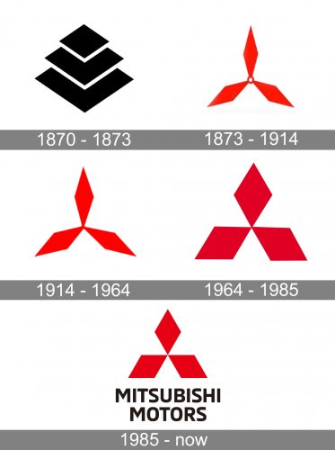
1870 – 1873
For the first three years after the company was established, it used both Iwasaki and Tosa crests, without any wordmark. It was more a symbolism than a brand’s visual identity, a tribute to the roots.
1873 – 1914
In 1873 the iconic emblem was created. It features three elegant thin rhomboids connected in the center of the image with a small circle. Today’s logo is already readable in the 1873’s version, but it is more modest.
1914 – 1964
The circle in the middle becomes a solid point, which makes the Mitsubishi logo look stronger and more confident.
In 1955 the wordmark appears on the logo. It is written in Japanese using a Mitarashi-ryu font. It adds modernity and elegance to the Mitsubishi logo. The color palette is now red and black, which is a great symbol of energy and stability.
1964 – 1985
In 1964 the logo gets a new shape, the one we can see today. The rhomboids become more balanced and bold. Now the Mitsubishi logo is harmonized and evokes a sense of reliability and expertise.
One more change of this time period is a company’s motto written above the emblem. It is in Japanese and can be translated as “with you today and tomorrow”.
1985 – Today
The Mitsubishi wordmark appears on the logo in 1985. The capital letters of the nameplate are executed in a traditional sans serif typeface with masculine straight lines, which are clean and direct. The wordmark features black color, which makes the logo strong and bright.
Later the nameplate changes to “Mitsubishi Motors”, but the typeface and color scheme remain untouched.
The classic powerful red black and white combination is a perfect choice for a minimalist and geometrical Mitsubishi logo. The straight lines and sharp angles reflect the brand’s energy and passion, evoking a sense of strength and authority.
The Emblem
The famous Mitsubishi emblem was created in the 1870s and is a celebration of the brand’s heritage and history.
The composition of three red diamonds, which is instantly recognizable worldwide today, is a graphical representation of the company’s name meaning.
The Mitsubishi emblem was designed based on two crests: the three rhombus for the founder’s family, Iwasaki, and the shape of three oak leaves, which was a crest of Tosa Clan, who were the first employers of Yataro Iwasaki.
Each diamond in the Mitsubishi logo reflects one of the company’s main values: reliability, success, and integrity.
This simple and straightforward approach made the Mitsubishi visual identity one of the most well-known across the globe. And the use of red color shows the brand as passionate, powerful and energetic.
The Mitsubishi emblem is a celebration of the company’s roots and has been a part of the Mitsubishi logo for more than a century. It was only slightly modified through the years, but the meaning and sense have always been there.
Font and color
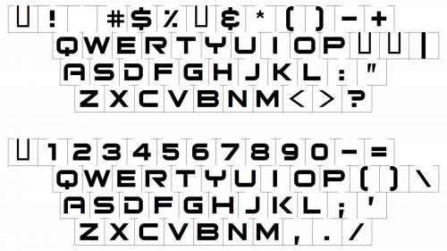
The bold uppercase lettering from the primary Mitsubishi logo is set in a modern and strong sans-serif typeface with stable letters, executed in bold clean lines. The closest fonts to the one, used for the Mitsubishi insignia, are, probably, Neo Sans Std Bold and ED Northridge Sans Extra Bold, but with some modifications.
As for the color palette of the Mitsubishi visual identity, since the beginning of the 1870s, it has been based on a combination of red and black, and by today not much has changed. The scarlet-red emblem looks powerful and represents excellence and precision, while the black lettering stabilized and grounds the badge, adding professionalism and confidence to the composition.
What does the Mitsubishi logo mean?
The laconic geometric badge of the Mitsubishi company is considered to be one of the most iconic symbols ever created. The graphic emblem of the brand is closely related to its name. The name Mitsubishi has its secret hidden meaning: it is a combination of the Japanese words “Mitsu”, which means “Three”, and “Hishi”, a water chestnut, which in Japan is considered a diamond. The official translation of the company’s name sounds like “Three diamonds”, and it can be seen on the badge. The logo of Mitsubishi is also a combination of the family coat of arms of the Iwasaki family in the form of a three-row diamond and the three-leaf crest of the Tosa clan.
Why is the Mitsubishi logo red?
Red is the color, which is often used by Japanese companies, as it can be seen on the official flag of the country, in its main element, the Rising Sun. Also, in Japanese culture, this color symbolizes good luck, and as history shows, good luck has always been following Mitsubishi. Red is also known to be a symbol of power and passion, confidence, and determination.


