Cagiva is the name of an Italian motorbikes manufacturer, which was established in 1950 as a metal detail producer, and changed its direction to motorcycles at the end of the 1970s. Today the company, headquartered in Varese, is very well-known and reputable across the world.
Meaning and history
The history of the company began in 1978 with the purchase of an old motorcycle factory, which used to belong to Harley-Davidson, by the two Castiglioni brothers, who owned several other metalworking enterprises in Italy. The young company was named after the father and hometown: CAGIVA = CAstiglioni GIovanni + VArese. The first motorcycles were produced under the name HD-Cagiva, but two years later, this name was changed to Cagiva. In the early 80s, the automobile industry crisis gained momentum in Italy, which allowed Cagiva to conquer the top of the market. Gradually, the company turned into an impressive concern. In 1999, the main brand of the company was MV Agusta, followed by Cagiva and Husqvarna. In 2000, the rebranding of Cagiva Group to MV Agusta Group begins. Seven years later, BMW bought the Husqvarna brand and the next year, MV Agusta was taken over by Harley-Davidson. The Castiglione family bought back the MV Agusta and Cagiva brands from Harley-Davidson in 2010.
1978 – 1985
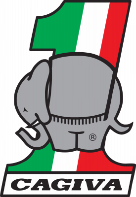
The original Cagiva logo already showcased the elephant, which has been its core part ever since. Unlike the minimalist modern logo, the old ones depicted the whole animal, not only its head.
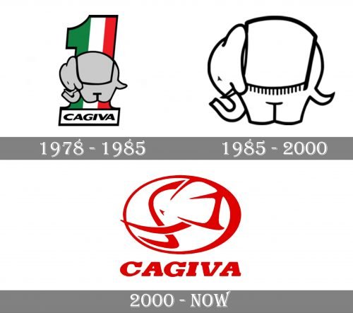
In the 1978 version, the creature was gray with black trim and was placed over the number “1.” The number combined a green stripe with white and red ones.
It had a flat sole housing the wordmark “Cagiva” in a bold sans.
1985 – 2000
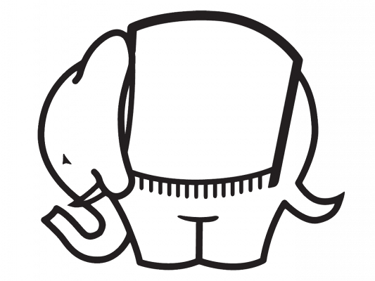
Only the elephant was left, while the “1” disappeared with all its colorful stripes. The animal was now white with a black outline.
2000 – Today
The Cagiva visual identity has always been bright and unique. Its funny mascot, an elephant, has always been a part of all the brand’s logos but has evolved a lot during the years, turning from a funny and bright image into a strong and modern emblem.
The Cagiva emblem is executed in the red and white color palette, which is a perfect reflection of power and passion, along with the energy to move forward and the brand’s loyalty to its customers.
The emblem with the wordmark under it is usually drawn in red and placed on a white background, but sometimes the colors are switched and white lines of the logo are being placed on scarlet red.
The main brand’s symbol, an elephant, is drawn in profile, looking to the left, and enclosed in a thick horizontal oval. The sleek and clean lines of the emblem represent a modern approach to the design and progressiveness of the company.
As for the wordmark, it is written in all capitals of a bold italicized sans-serif typeface, where the letter “C” is slightly extended. On the older version of the logo, which is also still used by the brand, the inscription features a custom serif font with massive square serifs.


