

![]() Heinz Logo PNG
Heinz Logo PNG
Founded in 1869, the H. J. Heinz Company is among the world’s oldest and largest food processing companies. The range of products it manufactures includes one hundred and a half #1 or #2 brands, according to the company. The most popular of them is the Heinz ketchup with the market share in the US exceeding 50%. After the merger with Kraft in 2015, the Kraft Heinz Company was formed.
Meaning and history
![]()
The visual identity concept of Heinz has always been based on the logotype, executed in whether red or black color palette. The brand, established in the middle of the 19th century, had only two redesigns of its emblem throughout the years, which says a lot about its stability, confidence, and value of the legacy and roots.
1869 – 1957
![]()
The original Heinz logo, designed in 1869, was composed of a bold red inscription placed on a white background. It was a capitalized logotype, executed in a custom rounded sans-serif typeface with its letters extended and solid, and a lot of space between the symbols. The simplicity of the composition was balanced by a bright and powerful color palette, which gave no reason to change the emblem for almost a century.
1957 – Today
![]()
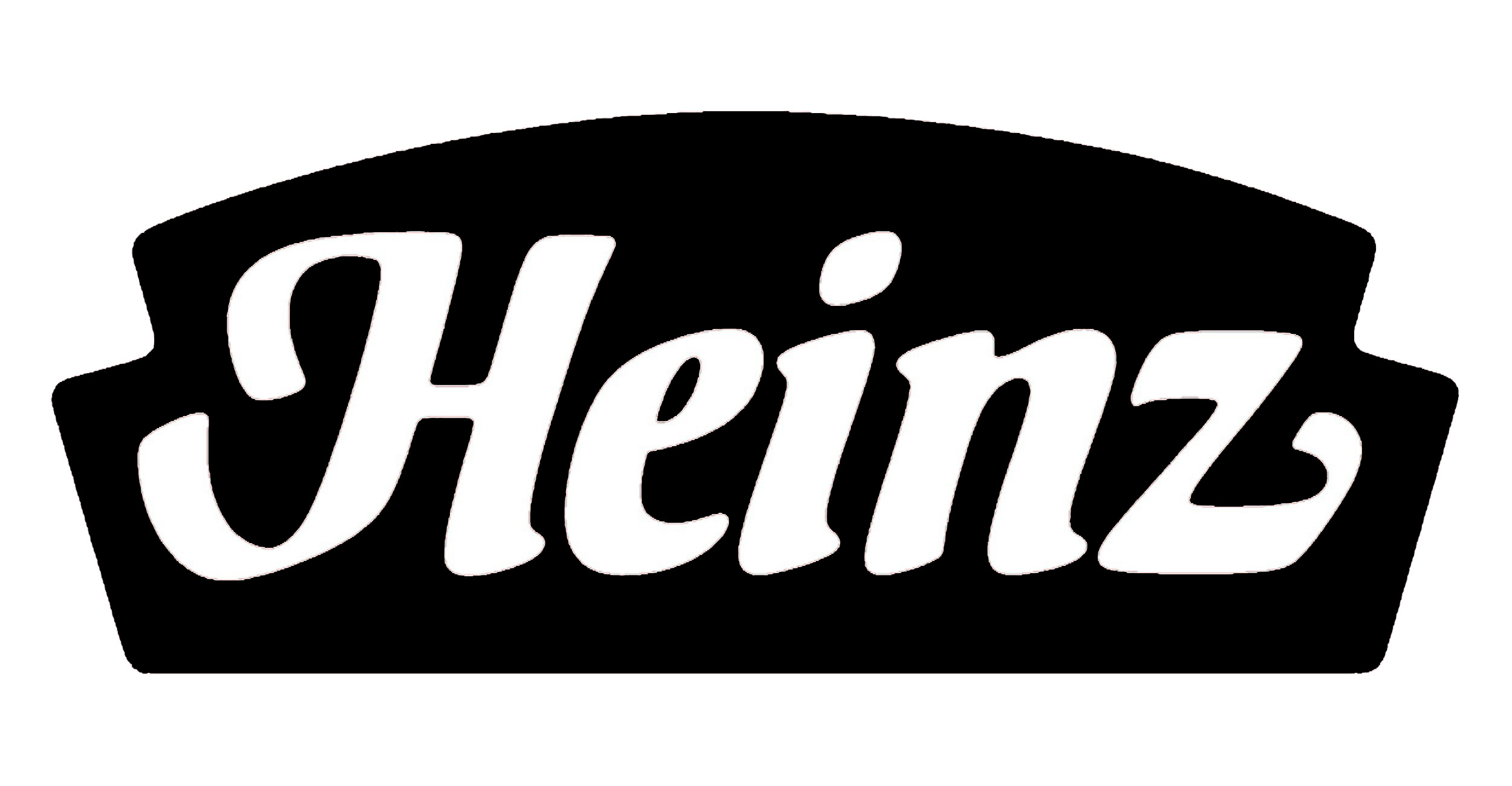
The first redesign for held by the company only in 1957 and the logo created in that year is still used by the brand along with the one, designed later, in 1989. The emblem from the 1960s featured an arched logotype in monochrome, written in all capitals of a custom typeface with thick straight lines and slightly elongated and pointed ends of the letters, which add some playfulness and elegance to the inscription.
1989 – Today
![]()
The logo, introduced by Heinz in 1989, boasts an elegant title-case inscription with its white letters placed on a scarlet-red banner with an arched top and geometric bottom parts. The lettering is executed in a custom typeface with a slight inclination it the right, and evokes a very warm sense, showing the brand’s love and attention to its customers.
Symbol
The Heinz symbol calls to mind a keystone. This similarity isn’t mere coincidence; it reminds that the brand is based in Pennsylvania, the so-called keystone state (the company has been headquartered here since 1890). If you take a look at the logo of the Pennsylvania state, you may notice an obvious visual similarity between it and the Heinz logo.
Emblem
In addition to the “keystone” logo, we should also mention the “Heinz” inscription the company puts on its labels. The word is written in a plain sans-serif font. Unlike the regular logo, where the letters are written along a single line, here they form an arch.
Colors
![]()
The logo features a specific shade of red called Heinz Red (Pantone 485). This color choice reflects the company’s origin: it is only natural for a ketchup maker to have an emblem colored the same as a ripe tomato. Alternatively, the logo may appear in black or Heinz Gray (Pantone 409). The company also mentions Pickle Green among the acceptable color choices. These colors are used for the keystone shape, while the Heinz text is negative.
Font
![]()
Customized typeface used in the emblem looks smooth and curvy. Letters are written in the italic font.
![]()


