

Punk music is often characterized by proneness to conflict and paradoxes. Even if rhythms and melody lie in the foundation of this music, the bands will do everything possible to make the first impression very contradictory. Logotypes of punk bands are always full of inner conflicts and paradoxes.
10. Dashboard Confessional
![]()
Dashboard Confessional is the band that plays both punk and emo-rock music and its logo contain a wide range of hardly matching elements. The winged anchor with the classic arms in its center highlights conflicts and contradiction underlying this music genre. The font is also used in the logo, but it doesn’t draw much attention having a simple functional and informational role.
9. Husker Du
![]()
Tearing in the middle of Husker Du logo is its most well-known feature. You can recognize it even before you read it. Formally, its font seems to be simple – letters are of different size, the contours are uneven – it looks like it was written by a shaking hand.
8. Daft Punk
![]()
For Daft Punk band, punk music was an obsession during a short period of time, but it played a crucial role for its formation. The logotype was introduced during this period, too. A bit later, the band continued creating music with punk elements.
Daft Punk logo seems to be made of mercury – each letter merges into another, but still stays autonomous and original.
7. Buzzcocks
![]()
Buzzcocks punk band logo consists of font only. The British band decided not to use images, but this logo is still rich in graphics: the original shifting of ZZ letters makes this logotype recognizable.
6. Weezer
![]()
Weezer logo combines both text and image, although the band uses the image only – W letter with wings. Green color on the white background is rarely used, and even contrasting contours were not necessary. In comparison with many other logotypes used by punk groups, Weezer has horizontal elements – wings. At the same time, both foundations are sharp and conflicting.
5. Grateful Dead
![]()
The provoking logo of Grateful Dead band has combined a few symbols of punk music. First, it’s the skull, lightening, and the double circle that symbolizes harmony and order – it embraces the acute and contradictory elements. The image consists of two contrasting colors – white and black – with black color prevailing.
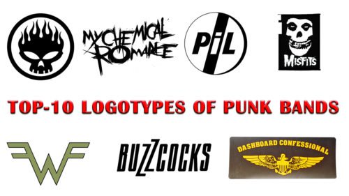
4. Misfits
![]()
The logo of Misfits band is as interesting as other design solutions. In fact, it’s a secondary image – initially, this image was created for the poster of The Crimson Ghost movie (1979). Besides, this font was used on the cover of Famous Monsters of Filmland magazine. However, the combination of these objects appeared to be quite original and helped the band to earn millions.
3. Public Image Ltd
![]()
Fans call the logo of Public Image Ltd a “hockey puck” because it has a similar form. The classic contrast color solution makes the logo bright and appealing. The form of the circle accentuates harmony and completion. At the same time, none of the lines is horizontal or vertical. The lines are diagonal, which highlights dynamics and readiness for movement, and at the same time – a violation of standards for the sake of development.
2. My Chemical Romance
![]()
American band My Chemical Romance used a deliberately inaccurate and loose font. Huge strokes seem to be brushed, and they remind of the first graffiti made with colors and brushes, not with aerosols. The font plays the role of both text and image.
1. The Offspring
![]()
Flaming skull – The Offspring logo – expresses the character of the band, attracts attention and is easy to remember. The contrast of red and yellow colors fixes attention. The orange contour closes the composition and finishes this composition.
These are ten most original logotypes used by punk bands, but our chart could include some other images. Every logotype contains an original and recognizable message.
Conclusion
In the vibrant world of punk rock, the essence of a band’s identity is often encapsulated in its logo. The journey from an initial chord to an iconic symbol is a testament to the power of logo design, especially within the diverse musical palette of punk. This article delves into the anatomy of the most popular punk bands’ logos and brands, showcasing how each logo serves not only as a profile photo on social media but as the perfect visual expression of the band’s branding.
Punk logo design is far from monolithic; it is a rich tapestry that spans the energetic pop of post-punk to the depth of metal, including subgenres like death metal and black metal. A good punk logo captures the essence of our music, embodying the music’s soul and presenting the band’s personality in every curve and color. These artworks are the first encounter fans have with the genre-bending music that awaits them, making every band logo design a critical piece of the band’s overall image.
The creation of a perfect punk logo involves a blend of creativity, craftsmanship, and a keen understanding of the genre’s ethos. The design elements must resonate with the musicians and drummers, reflecting the raw energy and exclusivity of the punk rock band. For example, the iconic Black Flag logo is more than just an image; it’s a symbol of rebellion and authenticity that speaks to fans across generations. This level of quality designs requires a professional designer or a team of professionals who can channel the band’s personality into a visual form that stands the test of time.
Selecting a punk band logo goes beyond mere aesthetics; it’s about finding the perfect punk logo that aligns with the band’s essence and stage of their career. From the initial sketches to the final, revamped logo, the creative process is a collaborative journey between the band and the designer, ensuring that the final product is not just an artwork but a reflection of the band’s soul. Transparent PNG logos, social media photos, and even podcast show visuals become cohesive components that enhance the band’s presence across various platforms.
The diversity in punk logo design reflects the genre’s evolution and its broad appeal. From the stark simplicity of classic punk to the intricate designs of genre-bending music, each selection of punk band logos offers a window into the depth and diversity of punk culture. The iconic designs give each band logos an edge, transforming them from mere graphics to powerful emblems of punk’s rebellious spirit.
In conclusion, the journey of crafting an authentic logo is integral to capturing the essence of punk music and its diverse subcultures. The perfect punk logo serves as a beacon for fans, a symbol of the band’s identity, and a testament to the creativity and professionalism behind its creation. As bands continue to explore and redefine the boundaries of their genre, their logos remain a constant, powerful reminder of punk’s enduring influence and the creativity it inspires. This exploration of punk band logos and brands not only celebrates the visual side of punk music but also highlights the intrinsic link between a band’s identity and its visual representation, showcasing the enduring power and significance of punk logo design in shaping the visual landscape of music.


