The Oracle Corporation is a multinational company developing and selling computer hardware and software. It is based in Redwood Shores, California.
Meaning and history
The company founded in 1977 was initially named Software Development Laboratories. Five years later it was renamed Oracle Systems Corporation, which was the moment when the need for a new logo arose. The corporation developed two versions of its logo: the Oracle Signature and the Oracle Red Badge.
The Signature Oracle logo includes the name of the company (red) on the white background. The wordmark looks pretty similar, but the colors are reversed: the name of the company is given in white on the red background. Also, for onscreen use, a custom RGB gradient may be applied.
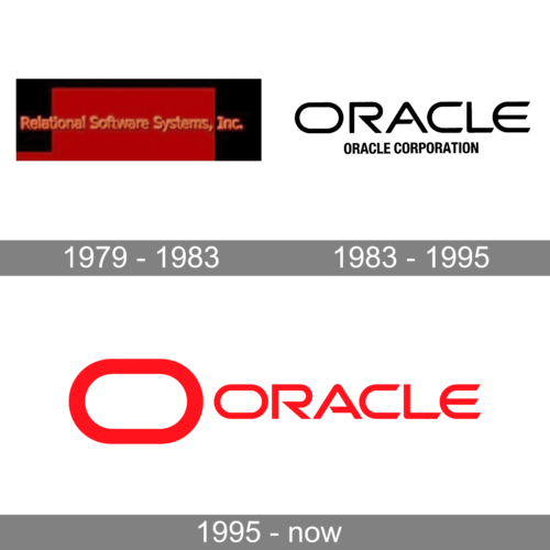
1979 – 1983
The image shows a logo that appears to be from an earlier era of digital design, indicative of the nascent stages of technology companies. The logo reads “Relational Software Systems, Inc.” in a serif font that is suggestive of typewriter text, reflecting a period when computing was still heavily associated with traditional business practices. The color palette is a monochromatic red against a darker backdrop, which may imply a bold, pioneering spirit in the field of software development. The typeface and the layout give a classic, almost vintage feel, potentially dating back to the times when software companies were building the foundational structures of modern computing. The name itself, “Relational Software Systems,” denote an early focus on databases or systems designed to manage and relate complex sets of data—a practice that has become even more crucial in today’s data-driven world.
1983 – 1995
The logo displayed is a straightforward yet bold typographic representation of the Oracle Corporation. Featured prominently in a stark, heavyweight, sans-serif font, the name “ORACLE” exudes strength and stability. The letters are black, creating a sharp contrast against the white background, which ensures high visibility and immediate brand recognition. The text “ORACLE CORPORATION” below the main brand name is smaller in scale but follows the same font style, maintaining the logo’s overall cohesive and assertive appearance. This logo design aligns with Oracle’s industry reputation as a powerhouse in computer technology, particularly in databases and enterprise software solutions. Its no-frills, clear-cut design communicates the company’s focus on delivering straightforward, reliable, and high-quality technological products and services. The choice of capitalization in the logo conveys a sense of authority and leadership within the tech sector.
1995 – Today
The logo presented in the image is that of Oracle Corporation. It is a simple yet bold design, consisting of the company’s name in a stark, sans-serif typeface, colored in a bright and assertive red. To the left of the wordmark is an abstract, rectangular shape, also in red, which has a distinctive cut-out suggesting a stylized “O”, for Oracle. This geometric form is suggestive of a portal or an entryway, hinting at the company’s role as a gateway to technology and innovation. The solid red color of the elements symbolizes energy, passion, and action, which are qualities that the brand aims to be associated with. The simplicity of the design lends itself to versatility, making it easily recognizable and effective in a variety of media. This logo conveys Oracle’s identity as a forward-thinking, authoritative presence in the tech industry, with a focus on clarity, efficiency, and modernity.
Symbol
 Hardware products manufactured by Oracle feature an emblem comprising two logotypes: the regular Oracle logo and a revised symbol of the now defunct company Sun Microsystems, Inc., which was purchased by Oracle Corporation in 2010.
The Sun logotype developed by professor Vaughan Pratt (Stanford) was orange, then blue and eventually went grey. Originally, the sides of the square were oriented horizontally, but in 1983 it was rotated.
Font
The minimalistic yet recognizable custom type is one of the things that contribute to the overall visual appeal of the wordmark. The clear sans-serif font looks unique, the most unusual characters being probably “E”, “A”, and “R”.
Color
Both the versions of the Oracle logo feature the same shade of red, which is called the Oracle Red (Pantone PMS 485). It is complemented with white. In some cases, for instance, in newspapers, a black-and-white version may be used.
What systems are under Oracle?
Oracle is the second-largest software producer by revenue, and the largest manufacturer of software for organizations, a major supplier of server hardware. The company’s most famous product is Oracle Database, which the company has been producing since its founding. Apart from that, the portfolio of the corporation includes such products as Oracle Private Cloud, Oracle Exadata, and Oracle Zero Data Loss Recovery.
Is Oracle trademarked?
Yes, the Oracle brand, it’s name, and its logo are trademarked, with all the rights owned by the Oracle Corporation.
Can I use the Oracle logo?
You can not use the Oracle logo without an official permission from the copyright holder, as all the visual identity elements of the Oracle brand, along with its name, are trademarked.


