The Kelloggs logo has gone through occasional minor changes, yet it has stayed mostly consistent in terms of color and the overall design.
Meaning and history
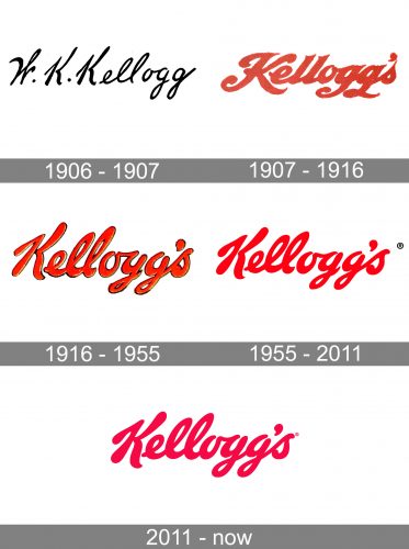
The visual identity of the iconic brand has always been based on a signature. With its appearance in the very first emblem, the iconic cursive lettering has grown into the main hero of the badge, getting its lines strengthened and modernized by today.
1906 – 1907

The Kellogg’s logo from 1906 was composed of a rectangular badge with three-leveled lettering and small red details placed on the upper corners of the emblem. The lettering featured a “Battle Creek Toasted Corn Flake Co” in bold capitals, written in dark green, and a thin handwritten signature in black placed above it.
1907 – 1916
The Kellogg’s iconic logo was first designed in 1907 and was based on William Kellogg’s signature. According to the brand’s legend, at the beginning of its history, Kellogg signed each package personally, so his signature became the company’s logo.
1916 – 1955
The lines of the iconic logotype were refined in 1916, getting more space between the letters of the inscription and their contours widened. The color palette was also refreshed, and now the main shade of the letters was light red, framed in a confident black outlined which allowed placing the logo on all the possible backgrounds.
1955 – 2012
Since the first logo was created, there were only two significant redesigns made. First of them, in 1955, when the lettering was refined and gained a new typeface as well as a more intense red color.
2012 – Present
The second Kellogg’s redesign was made in 2012 and brought a new palette and a slightly modernized typeface. The wordmark of the brand is executed in a custom drawn font, which was created based on the William Kellogg’s handwriting, but the closest available typeface is Ballpark Weiner. The font, designed by Mickey Rossi, is one of a few, similar to the famous logotype.
The bright red color of the inscription gained a more burgundy shade and became more elegant and confident. The color is now more calm and luxurious.
The Kellogg’s logo is instantly recognizable and perfectly balanced. There is nothing that can be added to it. A great timeless visual identity design.
Authors of the symbol
The person who developed the current logotype was Ferris Crane, while his art director was a well-known typeface creator Andrew Y. Ames.
Emblem
The current emblem, which was developed by Interbrand in 2014, may seem almost identical to the previous one, except for the shade of red. However, there has been more than just a shift in the color palette. If you overlay the two versions, you will notice that the shape of the letters is different. The only character that has stayed almost the same is “K”, while all the other letters have grown a bit smaller.
Font
The typeface featured in the Kelloggs logo is close, but not identical to the Lavanderia font. Also, the company uses a custom font called Kellogg’s Sans.
Color
The logo has been built around the red-and-white color scheme since 1907, but it has not always been the same shade of red.


