The earliest Marvel logo, which was created in 1939, reflected the original name of the company, Timely Comics. It was placed inside a shield shape. The 1951 logotype reflected the change of the company name to Atlas Comics.
Meaning and history
The visual identity of Marvel was set at the beginning of the 2000s after its iconic red and white logo was introduced. For the Marvel Studios brand, the logo was slightly redesigned, by adding the second part of the nameplate. Throughout the years the tagline was changed and placed in and out of the main badge, though its red rectangular emblem with the white lettering has never been changed since
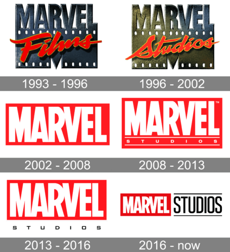
1993 – 1996
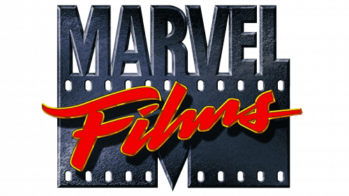
The Marvel Films logo from 1993 used the wordmark of the company depicted as if made of metal. Here, it stood on a wide letter ‘M’ that is also used by the company as a sort of secondary emblem. There was also a red & yellow cursive word saying ‘Films’ across this second part.
1996 – 2002
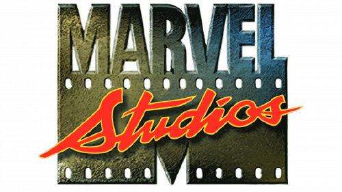
Much in the logo stayed the same, except they added a yellow illumination effect to the left side of the emblem, as well as changed ‘Films’ to ‘Studios’.
2002 – 2008
For several years, Marvel Studios used the typical emblem of the company – a red rectangle with the usual white wordmark written on it.
2008 – 2013
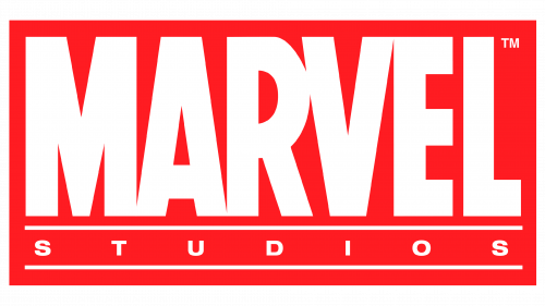
The logo, created for Marvel in 2008 featured an iconic scarlet-red rectangle with w narrowed white sans-serif lettering on it. All the thick letters were placed close to each other and even glued at some points. The bottom part of the badge featured two thick parallel lines and the word “Studios” between them. The inscription in all capitals was executed in a lightweight expended sans-serif font with symbols placed far from each other.
2013 – 2016
The redesign of 2013 placed the “Studios” part under the main badge, writing it in black and putting in a white background without any framing. The typeface of the tagline was also changed, and now the inscription was set in a lightweight square typeface with clean straight lines.
2016 – Today
The logo for Marvel Studios we all can see today was introduced in 2016 and featured a horizontally stretched rectangular badge, which is vertically divided into two equal parts — the red with “Marvel” inscription on the left, and the white with the “Studios”, written in black narrowed sans-serif, on the right. The inscription from the right part is placed between two horizontal lines, which are also black, and looks professional and stylish.
Emblem
With each modification, the Marvel wordmark was getting closer and closer to its modern look. The combination of white and red has been featured in the logo since 1990.
Symbol
For more than a decade in 1990-2002 a distinctive “M” (resembling the MTV logo) was part of the logotype, but the company eventually opted for a simpler sans serif wordmark. The latest modification took place in 2012. It was quite a subtle update hardly noticeable unless you compared the two versions side by side.
Font
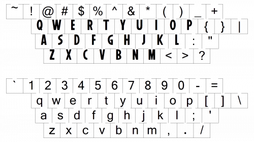
The typeface looks very close to the font called Benton Sans Extra Comp Black font. The regular version of the typeface was designed by Cyrus Highsmith and Tobias Frere-Jones.
Color
The bright shade of red featured in the Marvel logo creates an excellent background for the white lettering.


