Being very young, the ice hockey team Las Vegas Golden Knights has had only one primary logo so far. While focusing on the knight theme with such long-time symbols as a shield and a helmet, the emblem also pays tribute to Las Vegas.
Meaning and history
The National Hockey League held its first game in Las Vegas in the early 1990s. Las Vegas has been the place where the Frozen Fury competition has been held ever since. However, it was only in 2014 that rumors spread about the city’s own expansion team. The following year, the NHL started to take bids on expansion teams officially. The bid for a Las Vegas team submitted by businessman Bill Foley and the Maloof family was approved in the summer of 2016, while the first player, Reid Duke, was signed in March 2017. Today, the franchise is still the property of Bill Foley and his family as well as the Maloof family.
2016 – 2017
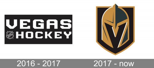
The team introduced its first logo in 2016, five months before the final version was unveiled in advance of the 2017/18 playing season. In fact, at the time the club didn’t even have a name, so the “knight” theme wasn’t even present here. While being quite simple, the temporary logo still did have mood and style. The white lettering “Vegas Hockey” paired with the NHL insignia appeared on the solid black background. The typeface was recognizable due to cut corners on many of the letters.
2017 – Today
The 2017 symbol
The name was chosen due to its noble symbolism. As Bill Foley, the majority owner, pointed out, “knights are the elite warrior class.” The knight helmet, which is the visual center of the Vegas Golden Knights logo, is grey and gold with black and white highlights. It is placed in a black shield with a golden outline. The way it overlaps the frame creates a subtle 3D hint as the helmet seems to be closer to us than the shield.
Another important detail is the letter “V” seen in the negative space, which stands for Las Vegas.
Alternative emblem
The secondary logo further elaborates on the knight team, this time focusing on another popular knight symbol, a sword. There’re two crisscrossed swords behind the star from the legendary “Welcome to Las Vegas” sign.
Font
While the main Vegas Golden Knights logo doesn’t contain the team’s name, the team also has a wordmark insignia that can be used either in combination with the icon or on its own. The insignia has been probably drawn by hand rather than just made up out of an existing type. The glyphs seem to fit the brand identity very well as they look a bit like neon signs burning brightly in the night.
Color
While the official palette includes four colors (steel grey, gold, red, and black), only three of them can be seen on the primary Las Vegas Golden Knights logo – all, except red. Red is used on the kits, though, where it adds an edge as an accent color.
Each of the colors comprising the color scheme was chosen because of its symbolic meaning:
- steel grey symbolizes strength and durability
- gold represents the team’s home state, Nevada. It is known as the country’s largest source of gold. Also, shades of yellow can be often seen in the local landscape.
- red reminds the city’s skyline and Red Rock. It was also chosen as the color symbolizing the readiness to serve
- black stands for such qualities as power and intensity.
Vegas Golden Knights Colors
GOLD
PANTONE: 465 C
HEX COLOR: #B4975A;
RGB: (185,151,91)
CMYK: (9,29,66,24)
STEEL GRAY
PANTONE: PMS 432
HEX COLOR: #333F42;
RGB: (51,63,72)
CMYK: (65,43,26,78)
RED
PANTONE: 186 C
HEX COLOR: #C8102E;
RGB: (200,16,46)
CMYK: (2,100,85,6)
BLACK
HEX COLOR: #000000;
RGB: (35,31,32)
HSB: (344,11,13)
CMYK: (0,0,0,100)
WHITE
HEX COLOR: #FFFFFF;
RGB: (255,255,255)
HSB: (42,0,100)
CMYK: (0,0,0,0)


