

![]() Columbus Blue Jackets Logo PNG
Columbus Blue Jackets Logo PNG
Columbus Blue Jackets history started in the fall of 1996 when a group of businessmen submitted an application and fee to the NHL office with the aim of establishing an expansion franchise.
Meaning and history
![]()
Columbus Blue Jackets is one of the youngest hockey clubs in North America, but even though it was only established in 2000, the club has already undergone one major rebranding, changing its bright logo to a sleeker and a more serious one.
What are Columbus Blue Jackets?
Columbus Blue Jackets is the name of a professional hockey club in the United States, which was established in 2000 in Columbus, Ohio. Today the club competes in the National Hockey League, being one of the youngest members. The Blue Jackets have Nationwide Arena as its home stadium, and Brad Larsen as the head coach.
2000 — 2007
The original logo for Columbus Blue Jackets was designed by Ken Loh in 2000 and featured a bright stylized badge, where the letter “B” was formed by a red ribbon with thirteen white five-pointed stars on it, and the “J” was drawn as a yellow hockey stick with a star in two shades of blue placed on its top. The green movement was outlined in white and had a wide blue shadow, which made the whole image dynamic and strong.
![]()
Along with the primary version of the badge, the team also used various icons with its mascot, a funny fly is a blue jacket. The insect had its red eyes enlarged looked hilarious with a war gun in its arms. Depending on the placement, the mascot could be accompanied by a smooth wavy banner with the team’s name in all capitals on it.
Two more versions were created for the team during the beginning of the 2000s, but they were used as secondary options and became official emblems of the club in 2003.
2003 — Today
The new logo, introduced by the team in 2003, was fully based on the alternate version from the previous years, a stylized gray and white five-pointed star in a thick blue outline, surrounded by a smooth white and red striped flat with a blue starry triangle on its right part. The solid red dot in a white outline is placed in the center of the triangle, symbolizing the hockey puck.
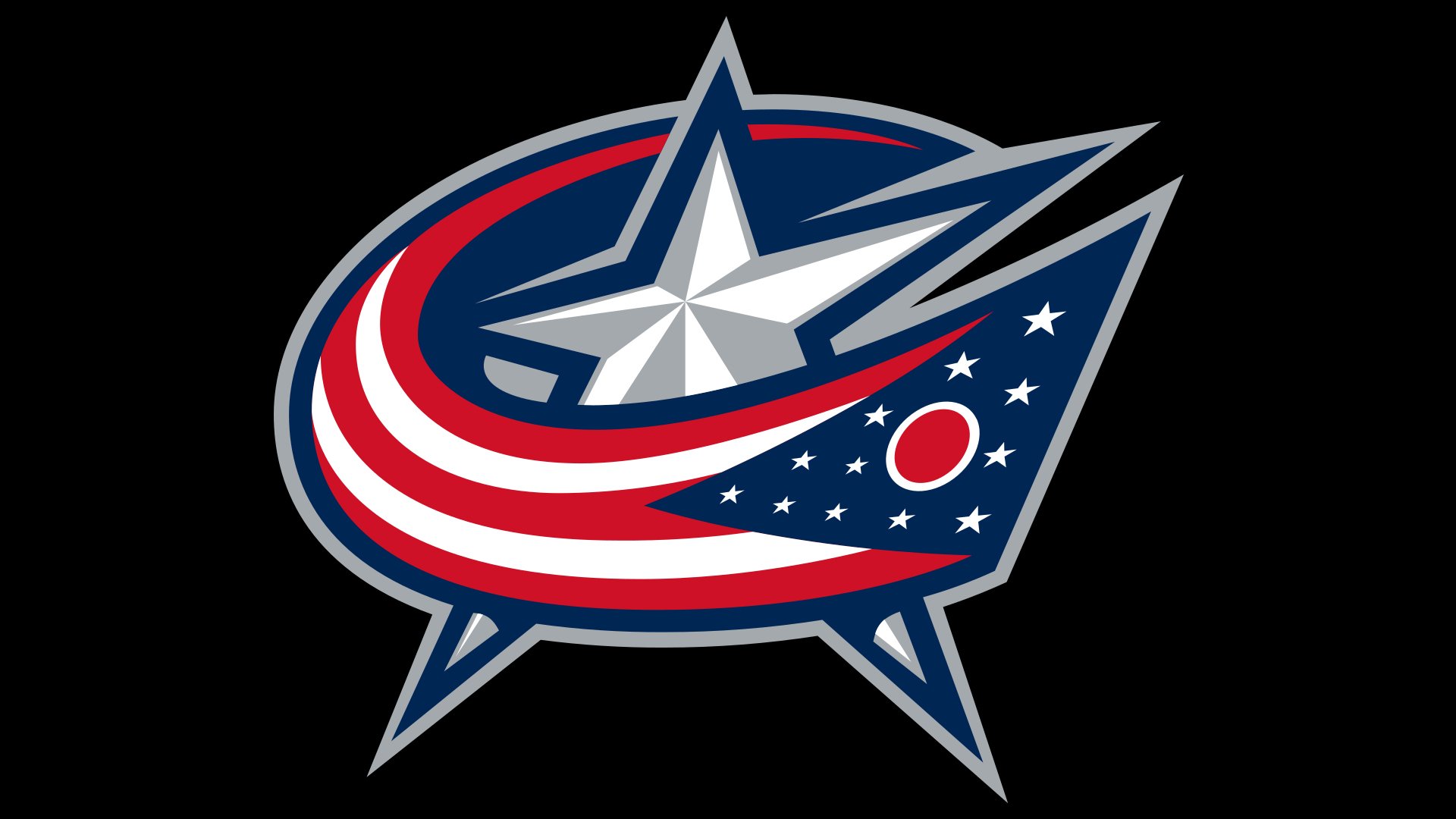
Another emblem used by the club today was also created in 2000 and featured a circular badge in a thick blue frame with a white inscription around its perimeter. The middle part of the emblem is executed in red and has a blue and gray had with a five-pointed star, placed on it.
Font
With their retro serifs, the glyphs look unique and recognizable without losing legibility. The wordmark is rather a custom artwork than a combination of letters taken from a ready-made font.
Color
The club’s official logo style guide lists three colors: blue (Pantone Color Matching System: 282), red (PMS 186), and flat silver (429). As an alternative to flat silver, metallic white silver (PMS 877) may be used. The Columbus Blue Jackets logo also features white as an additional color.
Columbus Blue Jackets Colors
UNION BLUE
PANTONE: 282
HEX COLOR: #002654;
RGB: (0,38,84)
CMYK: (100,90,13,68)
GOAL RED
PANTONE: 186 C
HEX COLOR: #CE1126;
RGB: (206,17,38)
CMYK: (2,100,85,6)
CAPITAL SILVER
PANTONE: 429 C
HEX COLOR: #A4A9AD;
RGB: (164,169,173)
CMYK: (21,11,9,23)


