

![]() Vancouver Canucks Logo PNG
Vancouver Canucks Logo PNG
The ice hockey team Vancouver Canucks has had three different logos. The latest hockey team logo has been modified once, yet it didn’t lose its recognizable core.
Meaning and history
![]()
The history of the Vancouver Canucks visual identity is very intense and bright. The club, which started in the 1950s, enjoyed experimenting with different graphical elements, and this brought us many emblems to look at — from a hockey player to orca, or an extremely minimalist badge, which could easily suit any financial corporation or fashion label.
What are Vancouver Canucks?
Vancouver Canucks is the name of a professional hockey club from Canada, which was established in 1945. Today the club competes in the National Hockey League as a member of the Western Conference. Canucks have Rogers Arena in Vancouver as their home stadium and Bruce Boudreau as the head coach.
1952 — 1964
![]()
The very first logo of Vancouver Canucks depicted a skating hockey player, drawn in the blue, white, and red color palette. The logo got nicknamed “Johnny Canuck” and is still remembered by the club’s fans, as was placed on the uniforms for quite a long time even after the official logo replacement.
1964 — 1970
![]()
Johnny Canuck was redrawn in a blue and white palette in 1974. This time he was not skating with the hockey stick in his hands but was kneeling, and it felt like the player was honoring hockey. This version of the logo stayed with the club for another six years, until they joined NHL.
1970 — 1978
![]()
The redesign of 1970 brought an elegant and stylish logo, designed for the team by Joe Borobudur. Even today the Vancouver Canucks badge from the 1970s is considered to be one of the most outstanding ever.
The horizontally oriented rectangular badge in blue had its corners softened and rounded. The emblem was enclosed in a double white and green outline, where the green part was a bit thicker. The whole hockey stick was placed horizontally on the badge, with its handle coming out of the right part of the composition.
1978 — 1997
![]()
In 1978 the iconic minimalist logo was changed to a new bright image, composed of a striped black red and yellow circle in a thick red outline with a yellow diagonal inscription stylized as the skate’s blade, and underlined by an elongated tail of the first “C”.
1997 — 2007
![]()
The new symbol was adopted by the hockey club in 1997, it was a dark blue orca with a dangerous where and red “smile”. The animal was coming out of the upper part of the stylized blue letter “C”, repeating its contour. The body of the letter was executed in a lighter shade of blue and had some thin and delicate gray and red accents on it.
Along with the new orca logo, the minimalistic badge with the hockey stick was also in use by Vancouver Canucks during this period, though the sophisticated blue, green and white color palette of the original version was switched to a more powerful and passionate blu, light gray and red.
2007 — 2019
![]()
The color palette of the emblem was changed to black, blue, gray, and white, with all the red elements removed, in 2007. Another change was about the composition of the emblem, as the “Vancouver” wordmark was added above the orca-C. The lettering in all capitals was executed in a clean and slightly narrowed square sans-serif typeface in a dark blue color, repeating the main shade of the “C”.
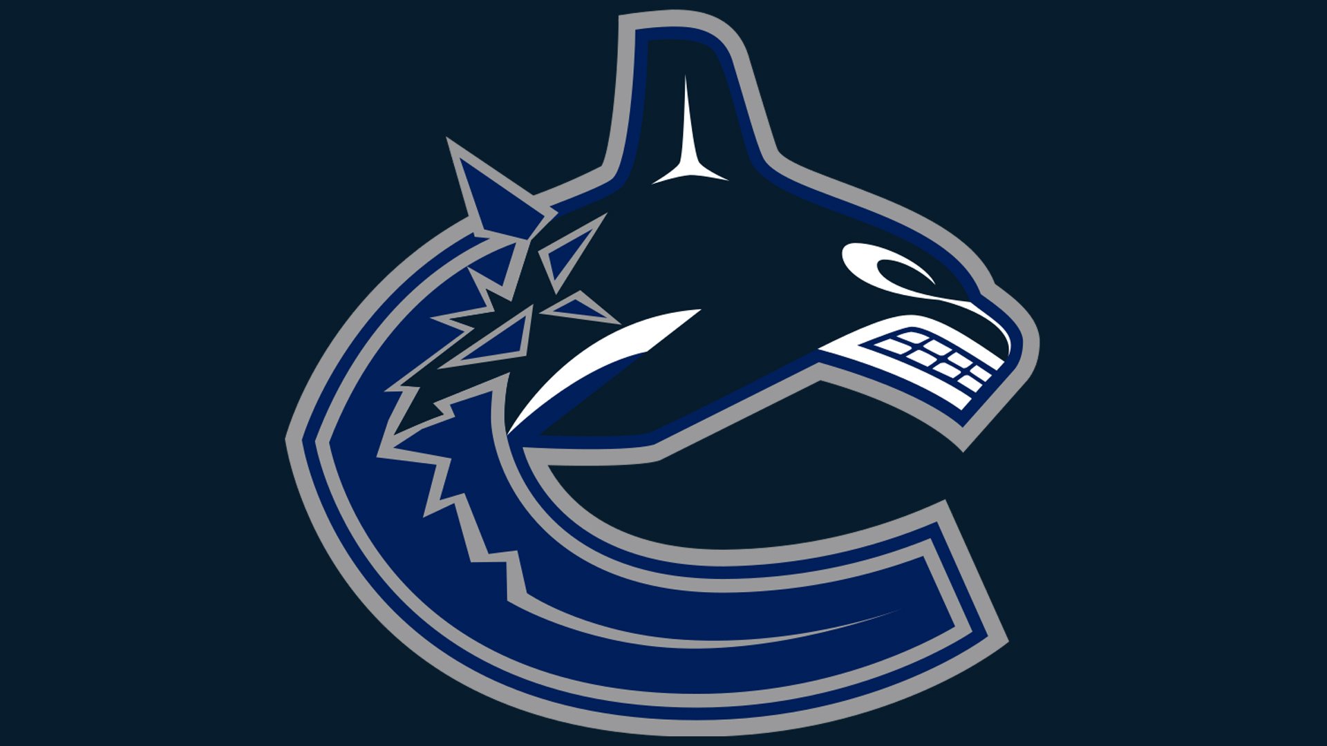
2019 — Today
![]()
With the redesign of 2019, the color palette was switched again, with the black orca from 2007, turning dark blue, and the letter “C” becoming two tones lighter. The lettering is remodeled from the official version of the visual identity, though can be used on the secondary bodies if needed.
The iconic Joe Borovich emblem is still in use by Vancouver Canucks and today it is executed in its original color palette, but with white as the main background color. And the hockey stick in blue.
Symbol
Vancouver Canucks logo history started a new era in 1997 when the iconic whale logo was unveiled. The emblem featured a Haida style orca whale with an aggressive expression on its “face.” The creature was breaking out of the ice. The design represents the letter “C” (for “Canucks”) with its upper part formed by the whale’s body and its lower part formed by the ice.
Emblem
The latest Canucks logo update took place in 2008. The new logo leaves the orca whale design untouched but adopts a more discreet color scheme.
Font
The wordmark features a simple sans serif type. The letterforms are based on a rectangular shape with slightly rounded corners on some glyphs.
Color
![]()
While the team’s uniform features blue, green, and white, the color palette of the Vancouver Canucks logo is different. Here, grey is used instead of green. The shades are close to the following ones: Pantone: 281 C (blue), PMS 348 (green), and PMS Cool Gray 7.
Vancouver Canucks Colors
BLUE
PANTONE: 281 C
HEX COLOR: #00205B;
RGB: (0 32 91)
CMYK: (100 85 5 36)
GREEN
PANTONE: PMS 348 C
HEX COLOR: #00843D;
RGB: (10,134,61)
CMYK: (96,02,100,12)
DARK BLUE
PANTONE: PMS 296 C
HEX COLOR: #041C2C;
RGB: (4 28 44)
CMYK: (100 73 28 86)
GRAY
PANTONE: COOL GRAY 7HEX COLOR: #99999A;
RGB: (153,153,154)
CMYK: (00,00,00,47)
WHITE
HEX COLOR: #FFFFFF;
RGB: (255,255,255)
HSB: (42,0,100)
CMYK: (0,0,0,0)


