

![]() Philadelphia Flyers Logo PNG
Philadelphia Flyers Logo PNG
The Philadelphia Flyerslogo has held practically identical appearance, with the only exception with the subtle color modification in 1990.
Meaning and history
![]()
There are constant clubs, which only slightly refine their logos throughout the years, and there is the Philadelphia Flyers hockey club, which still uses the emblem, created for it in 1967, with almost no modifications at all.
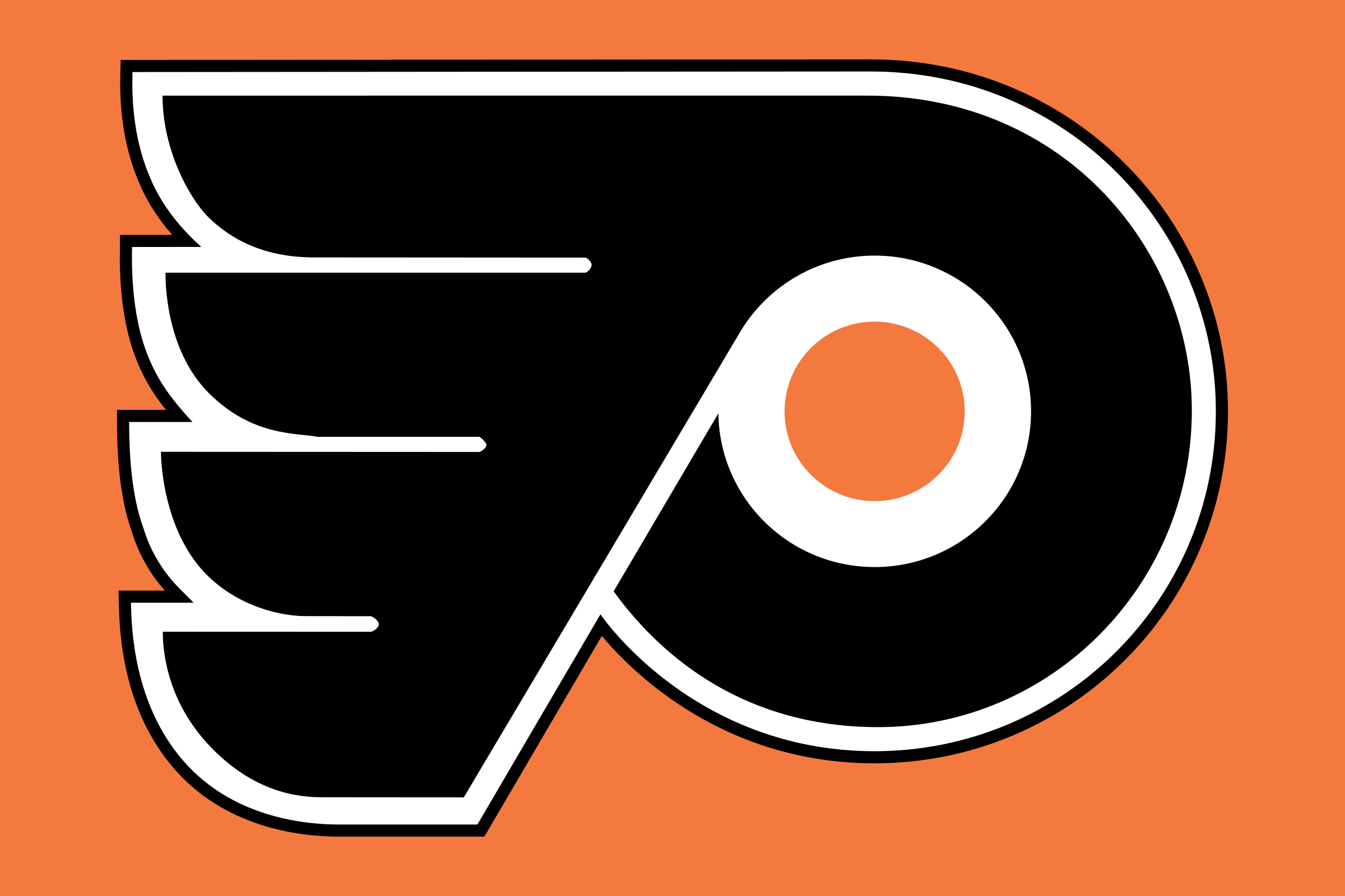
1967 — 1999
![]()
The original Philadelphia Flyers’ visual identity, introduced in 1967, was designed by Sam Ciccone and boasted an interesting rounded shape with a stylized wing on its left. The image featured black color as the main and was outlined in white and block, with the smaller white circle in the middle of the emblem’s rounded part, and a solid orange dot in its center.
The whole winged composition resembles the letter “P”, for Philadelphia, and the whit encircle with an orange dot stands for the hockey puck. Though the symbolism of the team’s logo is pretty obvious and simple, the badge looks unique and progressive and became one of the most recognizable and iconic hockey logos in the world.
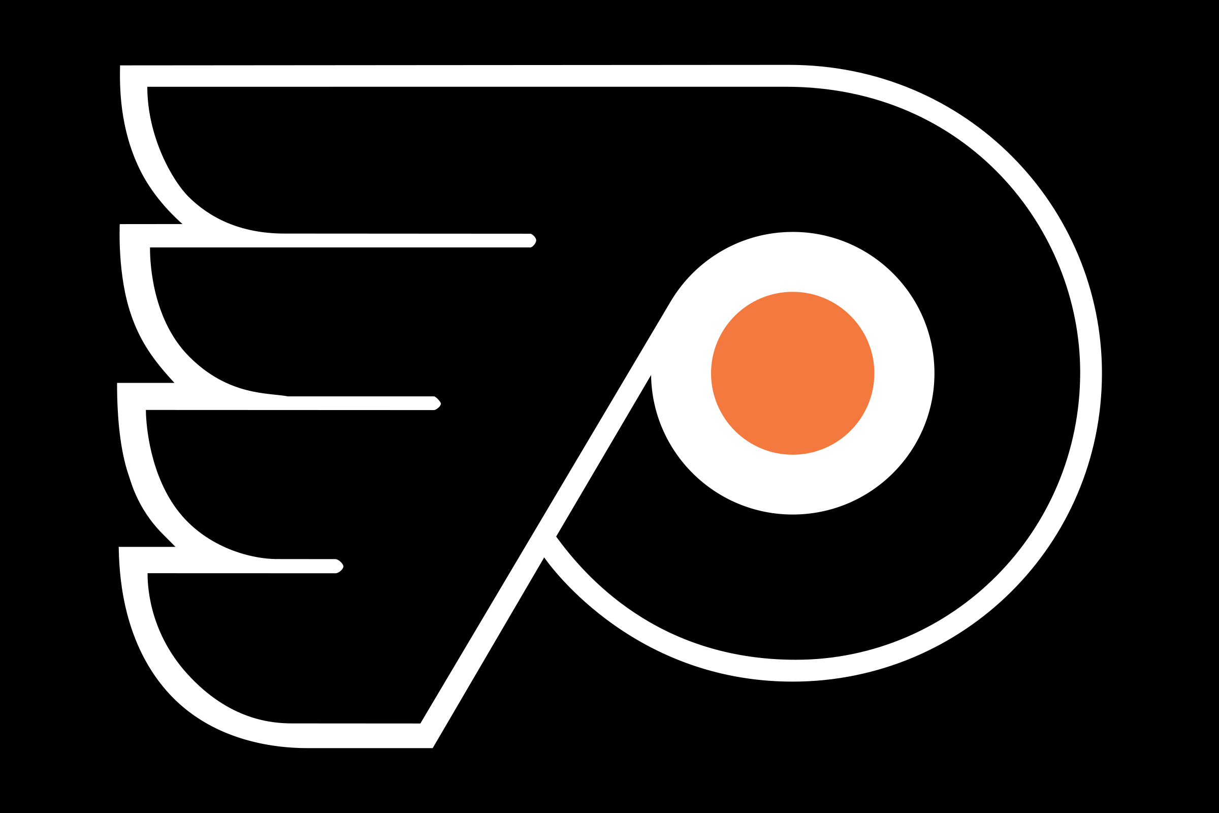
1999 — Today
![]()
In the 1990s the legendary logo was slightly refined, with its “feathers” made a bit more square. The new geometry made the badge look more powerful and masculine, and showed the ability of the club to change and grow without forgetting its roots.
Another change was done to the color palette, which is still composed of black, white, and orange, but with a more intense and bright orange dot, which evoke a sense of energy, strength, and determination, and creates a great contrast, which makes the logo of Philadelphia Flyers stand out on any background.
Emblem
The winged letter “P” with an orange dot inside symbolizes a hockey puck. There were actually quite a few other versions, but none of them was approved by the club’s owners.
Symbol
The Philadelphia Flyers logo was place on the 10th place in the NHL logo rankings.
Font
![]()
The wordmark represents the word “Flyers” in a custom all-cap serif font. The letters are black, with a bold black outline. The insignia has not changed since the 1967/68 season.
Color
![]()
All the three colors of the team’s official palette (orange, black, and white) are featured in its logotype. The club owners wanted to find a warm color, but red could be already seen in many sports logos. So, one of the founders, Bill Putman, suggested orange, as it was the official color of the University of Texas, where he used to study.
Philadelphia Flyers Colors
FLYERS ORANGE
PANTONE: PMS 172 C
HEX COLOR: #F74902;
RGB: (247, 73, 2)
CMYK: (0, 73, 87, 0)
BLACK
HEX COLOR: #000000;
RGB: (0, 0, 0)
HSB: (350, 89, 0)
CMYK: (75, 68, 67, 90)
WHITE
HEX COLOR: #FFFFFF;
RGB: (255, 255, 255)
HSB: (42, 0, 100)
CMYK: (0, 0, 0, 0)


