

![]() Colorado Avalanche Logo PNG
Colorado Avalanche Logo PNG
The Colorado Avalanche logo has gone through only one radical overhaul, which was part of the rebranding process when the team was renamed.
Meaning and history
![]()
The Colorado Avalanche hockey club was born in Quebec, Canada, and played there until 1995, being called Quebec Nordiques. So the visual identity history of the team has to be divided into two periods — The Nordiques and The Avalanche, which feature three different logo versions altogether.
What is Colorado Avalanche?
Colorado Avalanche is a professional hockey club from the United States, which was established in 1972 in Canada as Quebec Nordics, and moved to Colorado, getting its current name, in 1995. Today the club competes in the National Hockey League, being a member of the Western Conference. The club has Ball Arena in Denver as their home stadium and Jared Abernathy as the head coach.
1972 — 1985
![]()
The original Quebec Nordiques logo, created in 1972, became recognizable and even if in pretty fast. As it was a bright and minimalist badge with interesting geometry. The first logo of the team featured a white circular badge in a blue outline with a red stylized image of an igloo with its right part diagonally cut with the hockey stick and a puck above it.
The blue sans-serif inscription was placed inside the circle, around its perimeter, with the “Nordiques” arched above and “Quebec” — under the igloo.
1985 — 1995
![]()
The redesign of 1985 was all about simplification of the emblem and minimization of the elements, this the team only kept the igloo with the hockey stick, and removed the wordmark and the circular frame of the previous version. The blue color was lightened up, which made the color contrast of the badge stronger and gave a fresh and crispy feeling to the Nordiques’ visual identity.
1995 — Today
![]()
1995 was a very intense year for the hockey club. In the beginning, the new logo was designed for Nordiques, it featured a modern and sleek Wolf portrait, placed on a triangle, pointing down, and with a cold gray inscription under the animal’s head. This logo was supposed to become primary for the Quebec team, but in a few months, the club moved to Denver, Colorado, and changed its name to Colorado Avalanche.
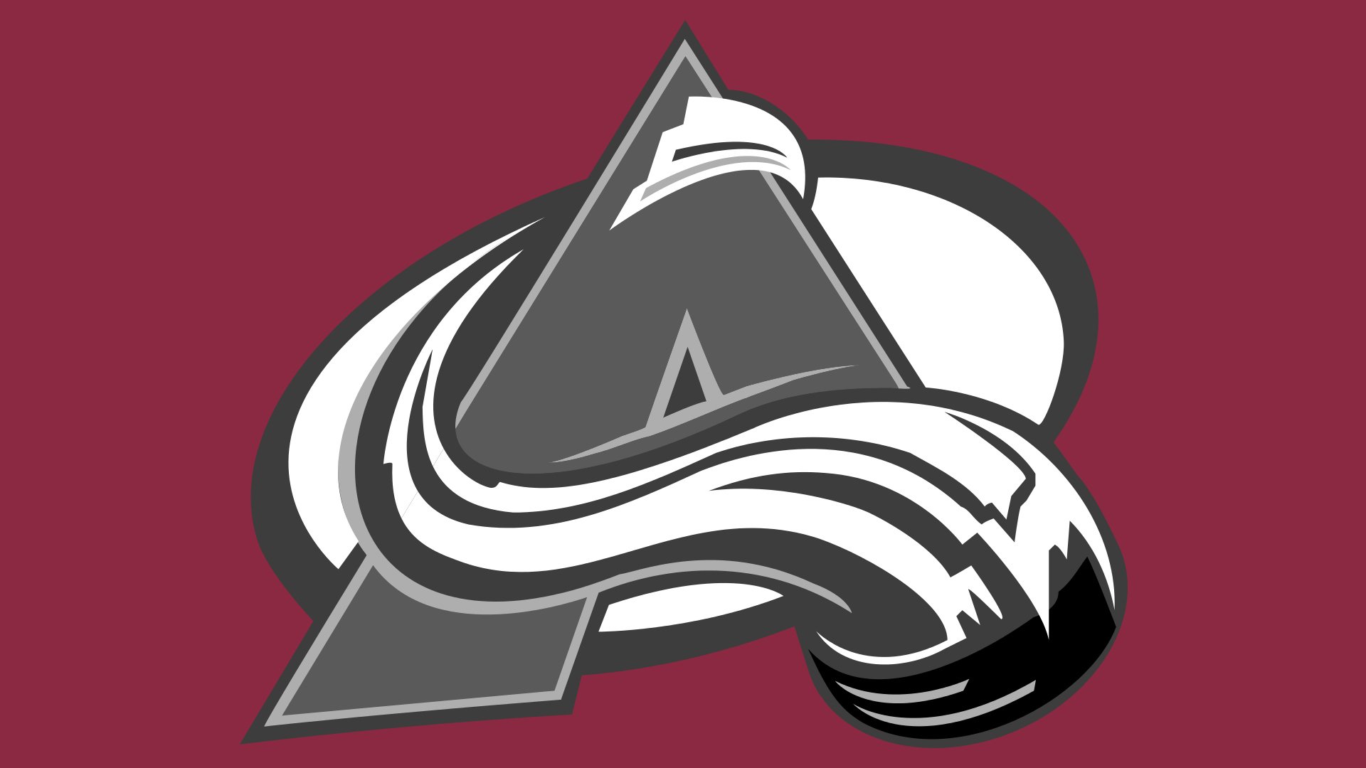
The logo for the rebranded hockey club was created by The Joe Bosack Graphic Design Co and comprised a bold burgundy letter “A” stylized as a mountain peace, with smooth white and blue lines around it, representing snow and ice.
The new bright yet elegant burgundy, white and blue color palette was also adopted for the secondary emblems of Colorado Avalanche: a yeti footstep in a blue circular outline and a letter “C” with the hockey puck in the middle.
Font
The custom typeface featured on the Colorado Avalanche logo wordmark perfectly fits the primary emblem and the metaphor behind the team’s name. The shape of the middle bar on the “E” reminds the shape of the “A” on the icon, while the unusual “serifs” on the letters conjure the image of an avalanche.
Colors
The team’s media guide lists the following colors in the official palette: blue (PMS 647), burgundy (PMS 202), silver (PMS 877), gray (PMS 428), and black (Process Black).
Colorado Avalanche Colors
BURGUNDY
PANTONE: PMS 209 C
HEX COLOR: #6F263D;
RGB: (111, 38, 61)
CMYK: (20, 97, 40, 58)
BLUE
PANTONE: PMS 647 C
HEX COLOR: #236192;
RGB: (35, 97, 146)
CMYK: (96, 54, 5, 27)
SILVER
PANTONE: PMS 429 C
HEX COLOR: #A2AAAD;
RGB: (162, 170, 173)
CMYK: (21, 11, 9, 23)
BLACK
HEX COLOR: #000000;
RGB: (0, 0, 0)
CMYK: (0, 0, 0, 100)
PANTONE: PMS BLACK 6 C


