

![]() New Jersey Devils Logo PNG
New Jersey Devils Logo PNG
The logo of the ice hockey team the New Jersey Devils seems a perfect example of how much you can say with a simple emblem. The red monogram combines the “N” (for “New”) and the “J” (for “Jersey”) with a pointed tail and horns (for the “Devils”).
Meaning and history
![]()
The team currently playing under the name of the New Jersey Devils started its history in 1974 as the Kansas City Scouts. The central element of the original logo was the Scout statue well-known to those who live in Kansas City.
1974 — 1976
![]()
The statue featuring Sioux Indian on horseback was created in 1910 by Cyrus E. Dallin. On the logo, the scout is encircled by a thick red frame. There’s a “KC” monogram in yellow with a thin navy blue outline.
1976 — 1982
![]()
Having spent two rather unsuccessful seasons in Kansas City, the club relocated to Denver and got a new name, the Colorado Rockies. The logo used in that era was the embodiment of the “rocky” concept: it featured a blue mountain with an uneven top. There was a horizontal white stripe in the middle with a red “C” and a yellow dot. On the whole, the design of the logo represented the state flag of Colorado inside a mountain-shaped frame.
1982 — 1986
![]()
The years spent in Denver weren’t particularly successful, to say the least of it, and eventually, the club was sold to another owner in 1982, a group led by John McMullen. Following the deal, the team relocated to the state of New Jersey.
The team’s new name was inspired by the story of the Jersey Devil, who, according to a legend, used to live in the Pine Barrens of South Jersey. Interestingly enough, the contest during which this name was chosen attracted around 10,000 fans.
The current New Jersey Devils logo history started in 1983. That was the first time when the iconic monogram appeared on the players’ uniforms. The letters “N” and “J” on the emblem overlapped. Like the legendary Jersey Devil itself, the monogram had a “tail” and “horns.” The emblem itself was red, while the outline was green. The circle frame, in which the monogram was placed, was also green, but it was bolder than the outline of the central image.
The concept of the emblem was developed by the wife of John McMullen, who owned the team back then. It was later polished by a professional graphic design firm.
1986 — 1992
![]()
In 1987, the NJ Devils logo was revisited, yet the update was hardly visible to an unprofessional eye as it included only a slight shift in the shade of red.
1992 — 1999
![]()
The 1993 modification was much more noticeable as the secondary color, green, was replaced by black, which affected the overall look of the logo.
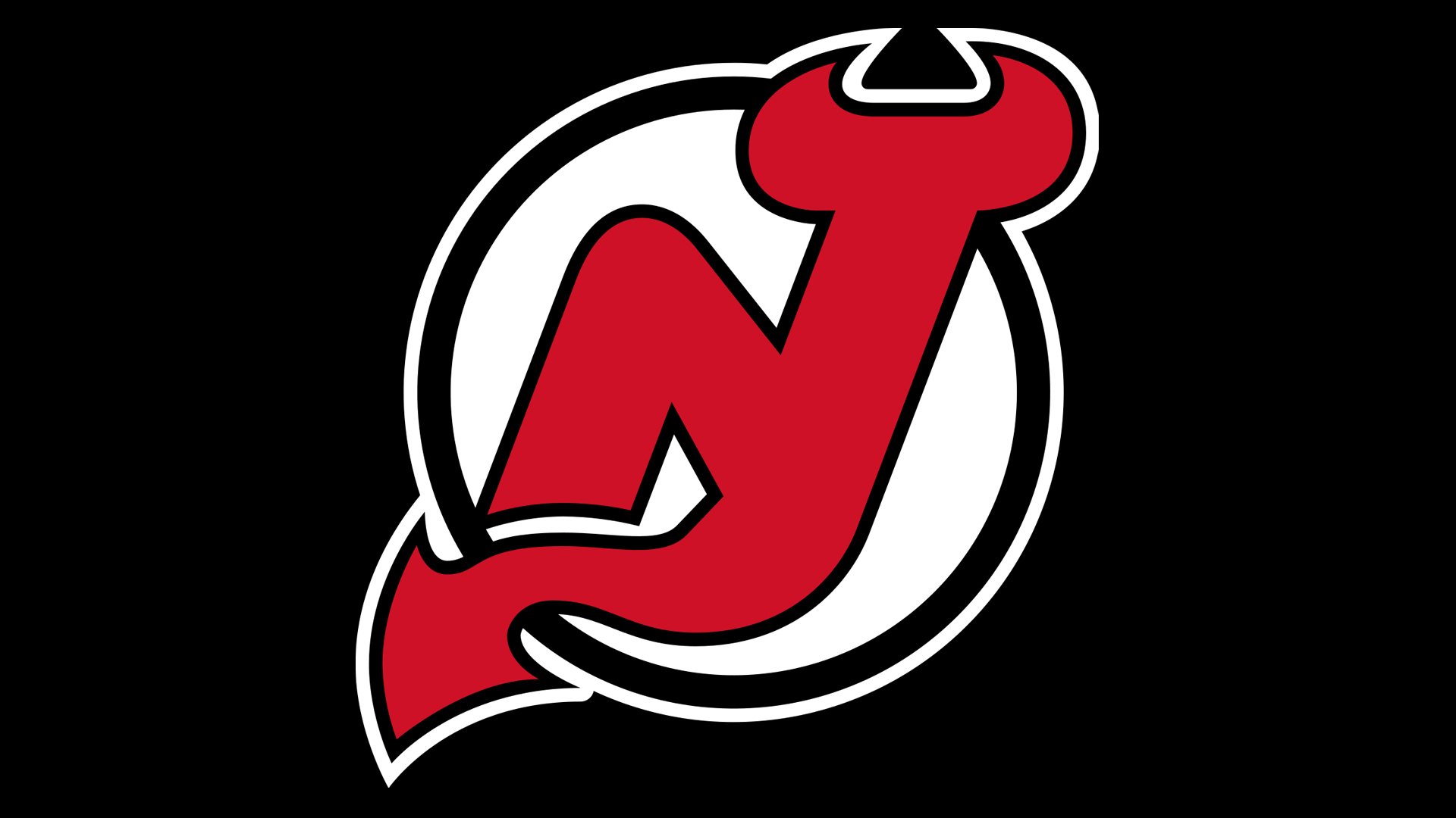
1999 — Today
![]()
The latest redesign so far has taken place before the 2000/01 playing season. Again, the update was hardly noticed by the fans as the basic structure of the New Jersey Devils logo remained virtually intact.
Font
While there’s no text on the primary logo, the team also uses a wordmark insignia featuring the club’s full name in bold red letters. Both the shape of the letters and their color seem to fit the “NJ” monogram of the primary logo perfectly.
Colors
![]()
The three colors of the team’s official palette are red (close to the following Hex shade: #C8102E), white (#FFFFFF), and black (#000000).
New Jersey Devils Colors
RED
PANTONE: PMS 186 C
HEX COLOR: #CE1126;
RGB: (206, 17, 38)
CMYK: (2, 100, 85, 6)
BLACK
PANTONE: PMS BLACK 6 C
HEX COLOR: #000000;
RGB: (0, 0, 0)
CMYK: (75, 68, 67, 90)
WHITE
HEX COLOR: #FFFFFF;
RGB: (255, 255, 255)
HSB: (42, 0, 100)
CMYK: (0, 0, 0, 0)


