

![]()
Florida Panthers Logo PNG
The ice hockey team Florida Panthers has only had two primary logos so far, which can be partly explained by the fact that the club isn’t that old.
Meaning and history
![]()
The Florida Panthers logo history started in late 1992 when Blockbuster Video magnate Wayne Huizenga received the rights for a National Hockey League team. The team was to be based in Miami.
1993 — 1999
![]()
The team met its first playing season with the legendary leaping panther logo. The creature was gold, blue, and white, while its eyes, mouth, and paws were of a bright shade of red, which emphasized the aggressive mood of the design. Such details as the sharp claws and the expression of the muzzle added to the overall impression, which was probably meant to scare off the team’s opponents.
1999-2016
![]()
The leaping panther symbol remained almost unchanged for the remarkably extended period of 28 years, except for a small update that took place in 1999. The update only included the color palette and wasn’t obvious unless you compared the two versions side by side.
![]()
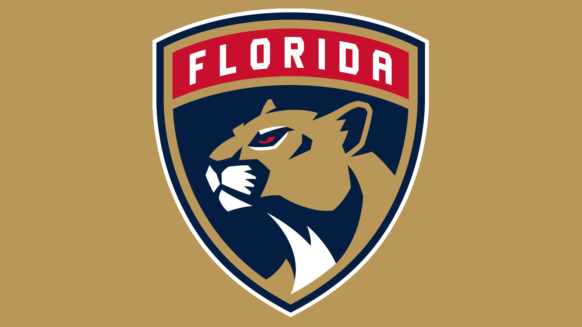
2016 — Today
![]()
The elements of the team’s new brand identity first leaked in April 2016, while in June the club officially unveiled the new uniforms and emblems. They were created by designers from Reebok.
According to the official press release, the updated logo features “a more mature and stoic panther.” Taking into consideration the panther is more than 20 years old, its “maturation” seems a perfectly natural concept. In what way is it reflected in the emblem? While the original panther was leaping at you, this one has a different pose; its head is turned slightly away, to the left. While the panther on the new logo doesn’t look overly aggressive, like its predecessor, it has preserved some of its threatening look.
The creature has been placed inside a shield with a dark blue outline. The word “Florida” in white can be seen in a red tab at the top of the shield. The shield shape is supposed to symbolize a military badge, while the tab emphasizes this theme. Also, the press release mentions that the shield was used to conjure historical connotations and serve as a symbol of Florida and Broward County.
2018
![]()
Florida Panthers 25th Anniversary Season Logo.
Alternate logo
![]()
In addition to the primary Florida Panthers logo, the 2016 brand identity includes one secondary logo and one tertiary logo. The secondary logo features a panther crawling over the Florida flag. The creature looks as if it was going to pounce.
The tertiary logo is a variation of the iconic leaping panther. It has been slightly polished once again, as a result of which the design acquired a more impressive and unique shape. This emblem was designed for the players’ helmets.
Font
The wordmark featuring all the team’s official colors is given in two lines. Under the word “Florida” in dark blue capitals, there’s the lettering “Panthers” in large red letters with cut corners. A gold streak can be seen below.
Colors
![]()
The color palette comprises red (PMS 186), blue (282), gold (465), and white as an additional color. White isn’t mentioned as one of the team’s official colors, though.
Florida Panthers Colors
NAVY
PANTONE: 282
HEX COLOR: #041E42;
RGB: (4,30,66)
CMYK: (100,90,13,68)
RED
PANTONE: 186 C
HEX COLOR: #C8102E;
RGB: (200,16,46)
CMYK: (2,100,85,6)
TAN
PANTONE: 465 C
HEX COLOR: #B9975B;
RGB: (185,151,91)
CMYK: (9,29,66,24)


