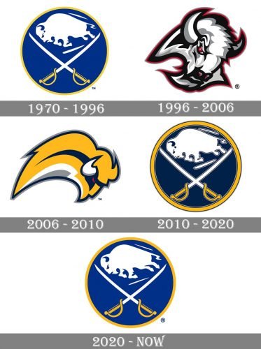
Although the logo of the ice hockey team Buffalo Sabres has always featured a buffalo as its central element, the creature hasn’t looked the same all the time. Following a series of design experiments in 1997-2009, the franchise eventually returned to its original logo.
Meaning and history
The visual identity of the hockey club from New York has always been based on two elements from the team’s name, a Buffalo and two crossed sabers. The color palette of the club’s visual identity was also set with the very first logo version, created in 1970, and despite four major redesigns of the logo, today Buffalo Sabers use its original emblem as the primary one.
What are Buffalo Sabres?
Buffalo Sabres is the name of one of the NHL teams, which was established in New York in 1970. Playing in the Atlantic Division of the Eastern Conference, the hockey club has KeyBank Center as its home arena, and Don Granato as the head coach. Buffalo Sabres are owned by Terry Pegula and managed by Kevyn Adams.
1970 — 1996
The very first logo for Buffalo Sabres was introduced in 1970 and boasted a stylish circular badge with a calm blue background and medium-thickness yellow outline. On the badge two main elements of the club’s identity were placed one under another — the white running bull on top and two crossed sabers with yellow handles under it. The animal was facing left and looked strong and drastic, while two thin sabers not only elevated the sense of danger but also added elegance and sophistication to the whole image.
1996 — 2006
The logo, born in 1996, was the only one in the club’s history, which featured a different color palette. The stylized white and gray Bull’s head featured a thick double outline in black and red, as well as red eyes and nose. It was a powerful and brutal image, which was accompanied by two additional emblems — silver and red saber, pursing the bold red letter “B”, and two crossed Sabres placed on a dark gray circular background with a silver and red outline.
2006 — 2010
The original color palette was brought back to the Buffalo Sabres visual identity in Woody with another logo redesign. The Buffalo was redrawn and now its arched smooth silhouette, placed above the wordmark, was facing rights as for the inscription, it was set in two levels, with the “Buffalo” in light gray, executed in a delicate yet recognizable sans-serif typeface, and the enlarged “Sabres” in a bold custom typeface with thick lines and slightly sharpened ends of the letters. The nameplate was drawn in dark blue and featured a gray outline.
2010 — 2020
In 2010 the club adopt its initial logo version as the primary one. The contours of the circular badge and all of its elements are being refined and strengthened, the white bull was slightly enlarged and the lines of two Sabres — cleaned. The yellow outline was now framed in thin blue, which added a stronger contrast and made the badge more distinctive. The blue color of the background was darkened in comparison to the original version.
2020 — Today
The redesign of 2020 softened and brightened up the color palette of the Buffalo Sabres visual identity, by adopting a lighter shade of blue and removing the thin blue outline from the emblem. Now the badge looks even closer to its original version, which says a lot about the club’s values and character and points to its professionalism and reliability.
Font
While the primary Buffalo Sabres logo doesn’t contain any text, the team has a wordmark that can be used on its own. The two-lined wordmark features the word “Buffalo” in blue with a saber going through it and the word “Sabres” in yellow with a blue outline. Both the words are a custom artwork rather than an existing typeface.
Colors
Blue, white, and yellow are the colors that have been used for most of Buffalo Sabres logo history, although their shades have varied. These are also the colors comprising the palette of the current logo, where they are featured together with silver.
Buffalo Sabres Colors
YELLOW
PANTONE: 1235 C
HEX COLOR: #FCB514;
RGB: (252,181,20)
CMYK: (0,31,98,0)
SILVER
PANTONE: 429 C
HEX COLOR: #ADAFAA;
RGB: (173,175,170)
CMYK: (21,11,9,23)
RED
PANTONE: 186 C
HEX COLOR: #C8102E;
RGB: (207,10,44)
CMYK: (2,100,85,6)


