

![]() Toronto Maple Leafs Logo PNG
Toronto Maple Leafs Logo PNG
The logo of the ice hockey team Toronto Maple Leafs has featured a maple leaf ever since the club received its current name more than 90 years ago. The leaf hasn’t been the same, though – both its shape and its color have been changed more than once.
Meaning and history
![]()
Toronto Maple Leafs is one of the hockey clubs, which have been very constant with its visual identity design throughout the years. Its original logo, created in 1927, was the only version amongst nine, with a different color palette, though the style and composition of the emblem are still the same.
1927 — 1928
![]()
The initial logo for the Toronto Maple Leafs was composed of a green leaf with bold white lettering on it. The inscription in geometric serif typeface was set in three levels with the upper one slightly arched, resembling a smile-line. This was the only logo of the club with a green and white color palette, and it only stayed for one year.
1928 — 1931
![]()
The redesign of 1928 switched the green color of the leaf to a blue one. All the other elements and the composition itself remained untouched, though the new color palette made the whole image look different — fresher and more professional. The new blue leaf represented not only the cold and ice but also the club’s professionalism and authority.
1931 — 1963
![]()
In 1931 the blue maple leaf was refined and gained some very delicate white lines on it, to represent the texture of a natural leaf. This was not the only change of the 1930s, as the wordmark was also rewritten. The upper, “Toronto”, part was now arched to the too and the whole nameplate gained a stronger and more modern typeface with bold clean lines.
1963 — 1966
![]()
The blue leaf gains a double blue and white outline with the redesign of 1963. The sans-serif typeface of the wordmark remains almost the same, the contours of the letters are only being slightly narrowed, which gave a more elegant and balanced look to the whole logo. This version with a lot of white lines on a blue background stays with the club for just three years.
1966 — 1970
![]()
The contours of the leaf were modified in 1966, giving the emblem a more solid and professional look and leaving the blue background with no additional white elements, just the lettering. The rewritten wordmark featured a rounded sans-serif typeface with smooth lines and straight cuts of the edges. The inscription is composed of both upper- and lowercase letters, which are all set in one size.
1970 — 1982
![]()
With the refinements of the contours, the typeface of the nameplate is being changed again in 1979. Now the inscription in all capitals is executed in a bold and solid sans-serif ripe face with traditional shapes of the letters and a strong masculine character. The wordmark is still set in three levels, but now they are all horizontal and parallel to each other, with no arched.
1982 — 2016
![]()
The lettering gains a smaller size in 1983, and this gave more balance to the logo. Along with the primary version of the emblem, the team starts using a secondary image — an ornate and detailed maple leaf in blue and white without any text in it, just thin lines and a triple outline.
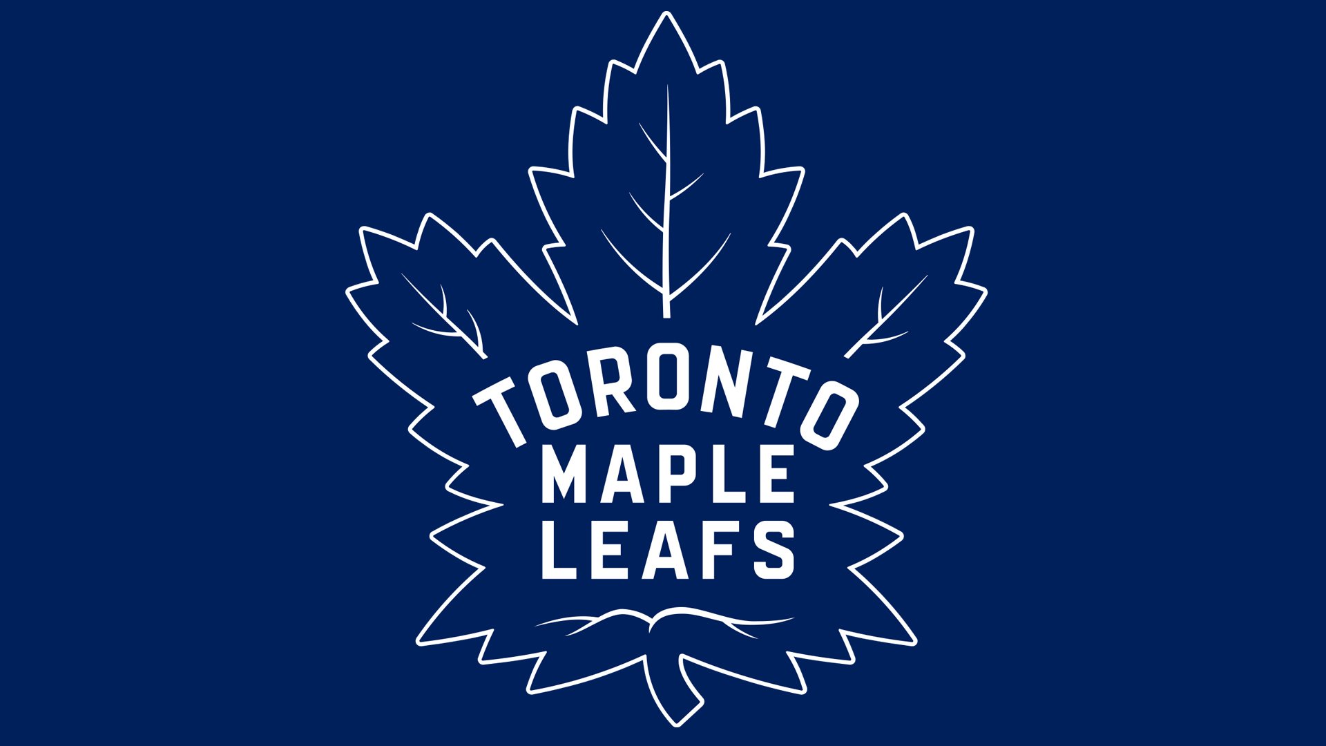
2016 — Today
![]()
The redesign of 2015 combines two versions of the Toronto Maple Leafs visual identity — the one from the 1960s and the 1980s. The blue leaf gains sharp borders and thin white details, the upper level of the nameplate is again arched to the top, but the inscription is executed in a strong and strict sans-serif typeface, which looks modern and confident.
Emblem
In advance of the 2016/17 season, almost half a century after the previous modification, the team eventually dared update its emblem once again. The logo 2017 had the following symbolic elements:
- 31 points to refer to the year 1931 when Maple Leaf Gardens opened
- 13 veins at the top as a reminder of the club’s Stanley Cup Championships
- 17 veins altogether to refer to the year of 1917 when the club was established
The outline has disappeared, which helped to make the emblem cleaner.
Color
![]()
There’re only two colors in the Toronto Maple Leafs logo: dark blue and white. While the earliest logo was green, shades of dark blue have been present in the color scheme since the second version of the leaf logo was adopted in 1928.
Toronto Maple Leafs Colors
BLUE
PANTONE: PMS 281 C
HEX COLOR: #00205B;
RGB: (0, 32, 91)
CMYK: (100, 93, 33, 32)
WHITE
HEX COLOR: #FFFFFF;
RGB: (255, 255, 255)
HSB: (42, 0, 100)
CMYK: (0, 0, 0, 0)


