

![]() New York Rangers Logo PNG
New York Rangers Logo PNG
The emblem of the ice hockey team the New York Rangers has been remarkably consistent throughout its more than 90-year history. All the modifications have been relatively minor and haven’t affected its core.
Meaning and history
![]()
In terms of visual identity design, New York Rangers is one of the most constant clubs, as its iconic and recognizable logo, introduced in the middle of the 1920s, has barely been changed by today. The style, color palette, and composition are being kept by the club, showing its value of legacy and roots.
What are New York Rangers?
New York Rangers is the name of a professional hockey club from the United States, which was established in 1926, and today competes in the National Hockey League as a member of the Eastern Conference. The club has Madison Square Garden Stadium in New York as its home arena and Gerard Gallant as the head coach.
1926 — 1947
![]()
The very first crest was designed for New York Rangers in the middle of the 1920s and boasted smooth rounded sides and a pointed peak on the bottom, balanced by a straightened top part. The crest was executed in blue, red, and white, the national colors of the American flag, with the “New York” inscription written in white on the blue part of the shield, and “Rangers” — diagonally on a blue banner, crossing the main part of the crest and separating it into white and red segments.
1947 — 1952
![]()
The shape of the crest got more square in 1947, as well as the typeface of both inscriptions, was refined and strengthened, with its lines bolder and stricter. As for all the other elements of the logo, including the overall compositions and colors palette — it all remained untouched.
1952 — 1967
![]()
In 1952 the shape of the crest was changed again, but this time the lines of its upper part became elongated and sharpened, while the bottom part’s angles got smoother and softer. The typeface of this version was switched to a thinner and narrower one, and the red color became slightly lighter.
1967 — 1971
![]()
The redesign of 1967 brought back the square style of the crest and enlarged the inscription of the logo, drawing both parts in white. The thick blue line was removed from the crest’s frame and replaced by a lightweight white and blue outline.
1971 — 1978
![]()
The emblem was refined in 1971, keeping the concept and color scheme, but balancing all the elements in terms of specking and sizes. The logo from 1971 looked elegant and confident with its clean neat lines and strong contrast of the palette’s shades. The “New York” part of the nameplate was underlined in white, while the “Rangers” was now put between two white lines under and above it.
1978 — 1999
![]()
The redesign of 1977 bright a lighter and fresher color palette to the New York Rangers visual identity, making it look friendly and progressive. All the other details and shapes remained untouched, but due to the switch of colors, the badge started looking different.
1996 — 2007
![]()
In 1996 the team introduced something new — its traditional recognizable crest was replaced by a modern stylized emblem with a thick gradient gray outline and an angular contour, which looked aggressive and brutal. The lettering on this version was executed in a condensed custom typeface with sharp triangular shapes and edges. The iconic crest was accompanied by a secondary version with the Statue of Liberty’s head placed on a red background with a blue outline and an “NYR” abbreviation under it.
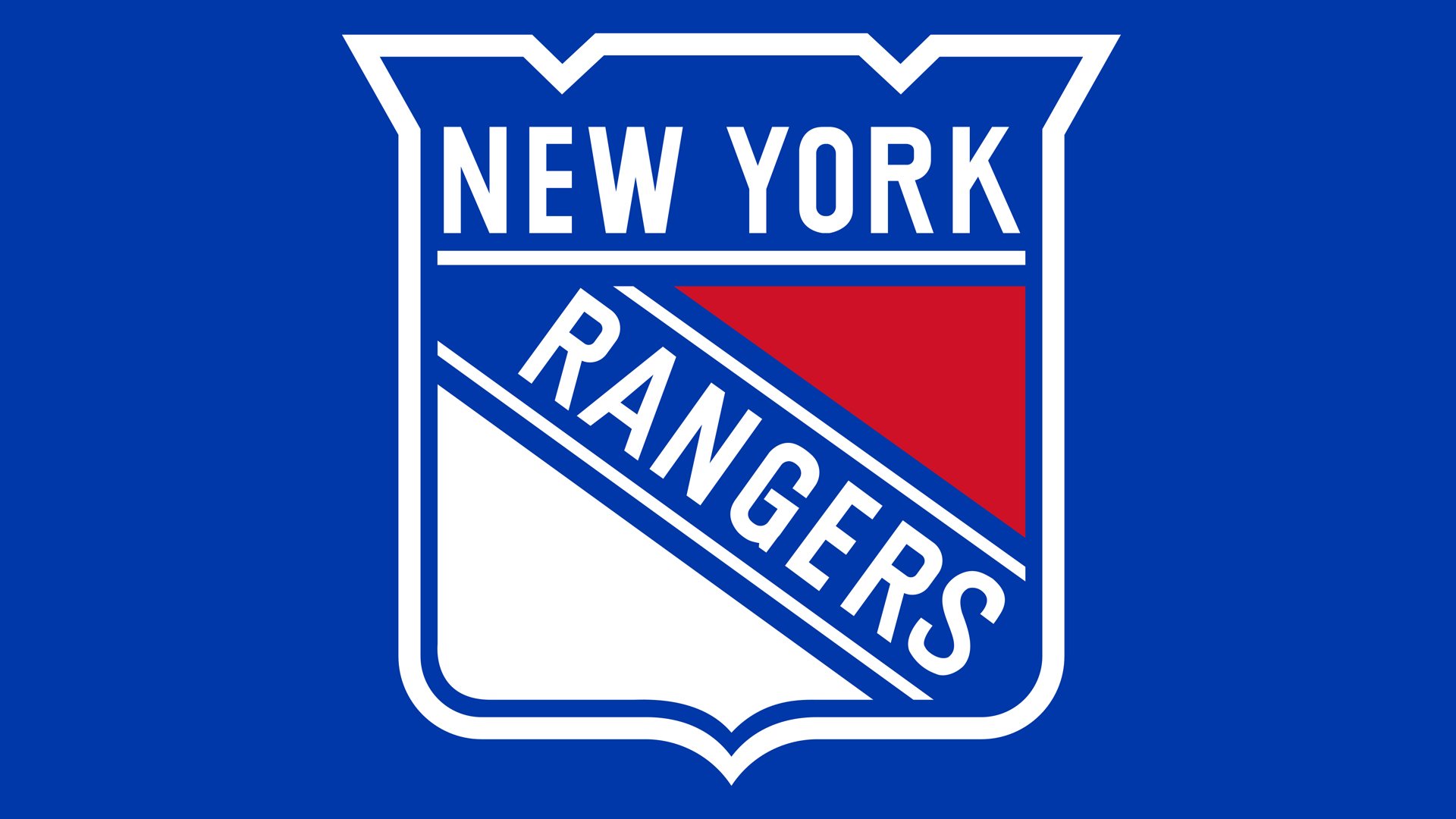
1999 — Today
![]()
In 1999 another version of the color palette for Rangers was adopted. Today it is a shade of blue, which is in the middle between the tones from two previous versions — a calm yet intense blue, which evokes a sense of reliability and professionalism. There was also a glossy three-dimensional version of the badge created in the same year, with the surface of the emblem resembling a metal sign.
Emblem
Lighter shades of red and blue were used starting from the 1978/79 season. Apart from the color scheme, which grew somewhat darker in 1999, the shield has remained virtually untouched since 1979.
Alternate logo
![]()
During the 2012 NHL Winter Classic, the team used a version of its original logo where beige replaced white. Also, a different logo was used for the 2014 NHL Stadium Series: here, the white fields of the primary logo were replaced by light grey ones.
Font
The logo New York Rangers use as the primary one features a different font than their wordmark. The letters on the primary logo are simpler and better legible. That’s just a regular sans serif type. The wordmark has a unique style where each of the glyphs is somewhat unusual. While the legibility leaves much to be desired, the wordmark is instantly memorable.
Color
![]()
The color scheme has remained basically the same since the team’s inaugural season in 1927. It still comprises blue, red, and white, although there has been some playing around with the shades. The shades look similar to the following ones: hex: #C8102E (red) and #0038A8 (blue).
New York Rangers Colors
BLUE
PANTONE: PMS 286 C
HEX COLOR: #0038A8;
RGB: (0,56,168)
CMYK: (100,88,0,0)
RED
PANTONE: 186 C
HEX COLOR: #CE1126;
RGB: (206,17,38)
CMYK: (2,100,85,6)
WHITE
HEX COLOR: #FFFFFF;
RGB: (255,255,255)
CMYK: (0,0,0,0)


