

Of course, the NBA is first and foremost a sport. But the vibrancy of the game and the competitive spirit that pervades everything during games is complemented by colorful team logos that remain in viewers’ memories along with game results. NBA basketball team logos are a world apart, where every icon is designed to represent your team, your city, and your character in the best possible way. Standing out from the 30 teams taking part in the competition is not an easy task.
Over the more than 70 years of the Association’s existence, basketball fans have seen many different emblems. And there have always been more or less successful ones, memorable the first time and forgotten the minute the game was over. Today we decided to compile our rating of the top 10 NBA logos and tell you a bit about their history. We start from the 10th line.
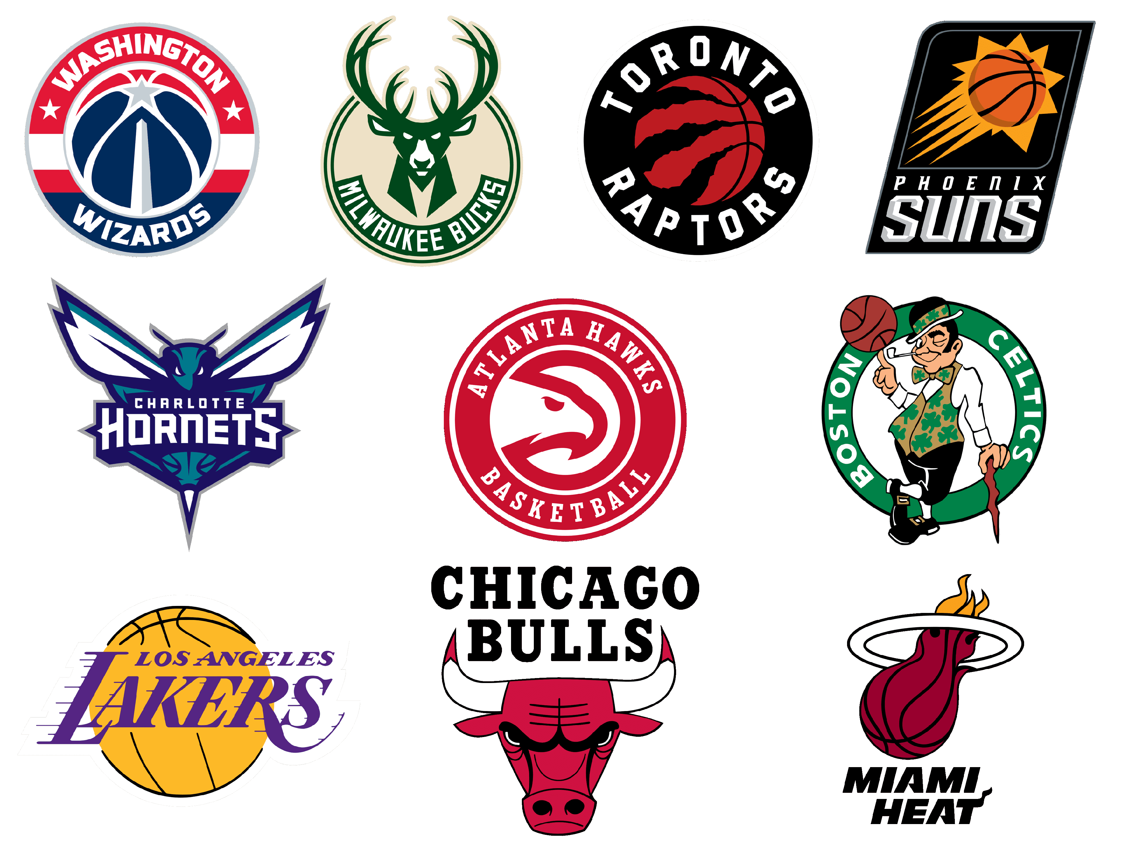
Los Angeles Lakers
![]()
The current logo was designed in 2001, but its predecessor was first introduced in the 1960s, and it was the third emblem created for the Basketball club in LA. The initial logo was also based on the image of a basketball, but had a different style of the lettering, and was created while the team played in Minneapolis, so featured a Minnesota state silhouette on it. Then, in 1960, the club moves to California and introduced the new logo — a simple white and blue inscription with no graphics.
The era of the iconic Lakers badge started in 1967, with the creation of the first “yellow ball” badge. It was a darker version of the logo the whole world knows today, with muted shades and a fuchsia hue on the logotype. In 1976 the colors on the logo become brighter, and finally, by 2001 the club comes to the perfect yellow and purple palette, which is instantly recognizable today.
Boston Celtics
![]()
The original version of today’s Boston Celtics logo saw the light in 1968 and has only been redesigned twice since then. Although the history of the club traces back to the 1940s, and there were two more design concepts for its badge, those versions are already forgotten. The iconic leprechaun in his green suit was first drawn over a dark red basketball, and only in 1974 it was placed on a white background and enclosed into a bold green circular frame with the team’s name written around it. Today the logo got more colors, and all of its elements are well-balanced and refined, creating a perfect professional look and showing the club’s value of roots and traditions.
Miami Heat
![]()
Compared to other teams on our list, Miami Heat is a pretty young one, thus its logo has been redesigned only once, keeping the original concept and not stepping too far from the initial style and color palette. The first emblem, created for the team, was introduced in 1988 and stayed untouched for almost a decade. It was the same bold black lettering as we can see today, the fireball was drawn with more orange gradients and the ring was colored black, balancing the inscription. Although today, with the dark red basketball and orange flame coming out of it, the logo of the club from Miami looks much more powerful and modern. Everything here is clean and strong, the contours are perfectly refined, and the proportions — are in complete harmony.
Charlotte Hornets
![]()
Charlotte Hornets is one of the teams that for a pretty significant period has been playing under another name: from 2004 till 2014 the club was called Charlotte Bobcats. Hence, the visual identity history of the Hornets can be split into three parts — the early Hornets, with some naive emblems and caricaturish images, the Bobcats with the modern and “wild” badges, and the modern Hornets with an extremely stylish and yes, sophisticated, badge in a dark-turquoise and blue color palette.
The Charlotte Hornets logo could work for a casual fashion brand or a hip-hop album cover with a huge success as it does for its basketball club. The alien-like hornet with its white sharp wings is accompanied by a two-levels inscription, executed in a custom fancy typeface, which is unique and memorable.
Phoenix Suns
![]()
The current Phoenix Suns badge was introduced in 2013 but is fully based on the version from 2000, just with a rethought color palette. Before that, the club had two more logo designs with sharp rays around the orange basketball, but they both were lacking something. The last emblem is executed in a strict black and white color palette with the orange gradients on the basketball and its “sun” stylization, which creates a strong accent and emphasizes the main — the sport. The black and white geometric crest of the Phoenix Suns team also makes the club stand out in the list of its competitors, which prefer brighter shades and more ornate designs.
Washington Wizards
![]()
Before getting the current modern and confident design for its badge, the Washington Wizards club has been experimenting a lot. While playing under the Bullets name, they used to have one of the most iconic and recognizable emblems in the history of the NBA — the logotype with two hands up and a red basketball above them. But the name was changed in 1997, and the first few logos after the rebranding were not very successful. Although, today’s badge is truly remarkable and simple at the same time. It is a circular medallion in a patriotic blue-red-white color palette, with the gradient gray Star as the central element and a voluminous inscription, with the white color softened and slightly shadowed.
Milwaukee Bucks
![]()
The deer has always been the main element of the Milwaukee Bucks’ visual identity, but in 2015 the animal became a real symbol of power and grace. The current badge of the basketball club from Milwaukee is executed in a calm and elegant beige and green color palette and features perfectly balanced clean lines and shapes, with the modern and sharp drawing of a deer and clean geometric sans-serif lettering, written along the bottom part of the logo’s circular frame. There is absolutely nothing special in the composition of the badge, and you don’t see any links to basketball or sport at all, but the animal evokes an extreme sense of strength and determination, that nothing else is needed.
Toronto Raptors
![]()
The third line of your today’s ranking goes to Toronto Raptors. The only team from Canada playing in NBA has a very strong and memorable logo. Its first version was introduced in 2015, after two badges with a dinosaur in the club’s jersey. The rethought concept was more minimalistic and strong: built around the basketball with its stitched replaced by the claw traces, outlined in a thick circular frame with a bold and clean inscription. After the redesign of 2020, the central part of the emblem turned red and black, which only elevated the whole mood and made the sense of the fighting spirit even more visible and sensible. The frame was simplified, which gave more space for the lettering, hence a better balance and proportions.
Atlanta Hawks
![]()
After a dozen of redesigns, the Atlanta Hawks club has finally found its perfect emblem in 2020. Although the original version was created in 2015, it looked and felt different because of the muted colors and lack of contrast. Today’s badge of the basketball club from Atlanta can definitely be called one of the most outstanding and stylish logos in NBA history. The stylized image of the hawk head, placed in profile and turned to the right is drawn in a thick red line over a white circle, and outlined in a double red frame with the lightweight and very delicate lettering, executed in a condensed typeface with enlarged serifs.
Chicago Bulls
![]()
And the leader in the logos of all times, which is hard to argue with — Chicago Bulls. It is undoubtedly the most well-known and recognizable NBA emblem across the globe, and also the one with the most power in it. The Chicago Bulls badge was designed in 1996 and has never been changed since then. Because there is simply nothing to change. It is bright, it is strong, it is brutal and the balance is also there. The dark red head of a bull with white horns and sharp red ends is accompanied by a massive black inscription set above it on two levels. The lettering is set in a serif font with smooth lines and small curves, which softens the sharpness of the graphical elements and makes the animal on the emblem look less aggressive.
Brooklyn Nets
![]()
The Brooklyn Nets have embraced a minimalist and sleek design for their logo brand, emphasizing modernity and sophistication. The emblem, characterized by a simple black and white color scheme, reflects the team’s urban identity and connection to Brooklyn. It features a bold, monochromatic basketball and a shield motif, complemented by the straightforward, contemporary typeface of the team’s name. This logo of Brooklyn Nets exudes a sense of elegance and simplicity, standing out in its stark contrast to more elaborate designs, mirroring the borough’s trendy and cutting-edge vibe.
New York Knicks
![]()
The New York Knicks logo embodies the spirit and energy of New York City, featuring a classic and vibrant design that pays homage to the team’s storied history. The emblem showcases an orange basketball as the backdrop, with the iconic “Knicks” script overlaid in a bold, blue font, and a triangular design element that hints at the city’s skyline. This logo Knicks captures the essence of the city’s hustle and resilience, with its dynamic and bold colors reflecting the team’s enduring presence in the heart of Manhattan.
Philadelphia 76ers
![]()
The Philadelphia 76ers logo encapsulates the rich history and patriotic spirit of the city where America was born. Featuring a circle of 13 stars representing the original thirteen colonies, with the number “76” prominently displayed in the center, the logo is a nod to the Declaration of Independence signed in 1776. The color scheme of red, white, and blue further emphasizes the team’s American heritage. The design is straightforward yet powerful, embodying the resilience and fighting spirit of Philadelphia without direct references to basketball, relying instead on historical significance to convey its message.
Cleveland Cavaliers
![]()
The Cleveland Cavaliers logo showcases a sense of boldness and energy fitting for a team named after valiant knights. It features a sword piercing through the letter “C” for Cleveland, set against a wine and gold color palette that adds a touch of royalty and valor. The modern design elements and dynamic typography reflect the team’s forward-moving spirit and competitive edge. While the logo primarily focuses on the theme of cavaliers, the use of a sword cleverly hints at competition and battle, resonating with the spirit of basketball.
Detroit Pistons
![]()
Detroit Pistons logo is a masterful blend of automotive heritage and sports dynamism, paying homage to Detroit’s status as the heart of America’s car industry. The logo features a bold, italicized “Pistons” written across a basketball, with the basketball’s lines subtly forming a car grille. The color scheme of red, white, and blue mirrors the American flag, linking the team’s identity to national pride. This logo cleverly combines the city’s automotive legacy with the essence of basketball, creating a unique and recognizable brand identity.
Indiana Pacers
![]()
The Indiana Pacers logo captures the spirit of speed and competition, drawing inspiration from Indiana’s rich racing history. The logo features a P inside a basketball, which is surrounded by the word “Pacers” in a sleek, modern font. The gold and navy color scheme is evocative of a winner’s circle, reflecting the team’s aspiration for excellence and victory. The design is simple yet effective, using minimalistic elements to convey the fast-paced action of basketball and the state’s racing culture.
Orlando Magic
![]()
Orlando Magic logo conjures a sense of enchantment and wonder, fitting for a team named after a city famous for its theme parks and magical attractions. It features a silver basketball transforming into a trail of stars, with the word “Magic” in a futuristic font that suggests innovation and fantasy. The color palette of blue, black, and silver evokes the night sky, adding to the mystical quality of the logo. This design seamlessly blends the excitement of basketball with the imaginative allure of Orlando, inviting fans into a world where magic and sports collide.
Denver Nuggets
![]()
Denver Nuggets logo pays tribute to the rugged beauty and pioneering spirit of the Rocky Mountains, with a pickaxe and mountain peak forming the backdrop for a basketball. The color scheme of navy, gold, and red reflects the natural landscape of Colorado and the team’s vibrant energy. The circular frame and bold typography give the logo a contemporary feel, while the inclusion of mountain elements highlights Denver’s unique geographic and historical context. This logo embodies the team’s resilience and ambition, rooted in the heritage of the American West.
Minnesota Timberwolves
![]()
The Minnesota Timberwolves logo encapsulates the fierce spirit and resilience of the team, featuring a howling wolf against a backdrop of a forest at night. The logo’s color scheme of blue, green, and silver reflects the natural hues of Minnesota’s wilderness, emphasizing the team’s connection to its geographical roots. The design strikes a balance between modernity and tradition, with the wolf symbolizing teamwork, intelligence, and a relentless pursuit of victory, which is central to the Timberwolves’ identity.
Oklahoma City Thunder
![]()
The Oklahoma City Thunder logo captures the energy and dynamism of the team with its simple yet striking design. It features a shield with a basketball and the team’s initials, set against a palette of blue, orange, and yellow, symbolizing the team’s vibrant spirit and resilience. The logo reflects the thunderous energy of the team and its fans, embodying the essence of Oklahoma’s stormy weather patterns while promoting a sense of unity and strength within the community.
Portland Trail Blazers
![]()
The Portland Trail Blazers logo is iconic for its simplicity and symbolism, representing the team’s pioneering spirit. The design consists of five lines swirling together to form a pinwheel, symbolizing five basketball players in unity and motion. The red and black color scheme stands for the team’s passion and determination. This unique logo design not only captures the essence of the sport but also pays homage to the trailblazing nature of the team and its home city.
Utah Jazz
![]()
The Utah Jazz logo combines musical elements with the spirit of basketball, featuring a note symbol integrated with a basketball design. The color palette of navy, green, and yellow reflects the natural beauty of Utah’s landscapes while nodding to the team’s original New Orleans roots. The logo symbolizes harmony, rhythm, and teamwork, emphasizing the Jazz’s commitment to excellence and entertainment, both on and off the court.
Golden State Warriors
![]()
The Golden State Warriors logo is a modern representation of the team’s heritage and its connection to California. It features a silhouette of the iconic Bay Bridge within a blue and yellow circle, symbolizing unity and the team’s pivotal role in the San Francisco Bay Area. The logo’s color scheme reflects the state’s sunny skies and the Warriors’ bright and dynamic playing style, making it a powerful emblem of the team’s identity and aspirations.
LA Clippers
![]()
The Los Angeles Clippers logo is bold and straightforward, featuring the team initials “LA” intertwined with a basketball design, all encased within a red, white, and blue color scheme that mirrors the American flag. This design reflects the team’s energetic and competitive spirit, emphasizing the Clippers’ ambition to carve out a distinct identity within the vibrant Los Angeles sports landscape. The logo’s simplicity and clarity convey a message of focus and determination, aiming to unite fans and players alike in their pursuit of success.
Sacramento Kings
![]()
The Sacramento Kings logo is a testament to the team’s royal theme, featuring a purple and silver color scheme that exudes a sense of regality and sophistication. The centerpiece is a stylized lion’s head within a crown, symbolizing leadership and strength, coupled with the team’s name in bold, elegant typography. This design not only reflects the historical depth and prestige associated with royalty but also connects with the team’s aspiration to dominate the court with dignity and power.
Dallas Mavericks
![]()
The Dallas Mavericks logo captures the spirit of the wild west and the tenacity of the team with a dynamic image of a blue and silver horse in mid-leap, symbolizing speed and agility. The horse is framed by a dark blue circle with the team’s name in a bold, modern font, conveying a sense of motion and forward momentum. This logo represents the Mavericks’ commitment to overcoming obstacles and charging ahead with determination in the competitive landscape of the NBA.
Houston Rockets
![]()
The Houston Rockets logo is a bold representation of the team’s name, featuring a red rocket streaking through a basketball, which doubles as the backdrop for this dynamic emblem. The imagery is set against a field of silver and red, highlighting the themes of speed, power, and technological advancement. The sleek, modern design of the rocket, combined with the fiery trail and aggressive typography, encapsulates the Rockets’ ambition to ascend to the heights of NBA success.
Memphis Grizzlies
![]()
The Memphis Grizzlies logo is a fierce portrayal of the team’s mascot, with a powerful grizzly bear ready to defend its territory. The bear is set against a navy blue and gold background, symbolizing strength, resilience, and a fighting spirit. The detailed illustration of the bear, along with the rugged typography of the team’s name, projects an image of unwavering determination and highlights the Grizzlies’ gritty approach to the game.
New Orleans Pelicans
![]()
The New Orleans Pelicans logo is a vibrant representation of the team’s namesake bird, showcasing a pelican with its wings spread wide, embodying grace and power. The logo features a color palette of gold, navy, and red, reflecting the cultural richness and spirited energy of New Orleans. The pelican is clutching a basketball, subtly integrating the essence of the sport, while the fleur-de-lis accents pay homage to the city’s French heritage, blending local pride with the team’s competitive spirit.
San Antonio Spurs
![]()
The San Antonio Spurs logo is a minimalist yet striking depiction of the team’s iconic spur symbol, embodying the heritage and spirit of Texas. The silver and black colors convey a sense of sleekness and professionalism, while the spur itself, a nod to cowboy culture, symbolizes precision, tradition, and the relentless pursuit of excellence. The straightforward design and classic typography of the team’s name underscore the Spurs’ no-nonsense approach to basketball and their commitment to championship-caliber play.
Conclusion
In the dynamic world of professional basketball, the power of branding through sports logos cannot be understated. As we’ve explored the realm of NBA team logos, it becomes evident that these symbols do more than just represent a team; they encapsulate history, triumph, and the spirit of the athletes who wear them. From the fierce depiction of the Vancouver Grizzlies to the simple elegance of the white shamrock, each logo brings with it a story that resonates deeply with fans across eras.
Nicknames and iconic logos have proven to be of the greatest value, not just for the teams they represent but also in the broader context of sports marketing. These logos transcend the boundaries of the game, finding their way into posters and memorabilia, turning a sports poster specialty store into a treasure trove for fans. It’s fascinating to see how these symbols adapt and thrive, much like the athletes of North Carolina, who are celebrated for their resilience and skill.
As we conclude, it’s clear that the intersection of sports logos and branding is a crucial aspect of the NBA’s allure. These logos serve as a bridge between the teams and their communities, embodying the spirit and the legacy of the sport. Whether it’s through posters adorning a fan’s wall or the jerseys worn with pride, the impact of these logos is undeniable. They are not just marks of identification but badges of honor, representing the heart and soul of basketball across generations.


