

![]() New York Knicks Logo PNG
New York Knicks Logo PNG
Taking into consideration that the New York Knicks logo has gone through not less than seven updates, it is amazing that at least one design element (the basketball) has survived all the changes and stayed even in the current version.
Meaning and history
![]()
The visual identity history of New York Knocks features eight logo versions created for the club throughout the years, but except for the very first version, all others are just a refined and modernized version of one basic badge, which reflects the essence of the club and its passion for basketball.
1946 – 1964
![]()
The very first logo for New York Knicks featured a blue and orange caricature of a big man in a tri-corner hat with a basketball. The man had his suit weaving behind him and was trying to catch a ball. It was a lively and memorable image, which stayed with the club for almost twenty years.
1964 – 1979
![]()
The redesign of 1964 brought a more laconic and strict logo version to the clubs it was a gradient brown basketball with a bold red handwritten “Kicks” inscription arched above it. The letters of the wordmark were executed in massive shapes of a clean geometric sans-serif typeface and were glued to each other.
1979 – 1983
![]()
In 1979 the lines and color palette of the logo was refined and strengthened. The basketball turned orange and gained a blue outline, while the lettering became burgundy-red with a double white and blue outline and the shadow in the same combination.
1983 – 1989
![]()
The redesign of 1983 made the basketball muted, drawing it in a light shade of brown with darker lines, as fir the wordmark, it became the star in this version, executed in bright orange and blue.
1989 – 1992
![]()
In 1989 both the ball and the inscription boasted the same color palette — orange and blue, and only the shadow of the lettering was executed in the sky-blue shade, adding lightness and freshness to the whole composition.
1992 – 1995
![]()
In 1992 the New York Knickers visual identity was redesigned again. This time the basketball was placed on a light blue triangle pointing down, and the wordmark was rewritten in a more square and progressive typeface with massive shapes and straight angles of the letters.
1995 – 2011
![]()
The “New York” inscription in blue was added above the badge in 1995. It was written in small capital letters of a custom sans-serif typeface, balancing the color and thickness of the triangular frame and lines of the basketball. This version of the logo stayed with the club for sixteen years.
2011 – Today
![]()
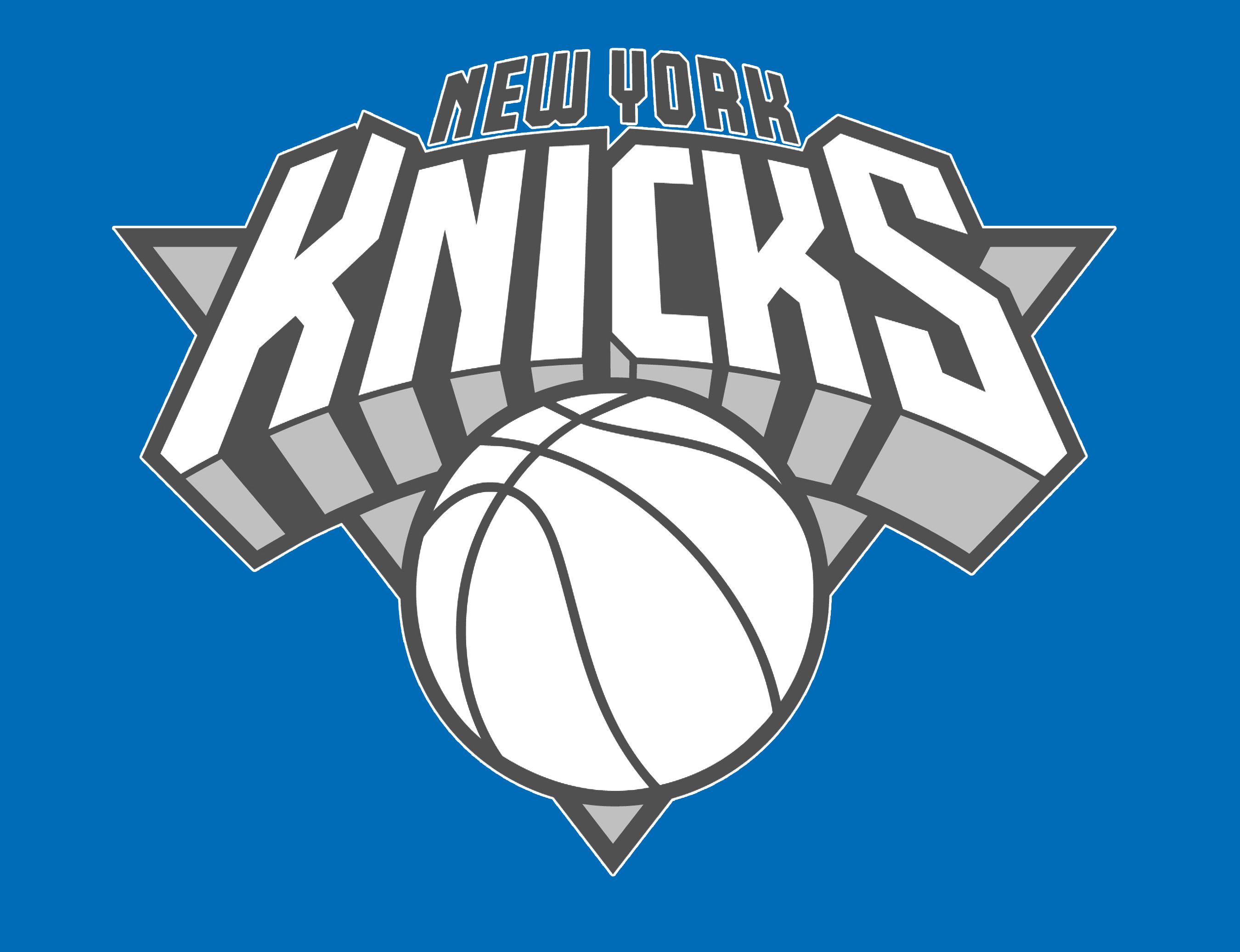
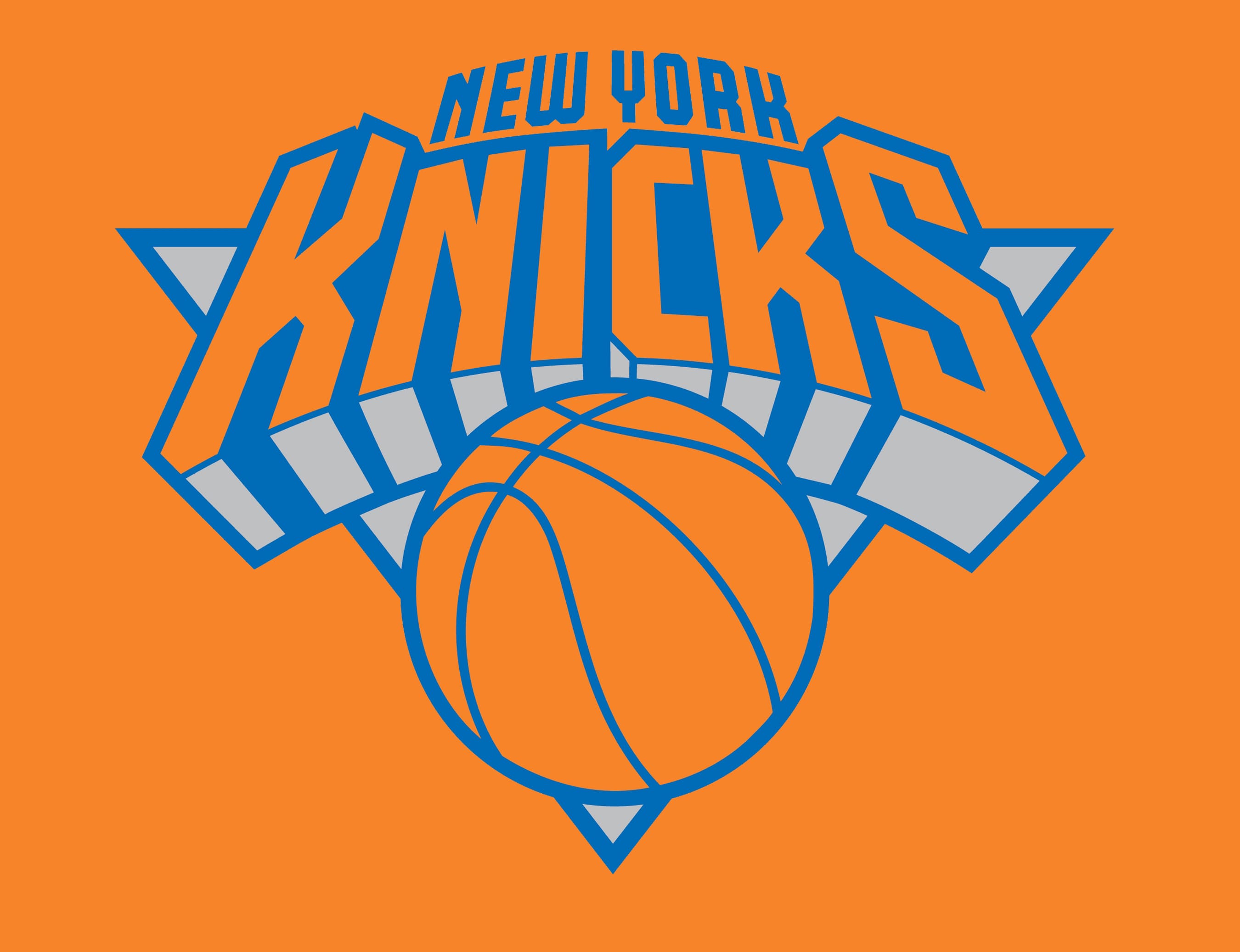
The redesign of 2011 changed nothing but the color palette of the New York Knickers visual identity, keeping orange and blue as the main colors, but lightening their shades, which made the whole image delightful and fresh.
Symbol
The 1964 variation, which was developed by Bud Freeman of the J.C. Bull advertising agency, looked like a prototype of the current logo. There was a brown basketball with a 3D lettering “Knicks” above. The typeface had something in common with the current one, although they are far from being identical.
The current emblem
The “basketball” logo underwent several modifications throughout more than half a century following its debut in the 1964-65 season. The most significant redesign was performed in 1992 by Michael Doret. It resulted in introduction of a new design element – a triangle, which served as the background. The typeface was a completely new one, yet, it featured a 3D effect and because of that looked somewhat similar to its predecessor, at first glance.
![]()
Originally, Michael Doret created the logo with a depiction of the Empire State Building in the center. However, as NBA was afraid that it wouldn’t be able to get the rights for it, the building was removed.
Font
The 3D effect is probably the most notable feature of the typeface. The letters do not belong to any of the commercial fonts; they were created from scratch specifically for the New York Knickerbockers logo.
Color
![]()
The team’s official color palette coincides with that of New York City. It includes orange (PMS 165), blue (PMS 293), and white. In some cases, black and silver are also included in the list.
New York Knicks Colors
KNICKS BLUE
PANTONE: PMS 293 C
HEX COLOR: #006BB6;
RGB: (0, 107, 182)
CMYK: (100, 56, 0, 0);
KNICKS ORANGE
PANTONE: PMS 165 C
HEX COLOR: #F58426;
RGB: (245, 132, 38)
CMYK: (0, 59, 96, 0);
KNICKS SILVER
PANTONE: PMS COOL GRAY 5
HEX COLOR: #BEC0C2;
RGB: (190, 192, 194)
CMYK: (0, 0, 0, 29);
KNICKS BLACK
PANTONE: PMS BLACK 6 C
HEX COLOR: #000000;
RGB: (35, 31, 32)
CMYK: (30, 0, 0, 100);


