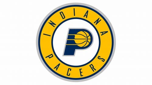
The logo of the basketball team Indiana Pacers has been fairly consistent for the first fifty years of its history. Even the new logo adopted in 2017 builds upon the team’s heritage.
Meaning and history
Indiana Pacers are the club, that owns one of the most iconic basketball logos in history. Its first version was created in 1967 and hasn’t changed much for more than fifty years, celebrating the club’s consistency and stability.
The name of the club is also a tribute to the club’s roots and its motherland. The “Pacers” nickname is a mixture of the Indiana history with the real passion for horse riding and speed.
1967 — 1976
The original logo of the club featured a solid blue letter “P” with a vertically placed white hand holding a yellow basketball, placed on the right side of the letter. This simple yet bright and memorable combination became a basis for all the future redesigns of the team’s emblem.
1976 — 1990

The color palette was a bit elevated and the “Indians Pacers” wordmark was added to the right side of the emblem, on its bottom part. The lettering was executed in an italicized serif typeface, which looked elegant and professional, balancing the bold and modern look of the graphical part.
1990 — 2005
The hard was removed from the logo and the lines of the rest elements were refined and modernized in 1990. The new emblem featured the bolder and darker letter “P” with a yellow basketball placed on its rounded part, with three lines coming out of it to the left. The bold italicized “Pacers” inscription was placed on the right from the emblem, executed in a modern and clean Sans-serif typeface.
2005 — 2017
The iconic “P” got outlined in thin gray and the typeface of the wordmark was switched in 2005. The new inscription featured a geometric and contemporary Sans-serif with strong flattened shapes of the blue letters. There was quite a lot of air between the symbols of the nameplate, which balanced the solid and massive emblem, Addis freshness and finesse.
2017 — Today
The “P” from the previous version was placed on a white circle and enclosed in a thick yellow and blue circular frame in 2017. The lettering was now written in blue around the frame’s perimeter, featuring a light narrowed Sans-serif typeface of its capital letters with a lot of space between them. The new badge is a reflection of the club’s ability to grow and change without losing its connection to the past.
Font
The type featured on the primary Indiana Pacers logo is a highly legible simple sans serif one looking very much like Agency FB Bold Italic. It is a square type designed by David Berlow and Morris Fuller Benton. The wordmark logo sports the same type, while the lettering itself is given in the arch shape.
Color
The three colors comprising the official palette are navy blue (Pantone Color Matching System 282), gold (PMS 123), and gray (PMS Cool Gray 5). Blue and gold are used as the colors of the state’s flag. While white can also be seen on the logo, it is not mentioned as part of the official palette in the team’s media guide.
Indiana Pacers Colors
PACERS BLUE
PANTONE: PMS 282 C
HEX COLOR: #002D62;
RGB: (0, 45, 98)
CMYK: (100, 68, 0, 54)
YELLOW
PANTONE: PMS 123 C
HEX COLOR: #FDBB30;
RGB: (253, 187, 48)
CMYK: (0, 15, 94, 0)
SILVER
PANTONE: PMS COOL GRAY 5 C
HEX COLOR: #BEC0C2;
RGB: (190, 192, 194)
CMYK: (0, 0, 0, 29)


