The professional basketball team Memphis Grizzlies is comparatively new and has only had two distinctive logos so far. There has also been a minor modification of its first logo, which was connected with a change in the name of the team.
Meaning and history
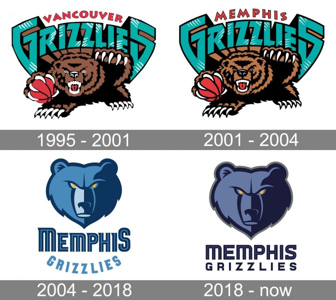
The club was founded in 1995 in Vancouver, British Columbia, under the name of Vancouver Grizzlies. The team was originally part of the NBA’s expansion into Canada. In six years, though, the club moved to the US. It started to play in Memphis, Tennessee, where it received its current name.
Throughout this period, the Memphis Grizzlies logo was almost identical, except for a minor change of the wordmark, which reflected the team’s new name.
1995 — 2001
 The original logo featured a highly aggressive bear clenching a basketball in his paw. The bear’s teeth and claws were emphasized. Moreover, from the way the grizzly held the basketball, you could clearly see that the ball was smaller than the paw. By exaggerating the bear’s size, the designer managed to find one more way of emphasizing his aggressiveness and dominance, which were supposed to scare off the team’s opponents.
2001 — 2004
 When the club moved to the US, it only changed one word in its logo. “Vancouver” was replaced by “Memphis” in red, while the 3D teal lettering “Grizzlies” from the Memphis Grizzlies old logo remained untouched.
2004 — 2018
 The current logo sports a less realistic bear’s head with yellow eyes. The logo is much easier to reproduce now.
2018 — Today

The redesign of 2018 strengthened the previous version of the Grizzlies logo, making the emblem a bit darker and the lettering — straight and solid. Now both parts of the inscription were set under the grizzly image in two lines, using a dark blue color for its bodies. The custom typeface of the upper part of the logotype has smooth angles, while the lower level is all strictly geometric, with sharp corners.
Font
The letters comprising the Memphis Grizzlies new logo appear to be a custom artwork. What makes the glyphs particularly memorable is the unusual sharp elements. They seem to symbolize the sharp claws of a grizzly bear, thus creating a visual and metaphorical connection with both the logo and the name of the team.
Color
The official logo usage guidelines mention the following colors as the team’s primary palette: Grizzlies Navy (PMS 289), Grizzlies Blue (PMS 652), Smoke Blue (PMS 650), and a gold shade of yellow (PMS 123).
Memphis Grizzlies Colors
BLUE
PANTONE: PMS 652 C
HEX COLOR: #5D76A9;
RGB: (93, 118, 169)
CMYK: (64, 38, 7, 2)
NAVY
PANTONE: PMS 289 C
HEX COLOR: #12173F;
RGB: (18, 23, 63)
CMYK: (100, 84, 45, 50)
YELLOW
PANTONE: PMS 123 C
HEX COLOR: #F5B112;
RGB: (255, 187, 34)
CMYK: (0, 23, 91, 0)
GRAY
PANTONE: PMS 424 C
HEX COLOR: #707271;
RGB: (112, 114, 113)
CMYK: (30, 20, 19, 58)


