

![]() Boston Celtics Logo PNG
Boston Celtics Logo PNG
Boston Celtics is a basketball club from the United States, which was established in 1946 in Massachusetts. The team was one of the original NBA members and is considered to be a legend of the national basketball, being the most successful club ever. The team, sponsored by General Electric, is owned by Boston Basketball Partners and managed by Danny Ainge.
Meaning and history
![]()
The visual identity of a famous basketball team is bright and instantly recognizable. The logo, built around Irish culture, is unique and perfectly represents the playful and progressive character of the club.
What are Boston Celtics?
Boston Celtics are the name of a professional basketball club in the United States, which was established in 1946 and was one of the eight clubs, which formed the National Basketball Association. The club from Boston is known as the one with the most wins in the history of the NBA. Boston Celtics play at TD Garden Arena and have Ime Udoka as the head coach.
1946 — 1950
![]()
The very first logo of the team, created in 1946, depicted an intense green circle with a white shamrock leaf in the middle and an arched rounded sans-serif “Celtics” lettering above it. It was a simple yet bright and memorable emblem, which didn’t stay with the team for a long time, but was the beginning of a colorful visual identity history.
1950 — 1960
![]()
The first leprechaun appeared on the club’s logo in 1950. It was a funny man in a crown-hat with the “NBA” lettering. There was also a pipe and an oak cane on the picture. The leprechaun, designed by Zang Auerbach, was colored in white and green, keeping the signature color palette of the team.
1960 — 1968
![]()
In 1969 the same image was used as the club’s logo, but now the leprechaun was placed on an orange background, in order to create better contrast. Orange is a bright and happy color, which symbolizes action, energy, and dynamics, and evokes smiles.
1968 — 1974
![]()
The jumping leprechaun was replaced by a standing one in 1968. He is now spinning the ball on his finger and leans on a cane, smiling and blinking. The green and white silhouette is placed on a red background, stylized as a basketball. The “Boston Celtics” wordmark was placed on the left and right from the leprechaun, around the ball’s perimeter, colored in white.
1974 — 1996
![]()
The prototype of the logo we all know today was designed in 1974. The leprechaun was refined, having sleeker and more confident lines. Now he was professionally executed with attention to details. His cunning smile evokes a sense of mystery and humor, making the logo unforgettable.
The basketball on his finger is now enlarged and comes out from the green frame, where the modified wordmark is placed. The whole logo is executed in white and green, with a thin black outline.
The white and green combination of colors symbolizes growth and progress, along with loyalty and success, while black adds a sense of stability, expertise, and professionalism.
The wordmark in white is written in all capitals and executed in a bold custom sans-serif typeface with neat thick lines and distinct ranges of the letters.
1996 — Today
![]()
The logo was redesigned again in 1996. The leprechaun remains untouched, yet the color palette is changed, adding moss-green for the best and brown for the ball and cane, along with solid black trousers and shoes. The leprechaun’s skin is now also colored, which makes the logo more detailed and realistic. As for the wordmark and the color scheme of the frame, no changes where made. The white pipe hasn’t been changed either, staying the only white element besides the shirt and the background.
This version is still in use today along with two additional emblems, created in 1998. It is actually one and the same image, just with its color switched. A stylish sleek shamrock leaf in white with white arched lettering above it, placed inside the green solid circle. Just like the original logo of the team, but refined and balanced. The second version puts the white circle inside a green square. The shamrock and nameplate are drawn in green.
As for the fonts, the closest one to the official logo inscription is BPmono Bold Font, a traditional clean sans-serif with neat contours. The additional logo inscriptions feature a stylized modern serif typeface with square letterforms. It looks strong and masculine, yet the perfect balance of the lines and spaces make the wordmark look sophisticated and stylish.
Symbol
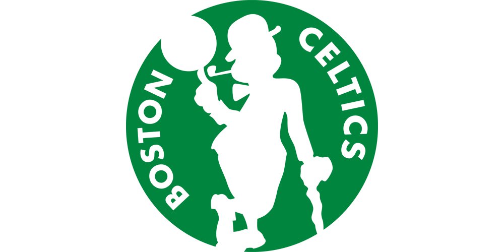
The current Boston Celtics logo (1996) features a Celtic with a stick spinning a ball, smoking a pipe, and a sort of leaning on a green circle with the team’s name in it.
Colors
The colors introduced on the Boston Celtics logo have a historic meaning for the club. The most memorable color is green, which can be linked with the shamrock.
According to the official Reproduction and Usage Guideline Sheet (2018), the following shades are used:
– Green. Pantone: 356, Hex: #008348
– Gold. Pantone: 874 C. Hex: #BB9753
– Brown. Pantone: 174 C. Hex: #A73832
– Beige. Pantone: 472 C. Hex: #FAB383
– Black. Pantone: Black. Hex: #00000
Font
The unique type has been probably hand-drawn specifically for the club. If you want to find a font looking somewhat similar, try the Lakers typeface. They have something in common, although the height of the letters isn’t the same.
Why is Boston called the Celtics?
The name for the team was chosen by Walter Brown, he head of the Boston Garden Arena Corporation, who wanted it to be a tribute to all the Irish people living in the state, and also to celebrate the old basketball team, which played in Boston in the 1910s — 1920s, the Original Celtics.
Does the Boston Celtics logo have a name?
The primary Boston Celtics logo doesn’t not have a name, although the iconic mascot of the club, the leprechaun in a brown and green west and a black hat, is known as Lucky. Lucky has been an essential part of the club’s visual identity since the beginning of the 1950s, and in his current design — since 1968.
Are the Celtics changing their logo?
Throughout their history, Boston Celtics have had six different logo versions greater for them, with the latest redesign taking place in 1996. So by 2023, the team has been playing with one emblem for almost thirty years, and no plans on changing the iconic badge have been announced.
Boston Celtics Colors
CELTICS GREEN
PANTONE: PMS 356 C
HEX COLOR: #007A33;
RGB: (0, 122, 51)
CMYK: (100, 0, 91, 27)
CELTICS GOLD
PANTONE: PMS 874 C
HEX COLOR: #BA9653;
RGB: (139, 111, 78)
CMYK: (30, 40, 80, 0)
CELTICS BROWN
PANTONE: PMS 174 C
HEX COLOR: #963821;
RGB: (150, 56, 33)
CMYK: (40, 95, 100, 0)
WHITE
HEX CODE: #FFFFFF;
RGB: (255, 255, 255)
CMYK: (0, 0, 0, 0)
CELTICS BLACK
PANTONE: PMS BLACK 6 C
HEX COLOR: #000000;
RGB: (0, 0, 0)
CMYK: (0, 0, 0, 100)


