

![]() Atlanta Hawks Logo PNG
Atlanta Hawks Logo PNG
Although the basketball team Atlanta Hawks has gone through several names and locations, its logo has almost always remained consistent in its core visual metaphor – the hawk bird.
Meaning and history
![]()
Before becoming Atlanta Hawks, the famous American basketball club has changed three names and locations and got their current identity only in 1968. As for its logo, after the name of the team was set, the emblem was redesigned six times to get its modern and stylish look the whole world knows today.
What are Atlanta Hawks?
Atlanta Hawks is the name of a professional basketball club in the United States, which was established in 1946 under the name Buffalo Bisons. The team got the new base and the current name in 1968, and today one of the NBA clubs has State Farm Arena in Atlanta, Georgia, as their home stadium, and Nate McMillan as the head coach.
1946 — 1951
![]()
The very first name of the club was Tri-Cities Blackhawks, though it lasted for just five years, this was an important chapter in the team’s history and its visual identity timeline. The initial logo for the club was designed in 1946 and featured a light turquoise basketball with black details and lettering. The name of the club was written in the middle of the ball, executed in a traditional bold serif font, which looked strict and confident.
1951 — 1955
![]()
The name of the club was changed to Milwaukee Hawks in 1951, and the new visual identity design was introduced in the same year. The badge with the flying hawk holding a basketball was executed in the original turquoise and black color palette, though if on the first logo black was only for thin lines and letters, here it became more prevailing. The wordmark in all capitals of a solid sans-serif font was arched under the emblem, framing it from the bottom.
1955 — 1957
![]()
The club moved to St Louis and changed its name again in 1955. The new emblem depicted a flying hawk with its wings spread to the sides, holding a basketball. There was no lettering on that version, and the color palette was switched to black and cream, almost monochrome.
1957 — 1968
![]()
The completely new style of the badge was designed for the club in 1957. It was a caricature of a bird wearing a team’s uniform and holding a basketball. The bird was drawn full size and facing right. The new red and white color palette made the image look passionate and fun, and the bold sans-serif inscription under the bird added stability and professionalism.
1968 — 1969
![]()
In 1968 the club relocated to Atlanta and changed its name to Atlanta Hawks. For the first year, the previous emblem was used as an official one, though it was executed in a monochrome palette with the contours strengthened and emboldened.
1969 — 1970
![]()
The caricature bird was redrawn in 1969. Now it was running with the ball and looked powerful and determined. There were two possible versions of the logo color palette — white image with the wordmark, contoured in blue and Ted, or the bold red bird in a white team’s jersey, with the brown basketball.
1970 — 1972
![]()
The visual identity, created in 1970, looked completely different. It was a modern and laconic badge in green and blue, with the circular emblem on the left from a two-leveled wordmark. The emblem featured a green background with the blue hawk’s head, facing right. As for the inscription, it was written in blue capitals of a custom sans-serif typeface with wide rounded contours of the letters.
1972 — 1995
![]()
In 1972 the predecessor of the logo we all know today was introduced by Atlanta Hawks. It was a red minimalist badge with the hawk’s profile in a circular frame. The drawing was executed in bold sleek lines and complemented by a delicate yet also bold title case inscription under it. The wordmark was executed in an elegant serif font and added a professional touch to a stylish icon.
1995 — 2007
![]()
The redesign of 1995 introduced a new concept for the Atlanta Hawks badge. The red flying hawk was drawn very detailed, and had its claws on a brown basketball, elongated and sharp. The logo was executed in an intense red, yellow, and brown color palette, and had a bold red wordmark placed above it. The secondary version of the logo featured a Ted hawk’s profile, facing to the left.
2007 — 2015
![]()
In 2007 the emblem from 1995 was redrawn in a new color palette — the yellow and brown details were switched to blue and gray, which added freshness and edginess to the logo, making it look more modern and confident. The wordmark was also rewritten, and the new strict and board typeface made the whole image look professional and elegant.
2015 — 2020
![]()
The redesign of 2015 brought back the minimalist emblem, created in 1970, refining its lines and adding some details. The contoured red bird’s head is now enclosed in a bold red frame with a double white and red outline and the stylish capitalized inscription around its perimeter.
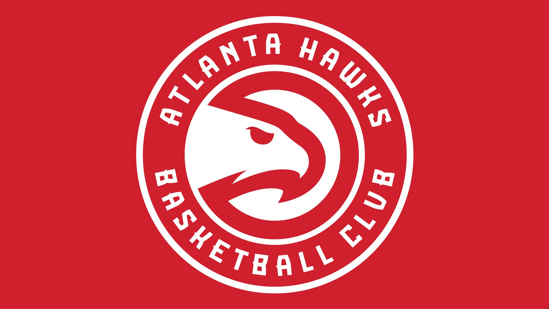
2020 — Today
![]()
The redesign of 2020 made the Atlanta Hawk emblem look stronger and more dangerous but just elevating the shade of red from the previous version. Now the red is two shades darker, and this created a stronger contrast between the background and white elements on it.
Font

The most recognizable feature of the typeface in which the name of the club is given in the logo is probably the sharp elements on the letters (“A,” “B,” “E,” “K,” for instance). The seemingly unnecessary design elements are actually relevant and meaningful, as they represent the sharp beak of a hawk and thus create a perfect visual harmony with the bird emblem.
Atlanta Hawks Colors
HAWKS RED
PANTONE: PMS 186 C
HEX COLOR: #E03A3E;
RGB: (225, 68, 52)
CMYK: (0, 91, 76, 6)
VOLT GREEN
PANTONE: PMS 382 C
HEX COLOR: #C1D32F;
RGB: (196, 214, 0)
CMYK: (29, 2, 100, 0)
HAWKS CHARCOAL
PANTONE: PMS 426 C
HEX COLOR: #26282A;
RGB: (38, 40, 42)
CMYK: (73, 65, 62, 67)


