The Brooklyn Nets basketball team is familiar not only to sports fans. The team with half a century of history became not only a legend of sports, but also a recognizable brand, although the Brooklyn Nets logo has changed more than once.
Meaning and history
The Brooklyn Nets, an esteemed franchise in the world of professional basketball, owe their inception to entrepreneur Arthur Brown, who founded the team in 1967. Initially known as the New Jersey Americans and later the New Jersey Nets, the team eventually settled into its Brooklyn identity in 2012, marking a significant chapter in its history. Over the years, the Nets have carved out a legacy marked by notable achievements, including two ABA championships in the early 1970s and consistent appearances in the NBA playoffs throughout the early 2000s. The team’s journey has been punctuated by the contributions of legendary players such as Julius Erving and Jason Kidd, whose performances have left an indelible mark on the franchise’s history.
In recent years, the Brooklyn Nets have continued to make waves in the NBA landscape. The acquisition of high-profile players like Kevin Durant and Kyrie Irving has bolstered the team’s competitive edge, making them a formidable force in the Eastern Conference. Their move to the state-of-the-art Barclays Center in Brooklyn has not only provided a modern home court but also revitalized the team’s fan base and local support. As of now, the Brooklyn Nets remain a significant player in the NBA, consistently striving for excellence and aiming to add more chapters to their storied history.
What is Brooklyn Nets?
Brooklyn Nets is a professional basketball team based in Brooklyn, New York. As a member of the Eastern Conference’s Atlantic Division in the NBA, the team boasts a rich history and a strong fan base, consistently competing at the highest levels of the sport.
1967 – 1968
The first logo of the world famous basketball team appeared in 1967. The shape of the logo resembled a shield. The flag of the USA became the keynote of its image. Against the background of shield the ball was located. The color scheme did not have any differences from the colors of the American flag: blue, red and white respectively. The team name was placed at the top of the logo and was made in white color.
1968 – 1971
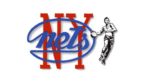
In 1968, the team has changed its name to New York Nets in connection with moving to Long Island, N.Y. It has been decided not to keep the previous form of the logo, but the color scheme was not changed – on a white background, a new team name in red and blue colors was located. In addition, on the right side of the logo appeared the figure of a basketball player, made in black.
1971 – 1977
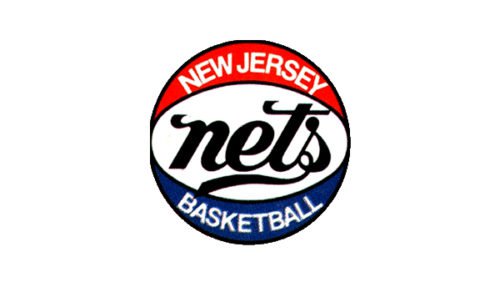
In 1971 the logo was deprived of the basketball player’s figure and acquired the shape of the ball of the same colors that were used by the one the ABA during the games. The lettering has not been changed.
1977 – 1978
Due to its first season in New Jersey, the team replaced the abbreviation NY in the logo, changing the color of font to black and white instead of red and blue.
1978 – 1990
The logo has lost any reminder of the sport, both in symbols and in lettering. At the same time on the team logo the silhouette of the state has appeared. As all inscriptions, it was made in white.
1990 – 1997
At the logo disappeared reference to the place and there was only a brief NETS. A gradient of red, white and blue colors was used to stylize three-dimensional letters. At the bottom of the logo the ball was located, which was made in the same style. It was a kind of flashback to the time the team played in the ABA.
1997 – 2012
For the first time since the team’s inception, the image of the shield was returned to the logo. It became a part of the image of the basketball net, where the ball is thrown. The color scheme was changed – the usual colors became more deep and dark gray and silver were added.
2012 – 2024
For the first time in club history the team has 2 main logos. Because of the move of team in the “Barclays center” co-owner of the club, the famous rapper Jay-Z, has developed a Brooklyn nets new logo. The black and white color scheme of the old system of signs of the New York subway, including its famous font “RollSign”, was taken as a basis and became Brooklyn nets logo font. The logo retained the shape of the shield and acquired the letter B, which is inscribed in the image of the ball. To emphasize the location of team the word Brooklyn appeared under the shield. The second logo is a black circle, which depicts the ball with the letter B in the center. Both logos are made in black and white.
The visual identity design of the famous basketball club from New York was in the making for almost ten years, so the logo, introduced in 2012, became a sensation, which was waited by people from all over the globe.
2024 – Today
Font and color
The modern and minimalist lettering on the Brooklyn Nets badge is executed in a clean and slightly narrowed custom Sans-serif typeface, which represents the club’s character and essence, showing its individuality and progressive approach, enclosed into a strong value of traditions and legacy. The typeface of the team’s logotype is pretty close to such fonts as Chairdrobe Regular and Neue Plak Condensed Regular but with the contours of some letters modernized.
As for the monochrome color palette of the Brooklyn Nets logo, it was the first time in the club’s history, when the logo didn’t have any red accents in it. The new black-and-white combination is meant to symbolize modern New York and its progressiveness and strength. The timeless color combination elevated the look of the emblem and makes it iconic.
Brooklyn Nets Colors
BLACK
PANTONE: PMS BLACK 6 C
HEX COLOR: #000000;
RGB: (0, 0, 0)
HSB: (1, 69, 0)
CMYK: (75, 68, 67, 90)
WHITE
HEX COLOR: #FFFFFF;
RGB: (255, 255, 255)
HSB: (203, 0, 100)
CMYK: (0, 0, 0, 0)


